


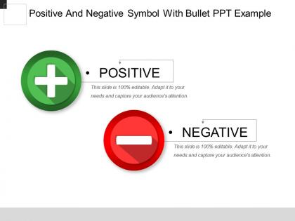
Positive and negative symbol with bullet ppt example




Try Before you Buy Download Free Sample Product
 Impress Your
 Audience
 100%
100% Editable
 Save Hours
 of Time


Our Positive And Negative Symbol With Bullet Ppt Example are excellent catalysts. They generate brilliant thoughts.
People who downloaded this PowerPoint presentation also viewed the following :
Positive and negative symbol with bullet ppt example with all 5 slides:
Breathe in new concepts with our Positive And Negative Symbol With Bullet Ppt Example. Your ideas will have a breath taking effect.
FAQs for Positive and negative symbol with
Think of symbols like visual shortcuts - way more memorable than just spelling everything out. Your brain processes stuff on multiple levels when you see meaning behind images. Pretty cool how that works, right? So instead of a slide saying "we value growth," throw in some tree imagery or mountain climbing visuals throughout your deck. The trick is picking symbols that actually connect to what you're saying (not random clipart) and sticking with them. Done right, people will remember your message long after they've forgotten your bullet points. It's honestly one of those presentation hacks that just works.
Pick images that people already "get" - like how a lightbulb means idea or broken chains mean freedom. These work because we all share this visual language. The best symbols work on multiple levels though. Apple's logo is perfect for this - it's literally an apple but suggests knowledge, temptation, all that good stuff. I'd start by writing down what emotions you want to hit, then think of images that naturally feel like those concepts. Don't overthink it too much. If it feels forced, your audience will sense that right away.
Oh man, symbols are tricky when you're presenting to people from different cultures. Red screams "good luck!" in China but screams "danger!" here in the West. White? Could mean pure or death depending on who's looking. I totally bombed once using an owl in a global presentation - turns out it's not "wise" everywhere, just bad luck in some places. Religious stuff and hand gestures are minefields too. Honestly, animals can be just as problematic. Before you present, do some homework on your audience's backgrounds. Better yet, run your visuals by someone from that culture first.
Yeah, so definitely scope out your audience first and pick symbols that work across different cultures. Skip anything religious or political unless you really know who you're talking to. Hearts for love, lightbulbs for ideas - that basic stuff everyone gets. Oh and bridges! They're actually brilliant for showing connection since that concept works everywhere. If you can, run your ideas by coworkers from different backgrounds. Sometimes what seems obvious to you... isn't. When you're unsure, just explain the symbol quickly instead of hoping people figure it out. Way better to be inclusive than accidentally leave someone confused.
Arrows are huge for showing growth or process steps. Lightbulbs = innovation, gears mean teamwork/efficiency. Charts and graphs for data stuff, obviously. Handshakes work great for partnerships, targets for goals, puzzle pieces when you're talking collaboration. Dollar signs are pretty self-explanatory. Trees show growth or that sustainability angle, but honestly everyone uses them now so they're kinda meh. Clocks are good for deadlines or time management. Just pick ones that actually make sense with what you're saying - don't just slap random icons everywhere because it looks "business-y."
Pick one main metaphor that captures your whole message - like "building bridges" for teamwork stuff. Then sprinkle related symbols throughout everything. Your slides, examples, words should all connect back to it. I've watched people absolutely murder this concept by going way too heavy-handed, so dial it back. Consistency matters here. Bridge metaphor means you'll talk about "foundations" and "connecting gaps." Sketch your main idea first, brainstorm maybe 3-4 supporting symbols, then build your presentation around that. It's honestly pretty effective when done right.
Think about what your main point really is, then find a visual that connects naturally - bridges for connection, lighthouses for guidance, that kind of thing. Industry stuff works, but honestly the best symbols come from weird places that somehow make total sense once you explain them. I've seen people use everything from recipe analogies to movie references. Just don't drop it once and forget about it - if you pick a symbol, use it throughout the whole presentation. Oh, and definitely run it by someone first. You'll know you nailed it when it feels both surprising and obvious at the same time.
Honestly, misusing symbols is such an easy way to tank your whole project. Your audience either gets totally confused about what you're trying to say, or worse - they're actually offended by it. Like using religious symbols wrong or completely missing cultural meanings? People notice that stuff immediately. I've watched campaigns just completely bomb because of symbol fails. Plus it makes everything feel super shallow when the meaning doesn't match what you're going for. My advice? Do your homework first and really think about who's gonna see it.
Oh totally! The best presentations use symbols that just stick with you. Jobs did that iPhone reveal where three devices became one - pure genius. Obama's "Yes We Can" poster hit different because it screamed hope without being preachy. I remember this TED talk where someone used a red paperclip to show how tiny changes snowball into something huge. Honestly, symbols work because they skip past our logical brain and punch you right in the feelings. Find one simple object or image that captures your whole message and you're golden.
So basically you want your words and visuals saying the same thing, right? Like if you're talking about growth, throw in words like "flourish" and "expand" while showing trees or whatever. Political campaigns are actually genius at this - everything matches perfectly. Short sentences work too. Map out your main message first, then brainstorm both the visual stuff and word choices that back it up. Honestly, consistency is what makes people remember your point. Multiple touchpoints hitting that same emotional vibe? That's where the magic happens. Don't overthink it though.
Dude, symbols and images hit people right in the feelings before their brain even catches up. That's why they're so powerful - way more than just throwing data at someone. Like Nike's swoosh? You see it and instantly think speed, winning, all that good stuff. No words needed. Our brains love shortcuts, and symbols are basically pre-loaded emotional triggers. Honestly, I think most people underestimate this. Next time you're doing a presentation, skip the wall of text. Pick maybe 2-3 really solid visual symbols that back up your main points instead. Your audience will actually remember what you said.
It's really about knowing your crowd. Educational stuff needs super clear, simple symbols - like basic icons that actually help people learn instead of confusing them. Corporate presentations are all about looking professional with clean charts and brand colors. Can't go wrong there. But artistic presentations? Go crazy with abstract stuff and emotional imagery. I swear, the worst presentations are when corporate tries to be artsy and nobody gets it. Just match what your audience actually wants - teachers need clarity, business people want credibility, and artists want you to take risks.
Honestly, symbols are a minefield because they mean completely different things everywhere. Red screams "danger" to us but it's lucky in China. Religious stuff and hand gestures? Even worse - you can accidentally offend entire groups without realizing it. Animals too, which sounds weird but it's true. Plus you've gotta think about whether people will even get your visual references in the first place. I learned this the hard way on a project once. Best bet is researching your specific markets beforehand and testing with locals. When you're stuck, just go with boring universal stuff like arrows.
Dude, symbols are basically cheat codes for presentations. Your brain sees a lightbulb and instantly thinks "ideas" - way faster than reading actual words. It's wild how that works. Pick ones everyone recognizes though, like mountains for obstacles or whatever fits your topic. I started swapping out random bullet points for little icons instead of just text everywhere. Honestly made such a difference. People actually remember those parts later. Try it with like 3 points next time you're presenting something. Your audience will thank you for not making them read another wall of text.
Just ask people what your symbols actually mean to them! Seriously, I've watched so many trainwrecks where someone's "perfect" lighthouse metaphor just looked like... a building. Super awkward. Quick chats or focus groups work fine - doesn't need to be fancy. Watch for confused faces during practice runs too. If people are squinting or asking "what's that supposed to be?" then you know something's off. The trick is testing early so you can either make it simpler or add more context. Don't wait until the actual presentation to find out your brilliant visual makes zero sense!
-
Topic best represented with attractive design.
-
Appreciate the research and its presentable format.