


Pptx monitoring and evaluation powerpoint presentation templates


Try Before you Buy Download Free Sample Product
 Impress Your
 Audience
Editable
of Time


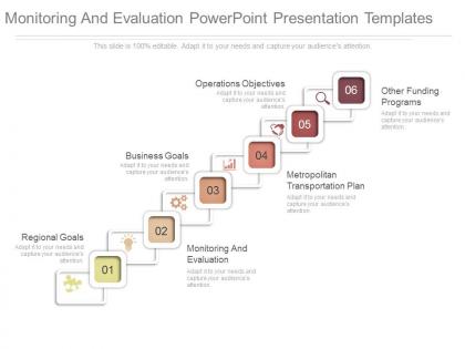
Accelerate flow of thought with our Pptx Monitoring And Evaluation Powerpoint Presentation Templates. They cut down any friction.
People who downloaded this PowerPoint presentation also viewed the following :
Pptx monitoring and evaluation powerpoint presentation templates with all 7 slides:
Deliver beyond all dreams with our Pptx Monitoring And Evaluation Powerpoint Presentation Templates. Be declared the firm favorite.
FAQs for Pptx monitoring and evaluation
For your PPTX M&E template, start with clear objectives and indicators. Include sections for data collection methods, timelines, and results tracking. Don't make it too fancy - I've watched people create gorgeous templates that nobody actually uses because they're a pain to fill out. Space for both numbers and qualitative feedback is crucial. Oh, and definitely add a lessons learned section for when things go sideways (they always do). Keep the flow logical: planning, implementation, then analysis. Honestly? Simple beats comprehensive every time. Your team needs something they'll consistently use, not something that wins design awards.
Honestly, visuals are a game-changer for M&E stuff. Most execs will just skim your charts anyway, so make them count! Use color coding so people can instantly see what's working vs. what's not. Charts show trends way better than paragraphs of text - nobody wants to dig through dense reports. Icons work really well for breaking down those complex logic models too. Oh, and keep your formatting consistent throughout or it'll look messy. I'd start with your strongest visual first, then stick to the same colors and style. Makes the whole thing flow better and actually tells a story people can follow.
Mix quantitative stuff with qualitative - budget variance, timeline adherence, deliverable completion rates, stakeholder satisfaction scores. Quality metrics like defect rates are honestly way more telling than the basic numbers most people obsess over. Risk mitigation effectiveness matters too, plus resource utilization rates. Oh and don't skip outcome-focused metrics that show actual business impact instead of just busy work. Pick maybe 5-7 that your stakeholders actually care about. There's always that temptation to track everything but it just becomes noise.
First thing - swap out those placeholder charts with your actual monitoring data. Keep the same format across all reports so everyone's on the same page. Trust me, getting people to actually stick to one template instead of making their own is like herding cats! Leadership only reads executive summaries anyway, so nail those first. Then dump your raw data in the detailed sections. Figure out which template parts matter most for your audience. Oh, and don't forget to update the format regularly - stale templates are useless templates.
Honestly, don't just grab a generic template and call it good. Those cookie-cutter things look pretty but they usually miss what actually matters for your specific project. You really need to customize the indicators and data collection methods to match your goals. I mean, every program is different, right? Start with a decent template as your base, then tweak the metrics and timelines to fit what you're actually doing. The reporting frequency should make sense for your stakeholders too. Just keep the basic M&E principles while you're adapting everything else to your reality.
Start by connecting each metric back to what you're actually trying to accomplish. Seriously, I've watched so many teams just grab random templates and then act shocked when the data means nothing. Get your PowerPoint slides matching up with your strategic plan first - that's basic stuff. Oh, and definitely loop in whoever's gonna be using these day-to-day because they'll catch things you won't. Short version: if you can't explain how a metric ties to your goals, ditch it. Your dashboard shouldn't look like someone threw numbers at a wall.
Honestly, just make sure each person has their own clear spot to add feedback - like separate comment boxes or rating sections. Don't cram everything onto one slide because it gets chaotic when everyone's editing at once. Use different colors so you can tell whose feedback is whose. Version control is huge here (learned that the hard way lol). Keep the formatting consistent so people actually know where to put their thoughts. Oh, and definitely add an instruction slide upfront - saves you from answering the same questions five times. End with a summary slide to wrap it all up.
So basically you just swap out the metrics for whatever sector you're working in. Education needs stuff like test scores, enrollment numbers, teacher training data. Health focuses more on patient outcomes and clinical indicators. Social services? Think beneficiary demographics and community impact measures. The cool thing is the visual layout stays exactly the same - that's why templates are actually useful, right? Just figure out your 5-7 main KPIs first, then update your data sources and tweak the terminology. Oh and don't forget to customize those dashboard elements to match how people in your sector actually talk.
Honestly, the biggest mistake is grabbing a template just because it looks polished. Most don't track what actually matters for your specific project. I see people get obsessed with making everything visually perfect - totally missing the point. Your data should tell a story, not just look Instagram-ready. Also, don't dump everything onto one slide. Nobody wants to decode a wall of charts and bullet points. Here's what works better: figure out your main questions first, then hunt for templates that fit those needs. Sounds backwards but trust me on this one.
For your M&E templates, pick 3-4 colors max and stick with them - nobody wants slides that look like a kindergarten art project. Bar charts work great for comparisons, line charts for trends over time. Keep chart text super minimal and save the detailed stuff for your slide notes. Actually, this might sound obvious but make sure each visual actually supports your findings instead of just being there for decoration. Oh and consistency is key throughout the whole deck. Clear labels and titles are non-negotiable too. Every chart should tell part of your story.
Okay so first thing - make it visually clean with clear headers and color coding. Drop-down menus are your friend here instead of letting people type whatever random stuff they want. The language should be super plain, and throw some quick examples right in the cells so people aren't guessing. Oh, and definitely create separate tabs for different users - your program people don't need to see finance stuff that'll just confuse them. I swear, most templates look like they were built by people who live and breathe Excel formulas! Before you launch it, test with real users first. They'll spot problems you'd never notice.
Honestly, Excel integration is your easiest starting point - just get comfortable with that first. Power BI and Tableau both connect straight to PowerPoint if you want live charts (pretty slick actually). SharePoint saves you from those "final_final_v3" file disasters since everyone works on the same version. Survey tools like SurveyMonkey dump data right into your presentations too. Power Automate gets fancy - it'll auto-update slides when new data rolls in, though that might be overkill depending on your setup. Start simple with Excel though, then build from there.
Set up feedback cycles with your users - quarterly surveys work well, or just quick check-ins after big presentations. I'd ask specific stuff like whether the slides actually save time and if the layouts are clear enough. Simple feedback form with ratings plus a comment box. Here's the key part though: you've got to actually do something with what they tell you. Update the crappy layouts, add slide types people keep asking for, fix formatting bugs. Keep a running list of requests and tackle the most common complaints first. Oh, and circle back to let people know what you changed based on their input.
Look, you absolutely need that lessons learned section. Otherwise all your monitoring data just disappears when people quit or projects wrap up. I've watched teams make identical stupid mistakes because nobody bothered writing down what went wrong the first time. The failures are honestly way more useful than the wins - though document both. Plus it helps you spot patterns across different projects instead of treating each evaluation like it exists in a vacuum. Think of it as building a cheat sheet for future you.
So you'll want to track completion rates first - are people actually using these things? Data quality matters too, plus how long it takes staff to fill them out. The insights need to be actionable, not just pretty charts nobody reads. I'd survey your team quarterly about pain points because honestly, most templates I've seen are terrible. Usage is everything - templates that sit unused are worthless. Set up reviews every 6 months to tweak what's broken. Also track if the data actually leads to program changes. That's the real test.
-
Great designs, really helpful.
-
The content is very helpful from business point of view.