

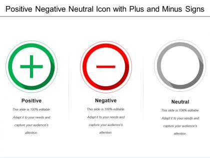
Positive negative neutral icon with plus and minus signs




Try Before you Buy Download Free Sample Product
 Impress Your
 Audience
 100%
100% Editable
 Save Hours
 of Time


Give them great grooming with our Positive Negative Neutral Icon With Plus And Minus Signs. They will be good for the future.
People who downloaded this PowerPoint presentation also viewed the following :
Positive negative neutral icon with plus and minus signs with all 5 slides:
Bring in the element of fun with our Positive Negative Neutral Icon With Plus And Minus Signs. Don't allow the going to get heavy.
FAQs for Positive negative neutral icon with plus
Think of icons as visual shortcuts - your brain processes them way faster than reading text. They're great for breaking up those walls of words that make people's eyes glaze over. Plus if you've got international folks in the room, icons just work regardless of language which is honestly pretty cool. Just don't go crazy with random clipart though (we've all seen those presentations). Pick ones that actually match what you're saying and stick to the same style throughout. Your slides will look way cleaner and people won't have to work as hard to follow along.
Icons are basically visual shortcuts - your brain processes them way faster than reading text. Like, you see a trash can and instantly know it means delete, no explanation needed. They tap into pattern recognition and stuff we've learned culturally. The trick is picking ones that make sense to your actual users, not just you. You can build icon families too where similar things share visual elements (though that gets nerdy fast). I'd definitely test them with real people first - I've seen designers pick icons they thought were super obvious but users had zero clue what they meant. It's wild how differently people interpret symbols.
Honestly, just match whatever vibe your brand already has going on. Playful brand? Go rounded and friendly. Corporate feel? Stick with clean geometric stuff. Consistency beats perfection every time - I've seen too many sites with amazing individual icons that look like a hot mess together. Keep them simple enough that people instantly get what they mean. Nobody has time to decode some clever abstract design. Oh, and definitely run them by someone else first. You'll be staring at these things so much you won't even notice if they're confusing.
Oh man, this is such a real issue! Icons that make perfect sense to you might totally confuse your audience. Like, I've seen people use American-style mailbox icons with international teams - awkward. Hand gestures can be straight-up offensive in some cultures too. Colors are tricky since red means luck in China but screams "danger" everywhere else. Even reading direction affects how people view your layout flow. Honestly? Run your icons by someone from your target audience first, or just stick with super basic stuff like arrows and standard tech symbols. Way safer that route.
Go with outlined icons over filled ones - they're way cleaner for presentations. Those super detailed ones from like 2019? They look so dated now, honestly. Keep your stroke weights consistent and use rounded corners so everything matches. Monochromatic is your friend, but throw in an accent color here and there if you need emphasis. Oh, and test them small! People are gonna view this stuff on their phones or crappy laptop screens. Nothing worse than icons that turn into blurry blobs when you shrink them down.
Honestly, icons are game-changers for presentations. People actually pay attention instead of scrolling Instagram under the table. Your brain processes visuals way faster than text, so complex ideas suddenly make sense. I learned this the hard way after watching my boss's eyes glaze over during my 47-slide text nightmare last month. Break up those bullet point walls with icons that actually match your content - not just random pretty stuff. Visual anchors help your audience follow along and remember what you said later. Try swapping out half your text for relevant icons next time. You'll see the difference immediately.
Oh nice question! Feather Icons and Heroicons are solid - I use them constantly because they're free and look super clean. The Noun Project has crazy variety but you'll probably want to pay to skip the attribution stuff. Figma's community section is actually amazing now, tons of free sets. Honestly though, if you have any budget at all, premium libraries like Streamline or Phosphor are so worth it. The consistency across everything just makes your life easier. Just pick something that doesn't clash with your overall design vibe, you know?
Bigger icons catch the eye way better - people in back rows can actually see them. Place them where your eye naturally goes, like left to right or near the text they relate to. Don't go smaller than 32px or they're basically useless decoration. I swear, cramming tiny icons everywhere just makes slides look messy. Give them space to breathe! Also, step back from your screen when you're done - does it actually work from across the room? That's honestly the real test.
Your brain processes icons in milliseconds vs. text which takes way longer to decode. Pretty cool how that works, right? People instantly get visual symbols without having to actually read anything. This frees up mental energy so they can focus on what you're saying instead of squinting at wordy slides. Icons also work for everyone regardless of language, which is super handy. Just don't get weird with it - stick to universally recognized symbols. Nobody wants to waste time figuring out what your random abstract icon means. Keep it simple and your presentations will flow much better.
Your brain loves visual shortcuts, so icons paired with text create this double-encoding thing that helps people remember stuff way better. They're also great for breaking up those intimidating text walls - honestly, who has time to read paragraphs anymore? Icons give your audience these little mental hooks they can grab onto later. Even the most basic ones work: arrows, checkmarks, lightbulbs. Nothing fancy needed. When someone's trying to recall your content later, they'll remember "oh yeah, that section with the lightbulb" way easier than trying to fish out specific words from memory.
Okay so the worst thing you can do is mix different icon styles - looks super sloppy. Also don't make them tiny! Your audience shouldn't have to squint. I learned this the hard way lol. Test everything from the back of the room first. Can't tell what it is from 10 feet away? Scrap it or add labels. Keep colors and sizing consistent throughout. And honestly, random icons just for decoration are the worst - every single one should actually mean something. Otherwise you're just cluttering up your slides for no reason.
Okay so first thing - pick 2-3 colors max and stick with one style throughout your whole deck. Change the colors to match your brand, adjust sizes for hierarchy, all that good stuff. Most design tools let you swap generic icons for specific ones too (like medical icons instead of boring arrows). Honestly, digging through icon libraries is weirdly addictive - I always end up spending way too long finding the "perfect" one. You can group related ones together or add shadows to make them stand out. Just don't go overboard with effects or it'll look messy.
Honestly, color schemes can make or break your icons. You need decent contrast so people can actually see them - I've used apps where icons just disappear into the background and it's so frustrating. Red usually means delete, green for good stuff, that kind of consistency helps users know what to expect. Here's what I do: test everything in grayscale first. If it works without color, you're set. Then use your brand colors on top of that. Just don't forget accessibility standards when you're picking colors.
Icons are honestly game-changers for presentations. Think lightbulb for your "aha moment" or mountain for big challenges. Our brains love visuals way more than text - and they definitely beat those crusty 2005 clip art disasters. Pick maybe 3-5 simple ones and stick with them throughout your slides. Creates this nice visual thread that pulls people along. Here's what works: map out your story beats first, then find icons that punch up each moment. Keep them consistent so your audience isn't getting whiplash from random design choices.
Three main things to nail down: alt text, visual clarity, and redundancy. For alt text, describe what the icon *does* - like "Search" not "magnifying glass." Your icons need good contrast and can't be microscopic (I made that mistake once with some gear icons that were basically invisible). Honestly, pairing icons with text labels saves you so much headache since people interpret symbols differently based on culture and ability. Oh, and definitely test with real users if possible - they spot issues you'd never think of. Short version: don't make people guess what your icons mean.
-
Colors used are bright and distinctive.
-
Editable templates with innovative design and color combination.