

Continuum scale presentation diagram powerpoint images




Try Before you Buy Download Free Sample Product
 Impress Your
 Audience
 100%
100% Editable
 Save Hours
 of Time


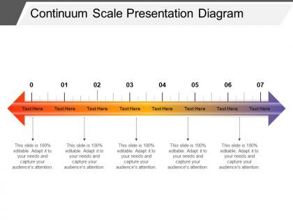
When a user wants to represent any continuous whole comprising individual units, he can go for continuum scale PowerPoint slide because it is a set of real numbers. The continuum measurement presentation template is perfect to show elements as corresponding one-to-one with the points on a single geometric line. A presenter can use the real number sequences PPT slide for presentation related to temperature range, notes of a musical scale and many more. The continuum concept presentation template is suitable for a user to give presentation on psychology, physics, mathematical model, and many other. The continuum theories PowerPoint slide is helpful to a presenter who wants to explain concept of variation as well as involving gradual quantitative transitions without any abrupt changes or discontinuities. The health continuum model template is perfect for doctors or nurses to help in guiding their patients in the right direction and also called the illness-wellness continuum. It can further illustrate that it draws a connection between treatment paradigm and wellness paradigm. Our Continuum Scale Presentation Diagram Powerpoint Images generate intangible gains. Your gang of followers will automatically increase.
People who downloaded this PowerPoint presentation also viewed the following :
Continuum scale presentation diagram powerpoint images with all 5 slides:
Our Continuum Scale Presentation Diagram Powerpoint Images assist beyond expectation. You will find them a glorious help.
FAQs for Continuum scale presentation
So a Continuum Scale Diagram is just a visual way to show that stuff exists on a spectrum instead of neat little boxes. Picture a slider bar - you're plotting things along a line to show gradual changes between two extremes. Psychology people love them for personality traits, businesses use them for risk levels. Honestly way better than boring pie charts sometimes! They're perfect when you need to show someone that life isn't black and white. Most things have that whole messy gray area in between, you know? Super helpful for research too.
So you know how most charts just dump everything into "good" or "bad" buckets? Continuum scale diagrams actually show the gradual shifts between data points instead. Way more realistic tbh. Your audience gets to see those gray areas that exist in real life rather than some oversimplified black-and-white situation. Survey results work great for this - people aren't just "satisfied" or "unsatisfied," there's a whole spectrum there. Same with performance metrics. Makes your data feel way more credible because you're not forcing weird artificial categories. Plus it's just more honest? Like, most things exist on a sliding scale anyway.
Oh these are actually really helpful! Most psych stuff isn't just on/off - like anxiety or personality traits exist on a spectrum, you know? I use them all the time to track client progress in therapy or show where someone lands on introversion vs extroversion scales. Way more accurate than trying to put people in boxes. They're great for case notes too - you can literally map how symptoms shift over time. Honestly beats the hell out of that binary thinking most people default to. Give them a shot in your presentations!
You need solid anchor points at each end first - that's your foundation. Then add meaningful labels along the middle with consistent spacing. Here's what gets tricky though: make sure it's actually a continuum, not just separate categories dressed up as a scale. Happens way more than it should! Visual stuff matters - arrows or lines help show the flow between points. Keep it clean looking. Oh, and definitely test it on a few people beforehand. You'd be surprised how often something that makes perfect sense to you confuses everyone else.
Continuum Scale Diagrams are honestly a game-changer for project planning. Instead of forcing everything into yes/no boxes, you map stuff along a spectrum from "bare minimum" to "all the bells and whistles." Perfect for getting stakeholders on the same page about priorities and trade-offs. I've started using them in kickoffs to show effort vs. impact – saves so much arguing later. Way more realistic than those black-and-white charts everyone defaults to. Next time you're in scope hell, try plotting features from minimal to comprehensive. Shows people that most decisions aren't actually binary, which seems obvious but apparently isn't?
Vector tools are definitely the way to go for continuum diagrams. Illustrator's amazing if you've got it - the precision is just *chef's kiss*. Figma works great too, plus you can share stuff easily. I've actually made some in PowerPoint before (don't judge me lol) but it gets annoying when you need things lined up perfectly. Inkscape's solid for free options, or Canva if you want ready-made templates. Honestly? Start with whatever you already know how to use. You can always switch later if you end up making tons of these things.
So colors and shapes totally matter for how people read your diagram. Warm colors like red scream "urgent!" while blues feel chill and low-key. I'd stick with consistent shapes so people can follow categories easily - too many different ones just confuses everyone. Oh, and don't randomly switch colors halfway through! If green means "good" on one side, keep that logic going. The shapes thing is tricky though because different shapes can make people think you're showing separate categories instead of a smooth transition. Just pick a color scheme that makes sense and stick with it.
Honestly, the worst thing you can do is make your scale points super vague where people can't tell the difference between them. Like, don't use more than 5-7 options or it gets overwhelming. You'll want to use actual examples for your endpoints instead of just saying "low" and "high" - that tells people nothing. Oh, and definitely test it with real people first! I made this mistake once where something seemed crystal clear to me but totally confused everyone else. Start with maybe 3-5 solid points, get some feedback, then tweak it. Way better than building something elaborate that doesn't work.
So continuum scale diagrams are pretty different from your usual bar charts or scatter plots. Instead of showing separate data points, they visualize stuff as flowing ranges across a spectrum. It's like comparing a staircase to a ramp - way smoother transitions between values rather than hard jumps between categories. They're great for gradual changes, overlapping conditions, or when your data has fuzzy boundaries. Honestly, I wish more people used them. Next time your data doesn't fit into neat little boxes, just sketch it as a continuum first and see what happens.
Honestly, healthcare's probably the biggest one - hospitals track patients from check-in to discharge. Manufacturing too, like car companies mapping everything from raw materials to the final product rolling off the line. Tech teams are obsessed with them for software development workflows. Banks use them for risk stuff, and retail maps out customer journeys. Oh, and basically any industry with complex processes loves these things now. I'd say start with whatever process gives you the biggest headache - the one with tons of moving parts and different people involved. That's where you'll actually see the benefit instead of just making pretty diagrams nobody uses.
Look at your min/max values first, then figure out what precision actually matters. Like, don't show decimals if you're doing 1-10 ratings - that's just annoying. Space your intervals evenly and keep them intuitive (0-100, 1-5, stuff like that). The tricky part is making sure important differences show up clearly without turning tiny variations into some dramatic visual. I always test mine with a few data points to see if what looks big on the chart actually matters in real life. Your audience needs to "get it" immediately, you know?
Your audience has to get it, or the whole thing's useless. Think about who's actually looking at this - are they technical people or just executives wanting the main points? Don't throw around fancy terms if they won't connect. The goal is making your scale so clear that people instantly know where stuff belongs on it. Honestly, executives are the worst at pretending they understand when they're totally lost. Test it on a couple people first and watch their faces. If they look confused, you'll know right away. That reaction tells you way more than any formal feedback ever will.
Okay so basically you draw out where different options fall on a spectrum instead of thinking it's just black or white. Like if you're deciding between solutions, plot them on a line - maybe cost vs quality or speed vs accuracy. Super helpful when everything feels murky and you can't pick. You'll see the trade-offs way clearer this way. Plus it makes explaining your logic to other people so much easier (which honestly saves you from those annoying "but why didn't we choose X?" conversations later). The middle ground options usually jump out at you once it's all mapped out. Definitely sketch one next time you're stuck between a bunch of choices.
Honestly, the biggest win is spotting patterns instantly instead of staring at endless spreadsheet rows. Your brain doesn't have to work as hard - it's like comparing a map to written directions, you know? Outliers and trends just pop out visually. Tables make everyone's eyes glaze over in meetings (been there), but show them a continuum diagram and people actually pay attention. I switched to this approach last month and caught data relationships I'd totally missed before. Way faster than scrolling through cells trying to connect dots mentally.
So basically you convert your qualitative stuff into categories first - like take those interview quotes and notes, then figure out where they fit on your scale based on intensity or meaning. Honestly, I kind of love this part because it's like doing a puzzle. After that, use those points to validate your scale or add better labels. Just don't wing it though - you need consistent coding criteria or you'll end up placing things randomly (been there). Oh and definitely start with a simple rubric that spells out what qualifies for each section. Makes everything way cleaner.
-
The content is very helpful from business point of view.
-
Content of slide is easy to understand and edit.