

5 step continuum diagram example of ppt




Try Before you Buy Download Free Sample Product
 Impress Your
 Audience
 100%
100% Editable
 Save Hours
 of Time


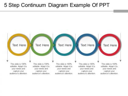
Our 5 step continuum diagram example of PPT can be used in making and delivering presentations on space-time concept, time and space continuum, mathematical models, the universe, electromagnetic spectrum, relativity theory, the black hole formation theory, etc. In any field of science, this continuum series PowerPoint model can be used to present any data and its gradual transformation. This impressive and user-friendly talent management continuum graphic presentation PPT visual is used to talk about the continuous series or a kind of succession. Explain the slow and steady transition, the multiple risks involved in the business organization, social science, etc with the aid of this five-step framework of continuum PPT PowerPoint template. The design as etched by our team of experts carries five circular interconnected multi-colored rings. This presentation provides the elegance and class needed for a flawless presentation. Take your presentation standards to the next level with the help of our distinct collection of slides. Get to the business end with our 5 Step Continuum Diagram Example Of Ppt. Implement decisions with alacrity.
People who downloaded this PowerPoint presentation also viewed the following :
5 step continuum diagram example of ppt with all 5 slides:
Our 5 Step Continuum Diagram Example Of Ppt are ideal for any debut. It eases the apprehensions of a first attempt.

FAQs for 5 step continuum diagram
A continuum diagram? It's just a visual way to show stuff exists on a sliding scale instead of rigid categories. Way more useful than you'd think, honestly. Psychology uses them for personality traits, businesses map customer satisfaction levels, schools track learning progress - pretty much everywhere. The main idea is that most things aren't black and white. There's tons of gray area and gradual transitions between extremes. Super helpful when you're stuck analyzing data or planning something. I'd sketch one out next time - you might catch relationships you totally missed otherwise. Makes patterns way clearer.
Dude, continuum diagrams are game-changers because they show relationships instead of just cramming everything into boxes. Most real-world stuff exists on a spectrum anyway - like how satisfied customers actually are or where your processes sit maturity-wise. Traditional charts miss all those gradual transitions and overlapping concepts. The visual flow lets people get complex interdependencies instantly rather than piecing together a bunch of scattered data points. Honestly, once you start using them for showing progression or change over time, you'll wonder why you ever bothered with regular charts.
So you need a horizontal line that shows your range - label the ends with whatever extremes you're measuring. Plot your data points wherever they fall on that spectrum. Tick marks help a ton with readability, trust me on this one. Different colors work great if you're comparing multiple things. Oh, and don't forget a clear title explaining what you're actually mapping. The whole thing should be pretty straightforward once you nail down those two endpoints. That's honestly the hardest part - defining what goes on each end of your spectrum.
Healthcare uses them a ton for patient progress and treatment stages. Software teams are always mapping out development phases with these things. Manufacturing is probably where you see them most though - they're super into quality control and that whole continuous improvement mindset. Education uses them too for curriculum stuff and tracking how students are doing. Basically any field dealing with gradual changes rather than clear-cut steps. Oh, and they work great when you're tracking progression over time instead of just yes/no type situations. If your work involves watching things evolve slowly, they're worth checking out.
So flowcharts are for step-by-step stuff - do A, then B, then C. Graphs plot data points and show relationships over time. Continuum diagrams are totally different though. They map concepts along a spectrum, showing all those gray areas between extremes instead of discrete steps. I actually love these for things like skill levels or risk assessments - anywhere you're dealing with gradual transitions rather than hard categories. Like, people aren't just "beginner" or "expert," right? There's a whole range in between. Next time you need to show degrees of something or progression, definitely try sketching out a continuum first.
First thing - nail down your endpoints so they're actual opposites, not just kinda similar things. Keep labels short but clear. Don't cram everything onto one diagram (I learned this the hard way lol). Space your points evenly and honestly, expect to redo the visual layout a few times - mine always look wonky initially. Colors help if you've got different sections to show. One dimension per diagram works way better than trying to be fancy. Before you call it done, show someone else. If they squint and look confused, you probably need to simplify it more.
Oh totally! Risk assessment continuums work great - you plot stuff from "low impact/low probability" up to the scary "high impact/high probability" zone. Makes prioritizing way easier. Stakeholder maps are clutch too, showing influence levels across the top with engagement on the side. Resource allocation ones show team capacity from "underutilized" to "completely swamped." Honestly these beat regular matrices half the time - they just click better visually. Try plotting your current project priorities from "nice to have" to "mission critical." You might be surprised what jumps out at you. Always helps me see things differently anyway.
Okay so Continuum Diagrams are actually pretty cool - they let you see decisions as a spectrum instead of just yes/no choices. Way better than getting trapped in that black-and-white thinking we all do sometimes. You map out your options and suddenly you're spotting middle-ground solutions you totally missed before. Plus it makes the trade-offs between different approaches way more obvious. I swear, the first time I tried this it was like putting on glasses. Your stakeholders will get your reasoning better too. Next time you're stuck on something big, just try plotting everything on a continuum first.
Honestly, Figma's probably your best shot for continuum diagrams - the gradient controls are solid and you can easily tweak things as you go. Sketch works great too if you're on Mac. I've used Illustrator but it's kind of overkill unless you're already comfortable with it (plus it's expensive). PowerPoint might sound weird but it actually handles basic gradient stuff pretty well for quick mockups. Google Slides too. The main thing is picking something where you won't fight the tool when you need to adjust gradient stops or move labels around. Start simple - you can always switch later if you need fancier features.
So instead of boring grade charts, try mapping where kids actually are on a learning spectrum - like beginner to advanced in reading or whatever subject. Continuum Diagrams are perfect for this! Plot students along different skill levels rather than just data points. Different colors work great for tracking multiple skills at once (though that can get messy if you go overboard). Both you and the students can see growth way clearer this way. I'd start small - pick one subject and maybe 5-6 key milestones so you don't overwhelm yourself. Way more intuitive than traditional methods honestly.
So continuum diagrams are like visual bridges - they show concepts as spectrums instead of separate boxes. Super helpful when theory feels too abstract, you know? They map out how ideas gradually shift from one state to another. Makes patterns way more obvious. I use them all the time for complex systems or when something slowly transforms. Like, way better than trying to explain nuanced stuff with just words. Actually saved my butt in a presentation last month. If you're stuck explaining theory, sketch it as a continuum first - seriously game-changing approach.
So basically you plot your data on continuous scales instead of those boring "high/low" boxes. Picture it like a spectrum where you can see the whole range of how things connect. Each point gets positioned based on multiple continuums at once - sounds fancy but it's actually pretty straightforward. The cool part? You'll spot patterns and clusters that regular charts totally miss. I mean, why limit yourself to just the extremes when the interesting stuff happens in between? Start with two variables and see what pops up. Way more revealing than traditional charts, trust me.
Don't overload it with too many items - that just makes everything look messy. Your endpoints shouldn't be crazy extreme either, or the middle stuff won't make sense. Label your scale properly too! So many people forget that step, drives me nuts. Also stick to one criteria throughout - like if you're doing complexity, don't suddenly throw in cost or whatever. I've seen that mistake wreck otherwise decent continuums. Keep it focused so people can actually understand what you're showing them without squinting at it for five minutes.
Honestly, good color-coding will save your life here. Use red for high-risk stuff, green for low-risk - whatever makes sense for your data. Labels need to be super specific too. I can't tell you how many times I've seen diagrams that are basically useless because the person who made them isn't there to explain what everything means. Pick your colors and don't switch halfway through (I've definitely been guilty of this). Test it on someone else first. If they squint at it for more than 5 seconds, you need clearer labels.
So basically, first figure out what the two opposite things are at each end of the line. Then see where everything else sits between them - that shows you how they relate to both extremes. Pay attention to where stuff clusters together or where there are weird gaps. Those patterns usually mean something. Honestly, the spacing between things can be just as telling as where they actually land on the spectrum. Don't get hung up on exact positions though - it's more about the relationships between everything. Oh, and remember these diagrams are meant to show gradations, not like definitive categories or whatever.
-
Great experience, I would definitely use your services further.
-
Professional and unique presentations.