


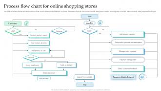
Process Flow Chart For Online Shopping Stores





Try Before you Buy Download Free Sample Product
 Impress Your
 Audience
 100%
100% Editable
 Save Hours
 of Time


This slide include customer and vendor process flow chart to deliver product easily to customer. It includes steps such as product search, view product details, include product to e cart, make payment, order placement and logout.
People who downloaded this PowerPoint presentation also viewed the following :
Process Flow Chart For Online Shopping Stores with all 6 slides:
Use our Process Flow Chart For Online Shopping Stores to effectively help you save your valuable time. They are readymade to fit into any presentation structure.





FAQs for Process Flow Chart For
So you'll want to map out the obvious stuff first - browsing, selecting products, adding to cart, checkout, payment, then confirmation. But don't forget the backend pieces like inventory checks and shipping logistics. Cart abandonment is huge, so definitely include that flow. I'd personally start with the happy path where everything works perfectly, then add in all the messy stuff later. Different payment options need their own branches too. Guest checkout vs creating an account is another big decision point. Oh, and error handling - because honestly, e-commerce sites break constantly. Maybe add delivery tracking at the end?
So basically, flow charts show you exactly where people bail on your site. Map out the whole thing - browsing, adding stuff to cart, checkout, all of it. You'll see where users get stuck or confused (usually it's those annoying multi-step forms, ugh). Walk through it like you're shopping there for the first time. Trust me, you'll spot the problems immediately. Maybe your navigation is weird, or checkout has too many steps. Once you see the bottlenecks, you can fix them and stop losing sales. Just sketch your current process first, then play customer.
Cart abandonment is probably your biggest headache - map that out first. Payment failures mess people up too, along with shipping delays and return hassles. Don't forget login problems and inventory going out of stock right when someone's checking out. Website crashes during checkout are brutal. Oh, and address validation issues drive me crazy as a customer! Map where things break down and add branches showing what happens when stuff goes sideways. Delivery confirmation is another spot where things get weird. Focus on these friction points and you'll spot where you need better backup plans.
So checkout flows are all over the place depending on what you're using. Amazon's got that crazy one-click thing down pat, but most Shopify stores make you jump through hoops - add to cart, review everything, shipping details, then finally payment. WooCommerce is wild because merchants can customize whatever they want, which sometimes works great and sometimes... yikes. Mobile's usually faster than desktop though. Oh and guest checkout is becoming huge since nobody wants to create another account just to buy something. I'd honestly just trace where your customers are bailing and fix those spots first.
Honestly, user feedback is like having customers draw you a map of exactly where your site is pissing them off. They'll straight up tell you "your checkout is a nightmare" or "I can't find anything with search." Way better than guessing what's wrong, you know? Set up feedback collection after purchases, when people bail on their carts, or through those pop-up exit surveys (yeah, they're annoying but they work). Once you've got the data, just fix whatever complaint shows up most often first. It's pretty straightforward - let your customers tell you what sucks instead of playing detective.
Honestly, don't just throw payment gateways in as one box - that's where everyone messes up. Break it into a whole subprocess or swim lane. You'll want to map out payment method selection, entering credentials, the actual gateway processing, and how you handle responses. I always sketch the happy path first because it's way easier, then add all the messy exception stuff after. Decision points are crucial here - successful payments, failures, timeouts, all that. Oh and don't forget showing how your system deals with whatever data comes back from the gateway. There's seriously so much happening behind the scenes it's wild.
Dude, mobile shopping is wild now - people literally buy stuff while walking to their car. Your checkout flow needs to be stupid simple, like 2-3 taps max. Those old desktop flows with multiple pages? They're garbage on phones. Make your buttons bigger, optimize for thumbs, and speed everything up because mobile users bail so fast it's not even funny. I always tell people to test their own site on their phone and actually count the taps. If you're hitting more than like 4-5 taps to complete a purchase, you're basically bleeding money. Trust me on this one.
Honestly, just stick those chat/help buttons wherever people get stuck most. During checkout is huge - that's where I'd focus first. Map them as side paths that loop back to your main flow, so if someone needs help with payment, they can get it and still finish buying. Abandoned cart emails work great too. The key is not being annoying about it - nobody wants help shoved in their face every two seconds. I'd start by figuring out where most people bail out of your process, then drop service options right at those spots. Oh, and delivery notifications are clutch for keeping people happy after they buy.
So for your flowchart, start with the customer requesting the return - that's your entry point. Then you'll want to check if they're eligible (time limits, condition, etc). After that comes the approval/denial fork in the road. If approved, generate the shipping label and wait for the item to come back. Once you get it, inspect everything - honestly, this step saves you from people trying to return clearly damaged stuff they broke themselves. Then process the actual refund through whatever method makes sense (original payment, store credit, minus any fees). The whole thing should end with either money back in their account or a "nope, denied" message.
Ugh, cart abandonment is the worst but it's actually forcing you to fix your checkout mess. Most people bail when they see surprise shipping costs or you make them create an account - honestly, some sites lose 70% of customers just from that! Map out where people are dropping off first. Then add guest checkout, show all costs upfront, and throw in progress bars so they know it's not endless. Oh and those cart recovery emails actually work pretty well. The key is cutting out any step that isn't absolutely necessary. People have zero patience for complicated checkout flows these days.
Wireframes are your best friend here - they'll show what each page actually looks like next to your flow chart boxes. User journey maps help capture the emotional stuff too. Screenshots work great, honestly nothing beats showing that actual "add to cart" button right next to your process step. If customers can take different paths, decision trees are clutch. Swimlane diagrams work well when you're dealing with multiple departments - inventory, payment, shipping, all that. Oh and throw some simple icons in the flow chart itself. Start with wireframes though, they give everything the visual context stakeholders need.
So basically, track where people are dropping off in your sales funnel - it's wild how much you don't notice until you actually look at the data. Set up conversion tracking first, that'll show you the biggest problem spots. Then you can A/B test different page layouts and fix whatever's broken. I always check checkout abandonment rates because they're usually terrible but fixable. You can also personalize product suggestions based on what people browse, plus use the data to predict what inventory you'll need. Oh, and search optimization - people bounce if they can't find stuff quickly.
Start with the happy path - that basic flow most people actually use. Browse, add stuff, checkout, pay, done. Don't get sucked into mapping every weird edge case right off the bat. I've seen so many teams waste weeks on exception flows when their main checkout is still broken. Build the core first, then worry about registered vs guest users and where people typically bail out. Oh, and definitely test it with real users before you call it finished. They'll catch obvious stuff you completely missed - happens every time.
Flow charts are great for spotting bottlenecks - you can literally see where things get messy. Look for steps with tons of decision points or where users have to input way too much info. Those are your red flags. I once saw a checkout that had 8 steps when it could've been 3, which is just insane. You'll catch where people bail too, like when sites force you to create an account before buying (ugh). Map it out first, then actually walk through it yourself. Trust me, the problems become super obvious once you see the whole thing laid out.
B2B flows are a total nightmare compared to B2C, honestly. With consumers, it's pretty straightforward - browse, cart, buy, done. But B2B? You've got like five different people who need to sign off on everything. There's quote requests, approval chains, negotiations that seriously drag on for months sometimes. Plus all the bulk pricing and procurement system stuff to worry about. Oh, and payment terms are completely different too. When you're mapping this out, just expect those approval bottlenecks everywhere - trust me, it'll save you from wanting to pull your hair out later.
-
Well-designed and informative templates. Absolutely brilliant!
-
I was confident and well prepared for my presentation for the first time ever. With SlideTeam’s templates, I could deliver one of my best presentations. Will be coming back for more!