


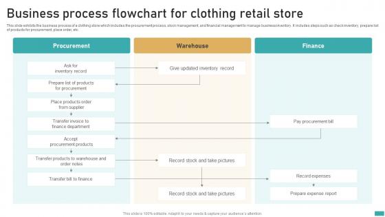
Business Process Flowchart For Clothing Retail Store




Try Before you Buy Download Free Sample Product
 Impress Your
 Audience
 100%
100% Editable
 Save Hours
 of Time


This slide exhibits the business process of a clothing store which includes the procurement process, stock management, and financial management to manage business inventory. It includes steps such as check inventory, prepare list of products for procurement, place order, etc.
People who downloaded this PowerPoint presentation also viewed the following :
Business Process Flowchart For Clothing Retail Store with all 6 slides:
Use our Business Process Flowchart For Clothing Retail Store to effectively help you save your valuable time. They are readymade to fit into any presentation structure.





FAQs for Business Process Flowchart For
You'll want the basic shapes first - ovals for start/end points, rectangles for your actual steps, and diamonds for decisions. Those diamonds are for your yes/no moments. Then just connect everything with arrows so people can follow the flow. Honestly? I've made this mistake before - don't try cramming a novel into each box. Keep the text short and sweet. Also, decision points can get confusing fast if you're not careful about labeling your yes/no paths clearly. Just grab a simple template to start with and you'll figure out the rest as you go!
Honestly, flowcharts are lifesavers for team stuff. You know how you'll explain something three times and people still don't get it? Visual maps fix that instantly. New team members can see exactly how things work without bugging everyone with questions. Decision points become super obvious too - like "oh, if this breaks, we do that." I used to hate making them but they're actually pretty quick once you start. Even basic ones work great. Way better than writing out long processes that nobody reads anyway. Your team will thank you when they're not constantly asking "wait, what's the next step again?"
Honestly, flowcharts are clutch when you're dealing with anything that has decision points or branching paths. Like if someone needs to follow a step-by-step process but there's different routes depending on what happens. They're way better than mind maps for this stuff - mind maps are more brainstorming territory. But flowcharts? Perfect for workflows, troubleshooting guides, that whole "if this happens, do that" thing. I'd definitely sketch one out before explaining complex processes to your team. You'll spot weird gaps or inefficient steps that you'd totally miss in a regular list. Trust me on this one.
Honestly, consistency is everything - same shapes for the same stuff (rectangles for steps, diamonds when there's a choice to make). Don't go crazy with colors either. Give things room to breathe instead of cramming it all together. I usually go top-to-bottom or left-to-right with clear arrows so people know where to look next. Make your text big enough that people aren't squinting at it - learned that one the hard way! Short labels work best, but they've gotta actually mean something. Oh, and definitely test it on someone else first. If they're confused, you'll know right away.
Honestly, flowcharts are game-changers for this stuff. Map out your whole process and you'll instantly see where things get bogged down. I swear, it's like turning on a light - suddenly all those weird redundant steps jump out at you. We did this at my old job and literally cut our approval time in half because we realized we were doing the same review twice (facepalm moment). The cool thing is you can play around with changes on paper first instead of messing with the actual workflow. Oh, and definitely start with whatever process is driving everyone crazy right now.
Honestly, Draw.io is probably your best bet to start with - it's completely free and runs in your browser. Lucidchart is really nice if you need team collaboration stuff, but you'll pay for it. Visio still exists if your work has it already, though I find it kind of annoying to use now. Oh, and if you're already doing design work in Miro or Figma, those work fine for flowcharts too. I'd mess around with Draw.io first since there's no cost, then upgrade later if you need fancier features.
Honestly, flowcharts are super helpful for keeping projects clear. They turn messy processes into visual maps that actually make sense. When you map out workflows and decision points, people stop asking "what's next?" all the time. New team members get up to speed faster, and stakeholders can follow along without getting lost. You'll catch bottlenecks early too - which saves headaches later. I always start simple, maybe just sketch the main workflow first. Then add details where things get tricky. Trust me, it's way better than trying to explain everything verbally.
Honestly, flowcharts are a game-changer for finding bottlenecks. You get this whole overview of your process laid out visually. Suddenly you can see where stuff gets stuck - like that approval step that drags on forever or when work just sits there waiting. It's weird how obvious problems become once they're mapped out, but when you're in the thick of it daily? Totally blind to them. The visual aspect helps you spot where you could run things simultaneously too. Pro tip: color-code by how long each step takes. Problem areas will smack you in the face.
Definitely use big fonts and high contrast colors - seriously, people in the back row will hate you otherwise. Don't cram everything on one slide, break complex stuff into multiple ones. I always animate mine step-by-step so you can walk through the logic piece by piece instead of dumping it all at once. PowerPoint's SmartArt actually works pretty well for this, or Lucidchart if you want something fancier. Oh, and make sure you can click through each decision point. That way you can pause and explain why each step matters instead of racing through it.
Honestly, the worst thing you can do is overcomplicating it - like trying to squeeze every possible scenario into one massive chart. Nobody wants to decode that mess. Keep your symbols consistent too, otherwise people get confused about what each shape means. Oh, and make your decision points super clear! I've seen so many where you can't tell what "yes" or "no" refers to. Stick to one direction - top to bottom works best IMO. Test it with someone first though. What seems obvious to you might be completely confusing to everyone else.
Dude, flowcharts are a game changer for big decisions. You literally map out every path before diving in, which stops those "wait, I didn't think about this" panic moments. When there's tons of moving parts, seeing it all visually just clicks better than trying to juggle everything in your head. Your brain will thank you. Getting your team on board becomes way smoother too - everyone can actually see your reasoning instead of just trusting your gut. I started doing this for work stuff and honestly wish I'd figured it out sooner. Next time you're stuck, just sketch out the main decision points and watch how much clearer everything gets.
Honestly, flowcharts are a lifesaver throughout the whole development process. Planning phase? Perfect for mapping user journeys and system architecture. I use them constantly during design for algorithm logic and business rules - way easier to spot problems early. They're clutch for debugging too, seriously saves so much headache when you're hunting down weird bugs. Testing gets smoother when you document scenarios visually. Even deployment benefits since you can outline release steps and rollback plans. Just don't forget to update them when requirements shift (learned that the hard way lol) or they become useless pretty quick.
So there's basic symbols - ovals for start/end, rectangles for processes, diamonds for decisions, plus arrows to connect everything. Honestly that covers like 90% of what you'll ever need. Then you've got advanced stuff like database symbols, delays, manual operations, predefined processes. These are clutch when you're doing complex system mapping or need to show different operation types. I mean, they definitely make your flowcharts look way more professional too, especially for technical docs. My advice? Start with the basics until you're comfortable, then throw in advanced symbols when your diagrams actually need that level of detail.
Dude, interactive flowcharts are seriously underrated. Instead of people just staring at you clicking through slides, they're actually making choices and exploring different paths. You can add clickable buttons, hover effects, or branch points where they pick their own adventure through your content. Way better for keeping brains switched on, honestly. When people participate instead of zone out, they remember stuff way better too. Oh and those decision moments? They create natural "lightbulb" moments when things finally click. Build in like 2-3 spots where they vote or choose directions - you'll notice the engagement difference right away.
Manufacturing and healthcare are probably the biggest users - think production lines and patient care protocols. Software dev teams are obsessed with them too, mapping out user flows and all that technical stuff. Finance uses them a ton, and honestly any job with complicated step-by-step processes benefits. If you're dealing with decision trees or workflows, flowcharts will save your sanity. My old boss was weird about documentation but even she admitted they make everything clearer. Just start small - pick one thing you do regularly and map it out. You'll be surprised how much it helps.
-
My team has been relying on SlideTeam’s professional PPT designs for a while now. It has greatly sped up quality work at my organization. So thanks!
-
Slideteam offers pocket-friendly products. As a college student this is a really necessary thing to look at while paying for something.