

Ecommerce Shopping Retail Store And Delivery Process Flowchart




Try Before you Buy Download Free Sample Product
 Impress Your
 Audience
 100%
100% Editable
 Save Hours
 of Time


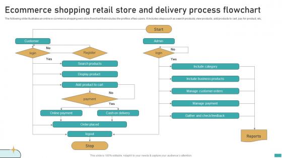
The following slide illustrates an online e commerce shopping web store flowchart that includes the profiles of two users. It includes steps such as search products, view products, add products to cart, pay for product, etc
People who downloaded this PowerPoint presentation also viewed the following :
Ecommerce Shopping Retail Store And Delivery Process Flowchart with all 6 slides:
Use our Ecommerce Shopping Retail Store And Delivery Process Flowchart to effectively help you save your valuable time. They are readymade to fit into any presentation structure.





FAQs for Ecommerce Shopping Retail Store And
So you'll basically start with browsing, adding stuff to cart, then checkout and payment. Pretty straightforward so far. Next comes order confirmation, shipping, and delivery. Don't forget the post-purchase flow though - order tracking, support, all that jazz. Most companies totally mess this part up which is dumb since it's huge for getting people to come back. You should also map out the weird scenarios like abandoned carts or when payments fail (happens more than you'd think). I'd sketch your current process first, then figure out where people are actually bailing out.
Honestly, flowcharts are a game-changer for onboarding. New people can actually see how the whole ecommerce process flows - customer hits the site, order gets processed, fulfillment happens, etc. Way better than handing them a stack of boring docs nobody reads anyway. They'll get where their job fits and what other teams do before/after them. I always walk through it during their first week - saves so many random questions later. Plus you can just point to the chart when explaining stuff. Trust me, it's like having directions instead of wandering around lost.
Start with the basics - awareness, consideration, purchase, post-purchase. Map every touchpoint: product discovery, cart abandonment emails, checkout flow, follow-ups. Oh, and don't skip the boring backend stuff like inventory and payment processing. I used to go way overboard making these things ridiculously detailed at first. Better to start simple, then build up. Add decision points where people might bail or go different directions. Include your automation triggers too. The whole point is making it visual enough that anyone on your team can instantly see where things are breaking down.
So basically, decision points are anywhere your customers have to choose something or your system checks stuff. Like "add to cart or keep browsing?" or "did the payment go through?" Those become the diamond shapes. You'll find them at login screens, when checking if items are in stock, shipping choices - honestly they're kinda everywhere once you notice them. I'd just pick one customer path from when they land on your site through checkout and follow it step by step. The yes/no moments will jump out at you pretty naturally that way.
Look, customer experience should drive every decision in your ecommerce flowchart. Walk through your site like you're buying something for the first time - where do you get stuck? Those are your problem spots. Nobody's dealing with a messy checkout process twice, trust me. Make each step feel natural so people can go from browsing to buying without wanting to throw their phone. I always think "would this annoy me?" when mapping out flows. Short paths work better than complicated ones. Fix the friction points and you'll see way fewer abandoned carts.
Honestly, flowcharts are pretty clutch for supply chain stuff. Map out your whole process visually and you'll catch things you'd never spot in spreadsheets. Those bottlenecks become super obvious - like when orders sit in approval hell for days. Plus you can see all the redundant steps your team's doing. I'd start by charting what you're doing now (might be painful lol) then redesign it how it should actually work. Makes it way easier to figure out where to automate things and cut out the handoff delays between departments.
Figma and Miro are probably your best bets for ecommerce flowcharts. I always use Figma when I'm already working on UI stuff since everything stays in one workspace. Miro's better for those collaborative brainstorming sessions though. Lucidchart works well too, especially if you need something more technical-looking. Honestly? I've even used Google Drawings when I was being lazy - it's super basic but gets the job done. Just pick whatever your team can actually access and edit together. Trust me, you'll have marketing, dev, and probably your boss all wanting to change things.
Honestly, flowcharts are a lifesaver for getting everyone on the same page. No more confusion about what happens when a customer does X or Y. Your developers won't have to guess what marketing wants, and your boss can actually follow along (you know how that goes). When something breaks in the checkout process, you can just point to the exact spot instead of explaining it five different ways. I always throw the flowchart up first thing in meetings now - saves like 20 minutes of back-and-forth. Trust me, it'll make your life way easier.
Honestly, don't try mapping every weird scenario right away - you'll create something nobody can follow. Start with the main path users take. Customers are weirdly unpredictable anyway, so map what actually happens, not your ideal version. I learned this the hard way on my last project. Add the edge cases after you've got the basics down. Those fancy design touches? Skip 'em if they're just clutter. Here's the key part though - test it with someone fresh. People who helped build it can't see the confusing spots anymore.
Flowcharts are perfect for this! Map out every step from when they first find you (social media, Google, whatever) all the way through buying and after. Use diamonds for decisions like "should I read reviews?" and rectangles for actions. Mobile users behave totally different from desktop ones too, so chart both paths. Honestly, this is where you'll spot all the annoying friction points that make people bounce. Maybe your checkout's too long or the search sucks - you won't know until you see it laid out visually. Focus on wherever people are dropping off the most.
Don't treat marketing like this separate thing - weave it right into your customer flow. When people abandon carts, hit them with email campaigns. Browsers who bounce? Retarget them with ads. During checkout, throw in some personalized product recs. Reviews are honestly clutch for conversions, so make sure they show up naturally on product pages. The whole point is making it feel smooth, not like you're constantly selling. Look at where people usually drop off in your current setup, then add marketing strategies right at those spots. It's way more effective than random promotional blasts.
Dude, just use Lucidchart or Figma for stakeholder stuff - even PowerPoint works if that's what you have. Rectangles for processes, diamonds for decisions, arrows to connect everything. Don't overthink it! I swear, half the flowcharts I see are so cluttered nobody can follow them. Focus on the big picture user journey instead of getting technical. Keep your colors consistent and text big enough to actually read. Oh, and export as PDF so it doesn't get weird when people open it on different devices. Clean beats fancy every time.
Just drop analytics boxes at the important spots - checkout, cart abandonment, product pages, wherever you're actually getting useful data. Connect them with dotted lines so you can see how info moves around. Don't go crazy and put them everywhere though, that gets messy fast. I learned that the hard way on my first flowchart lol. Label what you're measuring at each point so your team isn't guessing. Conversion rates, user clicks, that kind of stuff. Think of them like little checkpoints tracking how customers move through your site. Makes it way easier to spot problems later.
So flowcharts can actually bump up your conversion rates by like 15-30% - pretty solid ROI if you ask me. They help you spot all those annoying friction points where customers just give up and leave. Think of it as mapping out your sales funnel to see where people are dropping off. Maybe your checkout's too complicated or you're missing key product details somewhere. Once you visualize the whole customer journey, those bottlenecks become way more obvious. Your team gets on the same page too, which is honestly half the battle. I'd start by flowcharting what you've got now, then tackle the worst pain points first.
Honestly, B2C is way easier - just cart, payment, confirmation and you're done. B2B though? Total nightmare with all the quote requests and approval chains. Like, everyone and their boss needs to weigh in. For B2B you'll want RFPs, credit checks, custom pricing - the whole nine yards since those sales cycles drag on forever. B2C is all about that quick impulse buy. My advice? Map out how your customers actually behave first, then build your flowchart around those real moments. Don't try to guess what they do - you'll just end up redoing it later anyway.
-
I looked at their huge selection of themes and designs. They appeared to be ideal for my profession. I'm sure I'll grab a few of them.
-
“As you have innovative ideas and they are all customizable, this saves a huge chunk of your time to prepare well-read presentations.”