


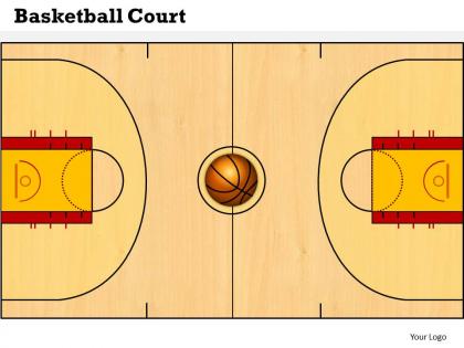
Basketball court powerpoint template slide




Try Before you Buy Download Free Sample Product
 Impress Your
 Audience
 100%
100% Editable
 Save Hours
 of Time


Every presentation helps grow your business. Upgrade your presentations with Basketball Court Powerpoint Template Slide.
People who downloaded this PowerPoint presentation also viewed the following :
Basketball court powerpoint template slide with all 6 slides:
Leave them gaping with our Basketball Court Powerpoint Template Slide. They will be dumbstruck by your abilities.
FAQs for Basketball court
Start with the basic court layout - dimensions, three-point line, free throw area, all that stuff. Movement arrows are clutch for showing plays, honestly they're way better than trying to explain with just words. Include the hoops obviously, plus spots for team colors or logos. Text boxes are super useful too - you can throw in stats or notes wherever. Oh and definitely make everything editable! You don't want to recreate the whole thing every time you need it for a different presentation. Trust me on that one.
Dude, those court templates are clutch for coaching. Players actually see where they're supposed to go instead of just hearing you ramble about positions. Way easier than trying to explain everything with words - I swear some of these kids are visual learners or they're completely lost. You can draw up offensive plays, show defensive rotations, all that stuff. Start simple though, don't jump into crazy complicated schemes right away. Once they get the hang of reading the diagrams, then you can get fancy with it. Honestly makes such a difference.
Honestly, clean lines and good contrast are everything. You want those white lines to really pop - whether it's against classic hardwood or a solid blue/green court. The three-point arc and center circle? Those are what people recognize instantly. That rectangular key area needs to be super clear too. Stick with official dimensions since everyone's used to seeing those proportions. Short tangent - I've seen so many weird custom courts that just look... off, you know? Don't go overboard with graphics either. Simple works best. The contrast between your court surface and crisp white markings will do most of the heavy lifting.
Honestly, the colors you pick make a huge difference! Bright orange and red pump up the energy - great for kids' leagues. Blues and greens are way more chill, perfect for corporate stuff or just casual games. I saw this neon court once that looked sick in photos but gave everyone headaches lol. Grays are boring but they're classic and always look clean. Really depends on your crowd though - youth teams can handle the crazy colors, but adults usually prefer something easier on the eyes. What kind of vibe are you going for?
Honestly, keep it super simple - bold arrows for movement, numbered circles for positions, dotted lines for passes. Stick figures are perfect since nobody needs fancy artwork when you're trying to explain a play quickly. I'd avoid going crazy with colors too - maybe 2 or 3 max because more than that just looks messy during timeouts. Make sure everything shows up clearly in black and white since you'll be photocopying these things nonstop. Trust me, your players will thank you for clean, easy-to-read diagrams over anything complicated.
Yeah, so first figure out who you're presenting to - that'll guide everything else. Corporate crowd? Stick with clean colors and simple graphics. But if it's for kids or youth programs, go wild with bright team colors and fun fonts (honestly, the more colorful the better with younger kids). Most templates are pretty flexible - you can swap out colors, mess with the layout, even switch between that flat overhead view and 3D angles. Oh, and you can usually adjust court dimensions too, like removing the three-point line if you don't need it. Custom logos are always a nice touch.
You definitely want to mark player positions on your court template - it makes a huge difference! Without them, your plays just look like random scribbles that nobody can follow. Positioning shows how players move, who guards who, and helps everyone understand their role in each play. Plus you can spot spacing problems before hitting the court, which honestly saves so much practice time. I'd stick with the same symbols or colors for each position though - keeps things simple when you're explaining stuff to your team.
Hotspots are your best friend here - make different court zones clickable to show stats or play diagrams. Drag-and-drop for moving players around works great too. Hover effects add a nice touch without being annoying. You could throw in some animated sequences for plays, though that might be overkill depending on what you're going for. Popup modals with player info are solid, plus form fields if people need to swap lineups. Oh, and drawing tools! Let users sketch plays right on the court. Just figure out what your users actually want to do first, then build around that.
Focus on the metrics that coaches actually use - shooting percentages by court zone, where turnovers happen most, defensive pressure spots. That's the real stuff. Player movement data and how possessions end up in different areas are huge too. Honestly, all that flashy visualization stuff just gets in the way if it doesn't tell you something useful. Make it super obvious which court areas are money for your team and which ones are killing you. Oh, and definitely lead with your biggest impact zones - don't bury the important findings.
Oh man, those court templates are seriously helpful! Kids need that visual stuff - way easier than just talking at them about positioning. I use them all the time to sketch out plays and show where everyone should be standing. Plus they start memorizing all the court markings without even realizing it. The spacing concepts finally click when they can see it drawn out. Honestly, just print a bunch and let the kids draw their own plays during practice - they love that part. Way better than my terrible whiteboard drawings from back in the day!
Prep your court template ahead of time with clear labels - you don't want people squinting trying to figure out what you're showing them. Different colors work great for highlighting zones or player positions. Walk through plays step by step instead of bouncing around randomly (I swear, some coaches make zero sense doing this). Let participants actually mark up the template themselves - way better than just talking at them. Print extra copies so they can scribble notes right on there. Keep explanations simple and you'll be golden.
Hey! So for making your basketball court template work for everyone, start with high contrast colors and thick, bold lines. Avoid that red-green combo thing - colorblind folks will actually be able to use it. Label everything clearly and throw in both metric and imperial measurements because why not cover all bases? Oh, and definitely save it in multiple formats. PDF, PNG, maybe an editable version too. People get weird about file types. Honestly though, the best move is having someone else look at it first. You'll catch stuff you totally missed.
Dude, animation makes such a huge difference for basketball presentations. Instead of boring static slides, you can actually show player movements and plays in action. Stats look way better when they pop up one by one - keeps everyone following your train of thought. Plus you can highlight different court areas as you talk about them. Smooth transitions between plays are clutch because they keep people engaged without losing focus. Complex game stuff becomes so much easier to understand this way. Just don't get carried away with crazy effects that pull attention from your actual analysis, you know?
Dude, get a basketball court template - it's a game changer. Your players can actually SEE the plays instead of you flailing around trying to explain where to go. Draw the movements, mark positions, show spacing. Way better than "go stand over there somewhere." Honestly, I wish more coaches used these things. You can walk through defensive rotations without confusing everyone. Print some out or grab a whiteboard version. Makes strategy sessions so much smoother when everyone's looking at the same diagram instead of guessing what you mean.
Just make feedback collection dead simple - like 30 seconds max or people won't bother. After each session, hit up coaches and players with quick surveys about what worked. If your template's digital, check which drills get skipped constantly (that's your red flag right there). Monthly pizza meetings with staff actually work better than formal reviews, trust me. Set up a suggestion box too - doesn't have to be fancy. Oh, and definitely track usage patterns if you can. Update the whole thing quarterly based on what you're hearing. The trick is staying consistent with collecting feedback, even when you're busy.
-
Qualitative and comprehensive slides.
-
Great designs, Easily Editable.