


Business model example of ppt





Try Before you Buy Download Free Sample Product
 Impress Your
 Audience
 100%
100% Editable
 Save Hours
 of Time


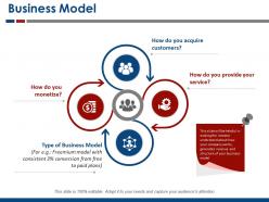
Do you need to create a professional presentation to showcase the concept of business model? Well if yes, then download our ready to use business model PPT template crafted by highly professional PowerPoint designers. Our PowerPoint designers have used the graphics of arrows that will help you to represent a model of four segments. They have also used customer icon, service icon, organization model symbol, and revenue icon to design this business model template slide. With the help of this business model development PPT template, you will be able to demonstrate the process of how business plans, delivers and captures value in an economical way. With the use of this business innovation model in your presentation, you will able to represent the concept of organization framework development and moderation. This business strategic model PowerPoint slide highlights various aspects of the business model which are how do you acquire customers, how do you provide your service, how do you monetize, and type of business model. Take the advantage this PPT design to create a presentation on business process, organizational structures, business digital transformation, business development, corporate planning, strategic management, value management, and revenue model. Conquer the cliff with our Business Model Example Of Ppt. You will accomplish the hardest of ascents.
People who downloaded this PowerPoint presentation also viewed the following :
Business model example of ppt with all 5 slides:
Applaud attempts to be innovative with our Business Model Example Of Ppt. Appreciate efforts to do a good job.
FAQs for Business model
So you'll definitely need the lean canvas basics - value prop, target customers, partnerships, revenue model, costs. Throw in competitive advantage and market size too. Financial projections are a must because investors are obsessed with numbers. Oh and don't skip the team slide - they want to know you can actually pull this off. Go-to-market strategy matters big time. Keep it simple though, one main idea per slide with good visuals. Honestly, just grab a clean template first so you're not messing around with fonts when you should be focusing on your story.
Honestly, visuals are a game-changer for business models. People's attention spans are basically nonexistent these days, so charts and diagrams help break everything down without overwhelming them. I learned this the hard way during my first pitch - total snoozefest with just text everywhere. Colors and clean layouts guide people through your revenue streams naturally. Plus there's actual research showing visuals stick in memory way better than bullet points. Don't go overboard though. Each graphic needs a purpose, not just decoration. Start simple - one strong visual per main idea and you're golden.
So traditional models just stick to what everyone else does - same revenue streams, same distribution, boring stuff really. Disruptive ones target people nobody cares about or use tech in totally new ways. Look at Uber destroying the taxi industry. For your PowerPoint, do side-by-side slides showing old vs new approaches. Visual stuff works great - arrows, timelines, whatever shows how disruptive models skip steps or create completely different paths to customers. Actually makes the comparison way clearer than just bullet points.
Honestly, just drop case studies right after your revenue streams or value props - that's where they hit hardest as proof. Before/after comparisons are *chef's kiss* for this stuff. Mini callouts work great in your market analysis too, shows there's actual demand. Oh, and customer journey examples that walk through your whole model? Super effective. The trick is matching each case to whatever component you're explaining. Don't just throw in random wins because they look impressive. Pick ones that actually back up your specific points. Makes such a difference when everything connects like that.
Check if you've got brand guidelines first - just use those colors and fonts. No guidelines? Pick maybe 2-3 colors that fit your vibe. Blue works for finance stuff, green's good for health/eco brands. I'd skip going crazy with colors though, it always ends up looking like a rainbow threw up. Font-wise, stick with clean ones like Calibri for regular text. Maybe go bolder for headers. Oh, and test everything on light AND dark backgrounds - you'll thank me later when you can actually read your slides. Just stay consistent throughout. That's honestly what separates the pros from the amateurs.
Keep your charts super clean and don't dump every number on there - people just zone out. I'd focus on the big stuff: revenue growth, burn rate, when you'll break even. Skip all the tiny spreadsheet details. Make sure your formatting stays consistent (same colors, fonts, whatever) and tuck your assumptions in somewhere because investors will definitely question those. The key thing? Tell a story with the numbers. Show how you get from where you are now to actually making money. Oh, and lead with your strongest metric - grab their attention right away.
Your slides shouldn't be walls of text - people zone out instantly when they see that. Use diagrams and charts instead. Don't assume everyone gets your market like you do, and explain the problem-solution thing clearly. Skip the business jargon that sounds impressive but confuses people (honestly, half the time it just makes you look pretentious). Make your revenue model super obvious. Include real financials, not pie-in-the-sky numbers. Oh, and definitely run through it with someone who's never heard of your business first - they'll catch stuff you'd never notice.
Think of your business model template like a story arc - start with the problem your customer's dealing with, then show how they find you and get value from your solution. I basically treat it like writing a movie script instead of boring bullet points (way more fun that way). Throw in real customer quotes and specific examples rather than vague concepts. Each section should flow from "here's where they are now" to "here's where they could be" with your business model connecting the dots. Oh, and add a quick customer story at the start of each major section - keeps everyone focused on actual people instead of abstract business stuff.
Tech startups need templates showing user acquisition, burn rate, runway projections - you know, all that VC candy. Traditional businesses? Focus more on market share, competitive positioning, supply chain stuff. Startups should highlight growth potential and scalability. Established companies need to prove they're operationally efficient and won't implode. Honestly, the visual style matters way more than people think - startups can go bold and flashy, but if you're pitching a manufacturing company, keep it conservative. Match what your audience expects or they'll tune out before slide three.
Okay so first make an overview slide with all 9 blocks visible - super helpful for the big picture. Then break each one out separately: key partners, activities, resources, value props, customer relationships, channels, segments, costs, and revenue streams. Each gets its own slide for when you need to dive deeper (trust me, people always ask questions). Keep the formatting consistent - boxes or tables work great to mirror that classic canvas look. Oh and definitely add placeholder text or sample questions in each section so people know what goes where. The whole thing should flow logically when you're clicking through, making it easy for everyone to follow your business thinking.
So I'd go with a battleground matrix - plot your competitors on price vs features, then drop your company as that standout dot. Feature face-offs work really well too, just do side-by-side comparisons with icons and colors instead of those soul-crushing tables nobody reads. SWOT grids are solid if you mash multiple competitors into one view. Radar charts look pretty slick but honestly they're kinda extra. The whole point is making something execs can actually scan quickly - they literally won't read tiny text during presentations, trust me on this one.
Okay so persona slides are super important for your pitch - like, I've literally watched presentations bomb because they skipped this part. Investors need to see who you're actually building for, not just some vague "everyone" audience. Create 2-3 detailed personas with real names, photos, demographics, all that stuff. Show their pain points and how your product fits into their actual day. Make them feel like real people you could grab coffee with. Drop these right after your problem slide - it sets up your solution perfectly. Trust me, it makes everything click for investors.
Think of feedback as your reality check - it shows you what's actually working vs what you think is working. After presentations, ask people which slides clicked and what felt off. The harsh stuff usually helps most (unfortunately lol). If three different people get lost during your budget breakdown, time to fix that slide. I keep a messy notes doc where I dump all this feedback, then do template updates in batches every few months. Way better than constantly fiddling with it after every single presentation.
Yeah totally doable! Just swap out what you're tracking based on where you're at. Startups should hammer the value prop and prove people actually want this thing - plus show how long your money will last. Once you hit growth mode, flip to stuff like acquisition costs and how you'll scale up. The mature company deck? That's all about market share and maybe what else you could get into. Honestly most decent templates are pretty modular anyway - you just shuffle the KPI slides around and tweak your story. Way easier than starting from scratch each time.
For market growth stuff, go with line charts or those simple trend arrows - super easy to read at a glance. Bar charts work well when you're comparing different segments or showing how you stack up against competitors. Heat maps are honestly underrated, especially for geographic data - they make patterns jump out. Just don't use pie charts for anything involving trends over time, they're useless for that. Oh and your audience will get it way faster if you use intuitive color coding. Green for good news, red for the opposite. Skip cramming data tables into your main presentation - stick those in the back if people want the nitty-gritty details later.
-
Nice and innovative design.
-
Use of icon with content is very relateable, informative and appealing.