

Business outcomes template ppt example





Try Before you Buy Download Free Sample Product
 Impress Your
 Audience
 100%
100% Editable
 Save Hours
 of Time


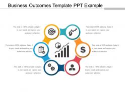
Maximize your business value creation using our Business outcomes template PPT example. Chalk out a plan to achieve the desired strategic business outcomes. Operationalize the plan using your products, services, expertise, strategies and other assets. With our delivering business results PPT design,ensure that your customer achieves the needful business outcome. Create a consistent process for delivering, determining, and demonstrating your business goals using our Key business outcomes PPT slide. Effortlessly define the stakeholders and the objectives for your work. Outline and organize the path required for the achievement of the outcome. Create new levels of customer alignment with the help of our business outcome management PPT template.Create new opportunities for visibility and accountability in the customer supplier relationship with Business Outcome Management PPT design. Provide timely guidance to your customers and help them reach the highest levels of satisfaction. Give them a foundation to attain both long term and short term goals. With high quality content and graphics, impress your audience by creating a PowerPoint presentation using our business outcomes PPT model in less time. Our Business Outcomes Template Ppt Example are great for handling adversity. They allow you to cope with anything.
People who downloaded this PowerPoint presentation also viewed the following :
Business outcomes template ppt example with all 5 slides:
Our Business Outcomes Template Ppt Example do away with glass ceilings. They enable you to climb to the top.
FAQs for Business outcomes
You'll want to start with clear objectives and measurable KPIs - that's your foundation. Add timeline milestones, success criteria, and who's accountable for what. Here's what most people forget though: baseline metrics! You can't track progress without knowing where you started. Define what "good" looks like upfront. Trust me, nobody wants to argue about whether you succeeded after everything's done. Keep it simple enough that people actually use the thing, but detailed enough to create real accountability. Those five pieces will get you 90% there, then just tweak based on whatever your business needs.
Honestly, clear objectives are like having GPS for your business - you actually know what success looks like instead of just winging it. I've seen too many teams spinning their wheels because nobody defined what they're trying to hit. Write down 2-3 concrete outcomes you want first. Then work backwards to figure out how you'll measure progress. Makes it way easier to pick the right KPIs and spot problems before they get ugly. Your team stays on the same page too, which is huge. Don't overthink it though - just get something down on paper.
Look, people's brains just work better with visuals than boring spreadsheets. When you turn your data into a story with charts and graphics, stakeholders actually remember what you're telling them. Most execs won't even touch those dense reports anyway - they want the "so what" served up fast. Visuals let you show cause-and-effect clearly, plus they make your wins way harder to brush off. My advice? Pick your strongest metric as the main character, then build everything else around that. It's honestly the difference between getting ignored and getting budget approval.
Honestly, charts and dashboards are lifesavers when you're presenting to busy people. Nobody wants to scroll through endless spreadsheets - I learned that the hard way once. Visuals help stakeholders instantly see trends and spot problems without squinting at rows of numbers. A good chart basically tells the story for you. Your audience can quickly figure out if you're hitting goals or if something's going wrong. Pick your most important metrics first, then find the right chart type that actually makes sense. Sometimes a simple bar chart beats a fancy visualization anyway. The whole point is making your data easy to digest at a glance.
Honestly, start with the money stuff - conversion rates, customer acquisition cost, lifetime value. Page views are total BS metrics that just make you feel good but don't actually matter. Set up like 2-3 things that predict what's coming, then 2-3 that show what already happened. Here's the test: what would your CEO grill you about in front of the board? Those are your real metrics. Work backwards from the financial wins to figure out which day-to-day numbers actually move the needle. Trust me, everything else is just noise.
So those business outcome templates? They're pretty adaptable honestly. You just swap the metrics based on your industry. Retail focuses on conversion rates and customer lifetime value. Manufacturing tracks efficiency and defect rates instead. Healthcare uses patient satisfaction scores - makes sense, right? The template structure doesn't really change, which is nice because you're not reinventing the wheel every time. Just figure out what "winning" looks like in your specific field first. Then plug those metrics into the framework. I'd start there and see how it feels.
Okay so here's what works - add "check-in points" after every big milestone or quarter in your presentation. Show them exactly how you'll collect data and when you'll review it. What triggers will make you pivot? I always throw in a basic flowchart (measure, analyze, adjust, repeat) because honestly, execs eat that stuff up. Makes them way less nervous about your whole plan. Oh and definitely specify who's actually gathering the feedback and how often you'll make changes. Here's the key part though - end by scheduling that first feedback checkpoint right there in the meeting.
The worst thing you can do is make your template super vague - like "improve customer satisfaction" without any actual numbers. I've seen people copy templates from other companies and wonder why they don't work... obviously they won't if you don't adapt them to your situation. Keep it to 3-5 outcomes max or everyone gets confused about priorities. Also, don't try to figure out success metrics after you've already started - that's backwards. Test it on something small first. Make everything measurable from day one, even if the numbers feel arbitrary at first.
Look, you absolutely need your business outcomes tied to what the company actually wants to achieve. Otherwise you're just creating paperwork nobody cares about. I've watched so many templates crash and burn because they weren't connected to leadership priorities. When outcomes support strategic goals, suddenly you get executive support and clearer budgets. Teams actually understand why they're doing what they're doing - which honestly shouldn't be revolutionary but somehow is. Map each outcome back to specific company objectives. Can't make that connection? Time to rethink it. That's where the real impact happens.
Honestly, the best ones I've seen just nail the storytelling part. Netflix crushes this - they'll show subscriber numbers jumping after big content investments, super straightforward. You want that before/after thing with actual numbers that matter. Salesforce is pretty good at this too, showing how their updates boost customer retention rates. Start with your biggest win first, then work backwards to explain how you got there. Oh and definitely connect everything back to what the company actually cares about strategically. Non-tech people need to follow along easily - that's where most presentations totally bomb.
Honestly, just get a dashboard tool like Tableau or Power BI - they'll pull data straight from your systems automatically. No more weekly spreadsheet hell. Connect them to your CRM, finance tools, whatever you're using for project management. Everything syncs in real-time through APIs, which sounds fancy but it's pretty straightforward once you set it up. The trick is figuring out where each piece of data lives first. Map out your top 3 business outcomes and their data sources. Build those connections once and you're done hunting for numbers every time someone asks for an update. Way better than the manual nightmare most people deal with.
Look, narrative is everything when presenting data. People's eyes glaze over with raw numbers—trust me, I've been there. You need to tell them what happened AND why they should care. Think of it like this: your analysis is pointless if executives can't follow your logic or know what to do next. Start with your story points before dumping data on them. Walk them through step-by-step so they get why this matters for decisions. Honestly, I've seen brilliant analysis get ignored because the presenter just showed charts without connecting the dots. Your template should make the "so what" crystal clear.
So basically these templates get everyone speaking the same language about what success looks like. Marketing stops saying "brand awareness" while sales obsesses over "pipeline velocity" - now they're all using one framework that connects to actual business results. Honestly, it cuts through so much BS in meetings where teams just talk past each other. Each department has to spell out how their stuff drives revenue, cuts costs, or makes customers happier. All measurable too, which is key. Try it in your next project kickoff and see how much clearer things get. Though fair warning - some people hate being that specific about their goals.
Put your outcomes right at the top - people need to see results before getting into the weeds. Use lots of white space and keep the language simple. Honestly, half these templates look like they were made by consultants who've never actually used them. You'll want fields for both hard numbers and the softer benefits since execs care about both. Dropdowns and checkboxes will save everyone time. Oh, and definitely test it first - grab a few coworkers and watch them struggle through it. That's where you'll find the real problems.
Honestly, I'd aim for every 6 months. Quarterly sounds good in theory but who actually has time for that? Your business changes, markets shift, and those templates can get stale pretty fast. New product launch? Yeah, definitely update them then. The worst thing is letting them sit there for over a year - they become completely pointless. I learned this the hard way lol. Just set a reminder and tweak them whenever you notice they're not working anymore or after any big strategy changes.
-
Visually stunning presentation, love the content.
-
Great product with effective design. Helped a lot in our corporate presentations. Easy to edit and stunning visuals.