


Case study challenge solution results ppt visual aids professional




Try Before you Buy Download Free Sample Product
 Impress Your
 Audience
 100%
100% Editable
 Save Hours
 of Time


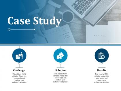
Create value for your business with our case study PPT slide for the effective use of your available scare business resources. Use this business environment case study PPT template to describe the business challenges which needs to be investigated in depth. Therefore, you can also find the effective solutions which help in solving the particular case and also helps in providing the yielding results for your concern. You can also study the various measures related to the particular case study which involves the evaluation tools like Industry Analysis, Environmental Analysis, Financial Performance, and SWOT analysis etc. Use this business case study PowerPoint slide design to take effective business decisions according to the identified results. You can likewise describe the effects of conducting the study on your existing business functions and operations with this PPT template. Thus, simply start working with this professionally designed PowerPoint layout for defining the value of case study for your entity. Give clear instructions at the first instance with our Case Study Challenge Solution Results Ppt Visual Aids Professional. Don't allow any dichotomy to develop.
People who downloaded this PowerPoint presentation also viewed the following :
Case study challenge solution results ppt visual aids professional with all 5 slides:
Grow happier by the day with our Case Study Challenge Solution Results Ppt Visual Aids Professional. Each one will help add to your assets.

FAQs for Case study challenge solution results ppt
Make sure your story flows logically and people can actually read the damn charts - I've seen too many gorgeous case studies with microscopic text. Use lots of white space and headlines that grab attention. Your visuals should back up what you're saying, not just look pretty. Real customer quotes work way better than generic praise, and definitely include specific numbers for your results. Most people skim first anyway, so break things up so they're scannable. The whole thing should walk through problem → solution → outcome in a way that makes sense. Short version: make it clean, readable, and actually useful instead of just eye candy.
Honestly, case studies work so much better when you ditch the boring spreadsheet approach. Show before/after photos instead of just dumping numbers on people. Create a timeline that walks them through the whole transformation - like, actually screenshot the original problem, then show how you fixed it step by step. Charts are okay I guess, but what really grabs attention is the human element. You want people seeing real faces and real results, not just data. Stories stick in your brain way longer than statistics ever will. Try storyboarding your next one like it's a short film or something. Trust me, it'll feel way more engaging.
Honestly, colors make or break case studies. They guide where people look and set the whole vibe. You'll want something that matches your brand but also fits the story. Tech stuff? Go with blues and greens - they scream trustworthy and innovative. Creative projects work better with warmer tones though. Keep it consistent across all your visuals, but use contrast to make important data stand out. I usually stick to 2-3 main colors, then throw in one bright accent for the big wins or key metrics. Makes everything way more scannable.
Honestly, infographics are a game-changer for case studies. Take your best data points and turn them into visuals that people can actually process - way better than drowning them in spreadsheet hell. Before/after comparisons work great, or timeline stuff showing progression. Charts make ROI pop like crazy compared to just listing numbers. Only thing is, don't go overboard trying to cram everything in there. Stick to maybe 3-4 of your strongest results. People's attention spans are shot these days anyway. When it's clean and focused, that's when folks actually share it around.
Honestly, visuals are a game-changer because they turn confusing data dumps into something people actually get right away. Why make someone struggle through paragraphs of numbers when a simple bar chart shows the whole story? Some people are just visual learners anyway - they'll spot a trend in a graph way faster than buried in text. Executives especially love this stuff during presentations because they can literally point at the results. Oh, and it definitely helps that different learning styles click with images better than raw stats. Figure out your main point first, then find the chart that shows it clearest.
Canva's my go-to for case study visuals - super easy and has great templates. Adobe stuff like Illustrator gives you way more control, but honestly the learning curve is brutal. You can make solid charts in Tableau or even Excel if you're just doing data viz. PowerPoint actually has decent design features now (who knew?). I've seen people make really impressive case studies with it. The main thing is keeping everything consistent with your brand. Also make sure your visuals actually tell the story instead of just... existing there looking random. Start with whatever tool you already know, then level up later.
Honestly, visuals are a game-changer for case studies. People's eyes just glaze over when they hit walls of text - been there myself. Charts showing your before/after numbers, infographics breaking down the cost savings, even basic diagrams of process changes. They make everything click instantly. Screenshots of improved dashboards or photos from actual implementation sites? Pure gold. I always throw in at least one visual per major finding. Makes the whole thing feel real instead of just theoretical business speak.
Okay so three big things to nail down: colors, text, and images. High contrast is your friend - don't just rely on color alone though, throw in some icons or patterns too. Text should be at least 12pt with simple fonts. Honestly, the number of people who mess this up is wild. For images, show actual diversity that matches your audience and don't forget alt text. Oh and keep layouts super clean - cognitive accessibility matters too. Pro tip? Color contrast checkers are free and will save you so much headache later.
Honestly, white space is your best friend here. Don't try to cram everything on one slide (we've all done it though). Break up dense stuff across multiple slides or reveal info bit by bit. Pick your top 3 insights first - that's what really matters. Use different font sizes and colors to guide where people look. Charts are lifesavers for heavy data since numbers just look less scary that way. I always think about what would make ME not want to zone out during a presentation, you know?
Pick visuals that actually back up your story - no random decorative stuff. Crisp screenshots and charts that show real results work way better than blurry before/after pics (those just scream amateur hour). Put them right where you mention each point in your text, not scattered everywhere. Oh, and captions are clutch - tell people exactly what they're looking at. Keep the style consistent so it doesn't look like a hot mess. Test on mobile too since everyone's scrolling on their phones anyway. Trust me, strategic placement makes such a difference.
Your brain processes images 60,000 times faster than text, which is pretty wild when you think about it. So when you throw charts or diagrams into case studies, you're basically creating more ways for people to remember stuff. Complex data becomes obvious instead of being buried in boring paragraphs. I mean, who has time to dig through walls of text? A good flowchart just makes sense. The trick is picking the right visual - timelines work great for chronological cases, process maps for operational stuff. Comparison charts are perfect when you're looking at competitors. It's honestly game-changing once you get the hang of it.
Dude, everyone's going crazy for interactive stuff now - like clickable prototypes and real-time dashboards where people can actually poke around themselves. Data storytelling is huge too. I'm seeing way more clean, minimal designs with tons of white space instead of those messy infographics from like 2019. Before/after comparisons are everywhere, plus visual timelines that walk through the whole transformation. Honestly feels like half these presentations are trying to be mini documentaries or something. Just make sure you're telling an actual story instead of info-dumping. Try adding one interactive thing to your next case study!
Dude, seriously - throw some videos in your case studies. Screen recordings work great for product demos. Or do those animated charts that show data trends over time. Customer testimonial clips are gold too, way more believable than quotes. I swear I've watched the most boring case studies totally transform just from adding a simple 30-second before/after animation. Actually crazy how much difference it makes. Just don't go overboard with fancy effects - keep everything short and actually useful. Try one video per case study first, then check if people are engaging more.
Hey! First thing - don't cram tons of text into your slides. Dense paragraphs kill presentations. Skip those fancy fonts that nobody can read, and seriously go easy on colors (trust me, I once made something that looked like Skittles threw up). Cut the pointless borders and drop shadows too. Focus your data - you don't need to show every metric you collected just because you have it. Sometimes less is way more effective. Before adding anything, ask yourself: does this actually help tell my story? If it doesn't, ruthlessly cut it. Your audience will thank you.
Honestly, who you're presenting to makes a huge difference in how you design those visuals. Executives want clean, simple stuff they can scan fast - think high-level metrics without clutter. Technical people? They actually love diving into detailed charts and data breakdowns. Age plays a role too - younger crowds expect interactive formats while older folks usually prefer traditional layouts. Industry norms matter as well (healthcare looks totally different than startup decks). Oh, and always scope out your audience beforehand. Sounds obvious but you'd be surprised how many people skip this step and end up way off target.
-
Enough space for editing and adding your own content.
-
Presentation Design is very nice, good work with the content as well.