


Challenges and solution powerpoint graphics





Try Before you Buy Download Free Sample Product
 Impress Your
 Audience
 100%
100% Editable
 Save Hours
 of Time


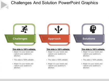
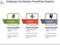
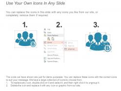
Overcome your business challenges by using our challenges and solution PPT template. A three staged process with colored icons has been used to craft this business challenges and solutions PPT visual. This business challenges and solution presentation design is created in a way that can completely change your audience’s perspective and inspire them to connect to your presentation. Apart from this, the combination of this solutions to challenges PowerPoint diagram with icons can create various fruitful benefits to not only your organization but also to your investors, clients and the customers. The business solutions PowerPoint slideshow explains the importance of business solutions to key challenges which occur while achieving your goals. Use this solutions PPT slide for business and management related presentations and get good remarks. You can also add more content and icons to this if the need arises as the PPT shape if fully modifiable. There is a wide range of more business solutions and challenges PPT graphics which can display your content in a nice way and help you achieve your objectives. So simply start working with this PPT presentation diagram. Add to the apples in your basket. Our Challenges And Solution Powerpoint Graphics will build up your assets.
People who downloaded this PowerPoint presentation also viewed the following :
Challenges and solution powerpoint graphics with all 5 slides:
For pitch perfect presentations select one of our thousands of Challenges And Solution Powerpoint Graphics options. Perfect for any presentation need.
FAQs for Challenges and
Keep your slides super clean - lots of white space and boring fonts that people can actually read. Stick to one color scheme throughout (I learned this the hard way lol). Make your headers big, subheads smaller, and use bullet points that don't suck. Don't just throw random images in there - they should actually help explain your point. Each slide needs one main focus so people aren't confused about where to look. Skip the crazy animations too. Find a decent template and use it for everything. Trust me, being consistent matters way more than trying to be creative when you're presenting something important.
Colors totally mess with people's heads in presentations, which is actually pretty useful. Blue makes you look trustworthy - great for boring data stuff. Red grabs attention but can stress people out if you use too much (learned that one the hard way). Green = stable and growing, orange feels friendly and energetic. Purple's weird though - it's either creative or fancy depending on the shade. Pick one main color that matches what you're trying to do, then sprinkle it on your important slides and wherever you want people to click or pay attention.
I always go with simple fonts like Arial or Calibri - they just look cleaner on screens. Whatever you do, stay away from Comic Sans (seriously, it's presentation suicide). Two fonts max is my rule: one for headings, another for regular text. Make everything big enough so people can actually see it from the back - like 24pt minimum for body text and 36pt+ for titles. Oh and once you pick your fonts, don't change them halfway through. I learned that the hard way when I got called out for being inconsistent in a work presentation. Consistency is everything when you want to look professional.
Pick visuals that actually support your points, not random stock photos that look pretty. Before/after shots work great for improvements. Charts should highlight the exact data you're discussing. I've sat through way too many presentations where images are just... there? No clue why. Stay consistent with your style too - same fonts, colors, filters throughout. Otherwise it feels like you're jumping between totally different presentations. Your audience needs to follow one story, not get whiplashed by design changes every few slides.
Okay so whitespace is honestly a game changer for slides. Most people try to cram everything in, but leaving empty space around your important stuff actually makes it pop more. It's like... you know how awkward it feels when someone stands too close? Same thing happens with text and graphics. Cut your content in half first - I'm serious, be ruthless about it. Then give what's left some room to breathe. Your audience won't feel overwhelmed trying to read a wall of text, and they'll actually focus on your key points instead.
Honestly, less is more with animations. Go for simple stuff like fade or push transitions - save the spinning text for your kid's school project lol. Pick one style and stick with it throughout. For bullet points and graphics, just use basic entrance effects like fade in. Nobody wants to watch their slides do gymnastics. Keep timing super quick, like half a second max. The whole thing should feel smooth, not distracting. Oh and definitely test it beforehand - I learned that the hard way when my "seamless" presentation turned into a glitchy mess during an important meeting.
Honestly, templates are lifesavers when you're slammed for time - they look professional and get the job done fast. Custom stuff gives you way more control but takes forever (learned that the hard way). I'd say use templates for internal meetings or regular reports. Save the custom designs for big client pitches or investor presentations where you really need to impress. Oh, and anything where your brand needs to shine through. Quick test: if people care more about what you're saying than how pretty it looks, just grab a template and call it done.
Honestly, you've gotta match your design to who's sitting in those seats. Younger crowds love bold colors and trendy fonts - they eat that stuff up. But older or more traditional audiences? They'll appreciate cleaner, simpler layouts way more. I learned this the hard way when someone used super modern graphics for a conservative board meeting... total disaster! Tech people expect everything to look sleek and cutting-edge. Meanwhile, healthcare or finance folks just want clear, data-heavy slides that make sense. Quick tip: always picture your specific audience and ask what visual style they'd actually connect with.
Honestly, just pick 2-3 colors and stick with them throughout the whole thing. Same goes for fonts - don't go crazy switching between different ones. I've seen presentations that look like total chaos because people get all fancy with their design choices. Your titles should always be in the same spot, images the same size, you know? Creates this nice flow when people are looking at it. Oh, and use PowerPoint's slide master thing - it's actually pretty helpful. Saves you from accidentally screwing up your layout halfway through when you're rushing to finish.
For accessible presentations, contrast is huge - dark text on light backgrounds. I always use Arial or Calibri, minimum 18pt size. Don't make color the only way to show information (learned that one the hard way). Alt text on images and charts helps screen readers out. PowerPoint's heading styles actually matter for structure. Videos need captions too. Oh, and there's this accessibility checker under File > Info that catches most problems before you present. Super helpful tool that I wish more people knew about!
Ok so there's a few tricks that work really well. Contrasting colors are huge - bright text on dark backgrounds, or throw important stuff in colored boxes. Bold fonts help too, especially bigger ones for your main points. You can use some animation but honestly don't go crazy with it unless you want that early 2000s vibe lol. Icons paired with key info naturally grab attention. Oh and white space is clutch - gives your highlighted content room to breathe. I'd try one technique per slide first, see what clicks with your crowd.
So there's this 6x6 rule - max 6 bullets, 6 words each. But honestly? Even that gets messy fast. Your visuals should carry the emotion while text just hits the key facts. Think billboards - people need to "get it" in like 3 seconds. Don't cram everything on one slide, just split complex stuff across multiple ones. Oh, and here's what actually works: make your visuals reinforce what you're saying out loud, not just repeat what's written. I always do the "glance test" - if someone can't grab your main point instantly, it's too complicated. Trust me on this one.
Dude, don't cram a novel onto each slide - nobody wants to read War and Peace during your presentation. Pick fonts that won't make people cringe (RIP Comic Sans). Also those bouncy animations? Just... no. Makes everything look like a bad 90s website. Use colors that don't clash horribly together and keep your formatting consistent. Oh, and make sure text is big enough - if you're squinting at it, so is everyone else. Two fonts max, leave some white space, and you're golden.
Start by grabbing your brand's hex codes from wherever you keep that stuff - trust me, you'll thank yourself later. Upload your logo and stick it in the same spot on every slide. Your brand fonts are key too, just double-check they're actually installed on whatever computer you'll be presenting from (learned that one the hard way). Make a master template with all your colors and logo placement sorted out. Honestly, throwing in some subtle brand elements like icons or patterns makes a huge difference. Save the whole thing as a custom template so your team can just grab it and go.
Dude, infographics are a game changer for presentations! They transform all that dry data into something people actually want to look at. Charts and icons beat bullet points every day of the week. Your audience won't zone out when they can digest info visually instead of reading walls of text. Our brains process visuals crazy fast - like 60,000 times faster than words. I swear this stuff actually works. Canva's pretty solid for making them, or you can just use PowerPoint's SmartArt if you're feeling lazy. Trust me, your next presentation will hit different.
-
Awesome use of colors and designs in product templates.
-
Colors used are bright and distinctive.