


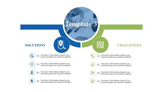
Solution vs challenges ppt visual aids infographic template





Try Before you Buy Download Free Sample Product
 Impress Your
 Audience
 100%
100% Editable
 Save Hours
 of Time


Use our solution vs challenges PowerPoint slide to measure the performance of your business processes. This solution vs challenges PPT visual has been created by our designing team after complete research and analysis of the market. Performance measurement indicates what a program is accomplishing and whether results are being achieved. It helps managers by providing them information on how resources and efforts should be allocated to ensure effectiveness. It keeps program partners focused on the key goals of a program. Our solution vs challenges PowerPoint graphic enables you to create the professional presentation design that can assist you to design effective marketing strategies which are useful in alignment with your business strategies. By incorporating this solution vs challenges PPT slide into your business presentation, you can show your marketing strategies and plans in a clear and explicit detail. Download the slide now. Get your excellence into focus with our Solution Vs Challenges Ppt Visual Aids Infographic Template. Give them a glimpse of your core capabilities.
People who downloaded this PowerPoint presentation also viewed the following :
Solution vs challenges ppt visual aids infographic template with all 5 slides:
Bring an end to any disagreement with our Solution Vs Challenges Ppt Visual Aids Infographic Template. It helps fix the deal.
FAQs for Solution vs challenges ppt visual
Set it up with challenges on the left, solutions on the right. Visual stuff helps a ton - arrows connecting problems to fixes, maybe some icons. I'd go bold with headers like "The Problem" and "How We Fix It." Honestly, people love numbers so toss in stats if you've got them. Color coding works too - red for bad stuff, green for solutions. Keep everything short and scannable since most people just skim anyway. Oh and make sure someone can get the gist in like 30 seconds max. That's about all the attention you'll get these days.
So basically, visual hierarchy is like creating a path for people's eyes to follow. You want them looking at your main points first, right? Make your "solution" sections bigger and brighter than the problem parts. Size and color are your best friends here - honestly, most people don't realize how much this stuff matters. Without it, readers just bounce around randomly and totally miss what you're trying to say. Oh, and here's something I learned the hard way - always make your solutions look more prominent than the challenges. People respond way better when the positive stuff stands out more.
So for challenges, go darker - deep blues, grays, maybe some muted reds. Makes the problems feel serious, you know? Then flip it for solutions. Bright greens work great (growth vibes), trustworthy blues, even some energizing orange if that's your thing. I've honestly seen way too many presentations where everything's the same boring color and it just falls flat. The trick is creating that visual contrast between your problem sections and solution sections. Helps people's brains switch gears. Dark challenge colors paired with lighter, poppier solution colors? That's where the magic happens.
Break your content into small chunks - people hate reading walls of text on infographics. Go with bullet points and short phrases instead. Make your important stuff stand out with bigger fonts or bright colors so it actually pops. I swear, half the infographics I see look like someone copy-pasted an essay onto a pretty background. Don't do that! Balance your text with visuals and throw in some icons to back up your points. Quick test: show it to someone for 10 seconds and see what sticks. If they can't remember the main point, you've probably crammed too much in there.
For challenges, grab icons that scream "problem" - warning triangles, roadblocks, storm clouds, broken chains. Red and orange colors hit hard. Solutions need the opposite vibe: lightbulbs, checkmarks, upward arrows, gears meshing together, bridges. Honestly, I'm still obsessed with the classic lightbulb thing - never gets old. Green and blue work perfectly for solutions. The whole point is creating obvious contrast between your "before" mess and "after" fix. Oh, and keep them simple so they don't look terrible when scaled down.
Think of it like telling a story - start with the "before" where everything sucks, then show the "after" where your solution saves the day. Instead of boring bullet points, use real examples or case studies that people can actually relate to. Stories just hit different than plain facts, you know? Add some visual flow with arrows or timelines so readers don't get lost. Each challenge-solution combo should feel like its own little story arc. Beginning, middle, end. Oh, and honestly? The narrative approach works way better than those generic infographics everyone's doing. People remember stories, not lists.
Don't make your solutions look too basic compared to the problems - comes across super oversell-y. Also resist cramming like 8 different challenges into one section, it's just overwhelming. Those generic stock photos of business people pointing at graphs? Skip them entirely lol. Your color scheme needs to match throughout or it looks like you copy-pasted two different designs together. Here's what actually works: pick 3-5 main challenges first. Then build solutions that directly answer each one - not just random benefits you think sound good. Make sure everything connects logically.
Honestly, visuals are a game-changer for breaking down complex stuff. Charts and diagrams beat walls of text every time - people's brains just process them faster. I love using flowcharts to show how problems connect, plus those before/after comparisons really hit different. Color coding works too (red = bad, green = good, you know the drill). Oh, and swap out boring bullet points for simple icons or infographic elements. Makes everything way more scannable. Your audience won't zone out halfway through your presentation.
Your fonts are literally your visual voice - they set the mood before anyone reads a word. Bold, chunky typefaces scream urgency (perfect for problems). Clean, minimal ones feel like solutions and relief. Size creates hierarchy too, walking readers through your points logically. I've watched amazing infographics get completely murdered by terrible font choices - like using Comic Sans for climate data (yikes). Match your typeface to your vibe: serious fonts for heavy topics, sleek modern ones for innovation stuff. Stick to 2-3 fonts max and don't go crazy with variety. Consistency is your friend here.
Honestly, just think about who's gonna see this thing first. Executives want the big picture - show them key numbers and outcomes, skip the boring details. Technical people are the opposite though, they'll actually want to see your methodology and data breakdown. Colors matter more than you'd think too. Corporate folks expect those boring blue-gray palettes, but younger audiences respond way better to bright, bold stuff. Oh and format it based on how they consume info - busy professionals need scannable bullet points while visual learners want charts everywhere. What do they already know, and what decision are they making?
Look at views, shares, and how long people actually stay on your content - that's your basic stuff. Click-through rates matter if you want them doing something after. But honestly? The comments are usually way more telling than view counts. You'll see if your message actually hits or if people are confused. I'd throw in a quick survey or follow-up questions too - just to check if your infographic solved what you meant it to. Oh, and don't go crazy tracking everything at once. Pick like 2-3 metrics to start or you'll drive yourself nuts.
Clickable stuff is your best bet - hover effects that show details when people tap specific problems or solutions. Tabs are solid too, letting users flip between different scenarios or timelines. Progress bars showing how well solutions work are weirdly addictive to watch, honestly. You could throw in polls where people vote on which fixes they think'll actually work (always gets people engaged). Oh, and drag-and-drop matching games work great - users connect solutions to problems themselves. Just don't go overboard with fancy animations that serve no purpose. Each interactive bit should actually help them grasp your content better, not just look pretty.
Honestly, just start with Canva - they've got a bunch of templates made specifically for problem/solution stuff. You can drag and drop everything super easily. Adobe Illustrator is the fancy option if you want total control, but it's way too much unless you're doing something really specific. Oh, and if you're dealing with charts or data, Infogram handles that stuff better than most. Piktochart and Venngage are decent too if Canva doesn't have what you need. I'd try Canva's free version first though - their solution templates are actually pretty solid. You can always pay for more features later if you get picky about customization.
Start with rough sketches and get feedback early - I can't tell you how many times I've seen people wait until the end and then wonder why everything feels off. Test your wireframes first to see if the problem/solution combo actually makes sense to people. Ask specific stuff like "does this challenge feel relevant?" instead of the generic "what do you think?" which gets you nowhere. Quick surveys work, or just grab someone for a 5-minute chat. Focus on clarity and whether your visual hierarchy actually guides their eye where you want it. Oh, and when you get feedback - look for patterns, not just one person's random opinion.
Oh, you'll see tons of these in healthcare - like symptoms on one side, treatments on the other. Business presentations do this all the time too with market problems vs their solutions. Tech companies are obsessed with this format for product launches, showing user frustrations and then how their app fixes everything. Environmental groups absolutely crush it with climate issues paired with actions people can take. Just make sure your pairs are obvious and the design looks balanced. Canva has solid templates, or honestly? Check out nonprofit social media posts - they're weirdly good at this since they have to grab attention fast.
-
Commendable slides with attractive designs. Extremely pleased with the fact that they are easy to modify. Great work!
-
Unique design & color.