


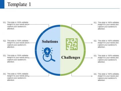
Solution and challenges ppt visual aids summary





Try Before you Buy Download Free Sample Product
 Impress Your
 Audience
 100%
100% Editable
 Save Hours
 of Time


Exercise effective control via our Solution And Challenges Ppt Visual Aids Summary. Demonstrate ability to handle events.
People who downloaded this PowerPoint presentation also viewed the following :
Solution and challenges ppt visual aids summary with all 5 slides:
Counsel employees with our Solution And Challenges Ppt Visual Aids Summary. They will find your advice beneficial.
FAQs for Solution and challenges ppt
Honestly, visuals are a game-changer for presentations. People remember like 65% more when you show them something instead of just talking at them - which makes sense, right? I mean, we're all pretty visual learners whether we realize it or not. They definitely help break up complex stuff that would sound confusing otherwise. Plus you won't feel as awkward just standing there with nothing to point at lol. Just don't go crazy with the spinning text animations (we've all seen those trainwreck PowerPoints). Stick to simple charts or images that actually support what you're saying.
Honestly, visuals are a game-changer for presentations. People remember like 65% more when they actually see stuff instead of just listening to you talk. Pretty crazy right? Don't just throw random charts around though - that's amateur hour. Good visuals help explain tricky concepts and give your audience something to look at (instead of watching you mess with your hair). I always use the 6x6 rule: six bullet points max, six words each. Nobody wants to sit there while you read entire paragraphs off slides. Trust me on this one.
Honestly, diagrams and flowcharts are lifesavers for complex stuff - they show processes step by step without overwhelming people. Infographics are solid too since they mix visuals with short text bits. Interactive features like clickable charts are cool if you've got the budget, but simple often works just as well (maybe better tbh). Don't do those awful dense slides with microscopic text. Match your visual to what you're showing: timelines for sequences, org charts for hierarchies, comparison charts for... comparing things obviously. Oh, and definitely test it on someone first - what makes sense to you might be total gibberish to everyone else.
Colors can totally make or break your presentation tbh. Dark blue with white text? Chef's kiss for readability. Warm colors like red grab attention fast, but don't go crazy - I made that mistake once and my slides looked like a circus poster lol. Blues and greens feel way more professional and help people actually process complex stuff. Here's the thing though - stick to maybe 3 colors max or it gets messy. Oh, and definitely check how your colors look on the actual projector beforehand! Consistent color coding helps people follow along without even thinking about it.
Honestly? Go for like 80% visuals, 20% text max. Think billboard, not essay. I've sat through way too many presentations that are just walls of bullet points - nobody wants that. Use strong images or simple charts instead of cramming everything into text. Here's my test: if someone glanced at your slide for 3 seconds, would they get it? Your slides should back up what you're saying, not be your script. Stick to key phrases or single words. Oh, and if you're reading straight off the slide, you've already lost people. Let the visuals carry the weight.
Honestly, infographics are a game-changer for boring data stuff. You know how everyone's eyes glaze over when you show them spreadsheets? Charts and icons fix that instantly. I've watched presentations go from putting people to sleep to actually holding their attention – just by switching out dense tables for simple bar charts or flow diagrams. Focus on your main point first, then figure out what visual works best. Even PowerPoint's basic charts beat the hell out of raw data tables. Oh, and don't try to cram everything in – pick your best insights and make those pop.
Ugh, don't cram everything onto one slide - people can't read tiny text from the back row anyway. Skip Comic Sans obviously lol. Clashing colors are brutal too, like neon green on red or whatever. I learned this the hard way but test your stuff on the actual projector first because your laptop screen lies about how things will look. Animations are fine but don't go crazy with bouncing text everywhere. Keep fonts consistent throughout. Honestly, boring beats unreadable every single time. Your content matters more than making it "pop" or whatever.
Honestly, don't just throw in videos and images because they look cool - make them actually mean something. Short clips work great for backing up your main points, but the quality has to be there. I learned this the hard way when my pixelated video made everyone cringe instead of paying attention. Images should work with your text, not fight against it for attention. Oh, and compress those files so they don't take forever to load. Always test everything on the actual setup you'll use because Murphy's Law is real. Sometimes the simple approach hits harder than going overboard with effects.
Ugh, cultural differences are SO important for visual design. Like, red screams "danger" here but it's lucky in China - who knew? Also some people read right to left which totally messes with your layout. Hand gestures can be super offensive depending where you are (learned that one the awkward way). Font choices matter too, honestly more than I thought they would. My advice? Do your homework on the audience first. Then adjust everything - colors, images, the whole thing. If you can, definitely run it by someone local before presenting. Trust me on this one!
Okay so basically charts and graphs are like having backup singers for your presentation - they make everything hit so much harder. People process visuals 60,000x faster than text, which is wild when you think about it. Your audience will actually understand what you're saying instead of just staring blankly. Attention spans are pretty much nonexistent now anyway. The trick is picking the right chart type though - pie charts aren't always the answer, trust me. When you match your visual to your message, you'll notice people actually paying attention instead of scrolling Instagram under the table.
Honestly, visuals are a game-changer for storytelling. Your brain processes images way faster than text, so why not use that? Instead of rattling off sales numbers, show a graph that makes people go "oh shit." Before/after photos hit different than just describing changes. Match your visuals to the moment though - emotional scenes need images, data needs charts. I always storyboard presentations now (sounds nerdy but whatever). Simple icons can guide people through your story without being distracting. It's like giving your audience something to grab onto instead of just floating through words.
Dude, stick with high-res stuff from Unsplash or Pexels - they're solid. Getty Images too if your company has that account. Those awkward corporate handshake photos are the worst, honestly. I'd skip them entirely. For your own graphics, keep fonts consistent and use your brand colors so everything looks cohesive. Oh, and definitely check usage rights before you use anything client-facing - learned that one the hard way! File sizes matter too since nobody wants to wait forever for images to load. Pro move: set up a shared folder with pre-approved images. Your team will thank you later.
Match your visuals to who you're talking to. C-suite wants clean dashboards with the big numbers - don't dump spreadsheets on them, trust me. Technical folks? Go ahead and get into the weedy details. Room size matters too. Conference rooms mean you can use smaller text, but auditoriums need everything bold and high-contrast or people in the back are screwed. Oh, and always test your setup beforehand. I learned that one the hard way when my carefully crafted charts looked like garbage on their ancient projector.
Honestly, Canva's where I'd start - their free version is solid and you can make stuff that actually looks professional. Once you get the hang of it, you'll probably get a little obsessed (I definitely did). Adobe Creative Suite is obviously the gold standard if you want to get fancy with it. Oh, and those AI image generators like DALL-E are pretty wild for custom graphics. Piktochart's great for infographics too. I'd mess around with Canva first though and see what works for your vibe before diving into the pricier options.
Honestly, visuals are like brain glue - people remember images way longer than whatever you said out loud. Your audience will still picture that crazy chart or simple diagram weeks later, but they'll totally forget your brilliant verbal explanation. Our brains just work that way, processing images super fast while storing them differently than words. I learned this the hard way in college presentations actually. So yeah, tie your biggest points to clear visuals that pop. Give people something concrete to see in their heads when they're trying to remember your stuff later.
-
very effective
-
Great quality slides in rapid time.
-
Innovative and Colorful designs.