

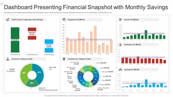
Dashboard presenting financial snapshot with monthly savings




Try Before you Buy Download Free Sample Product
 Impress Your
 Audience
 100%
100% Editable
 Save Hours
 of Time


Our Dashboard Presenting Financial Snapshot With Monthly Savings are topically designed to provide an attractive backdrop to any subject. Use them to look like a presentation pro.
People who downloaded this PowerPoint presentation also viewed the following :
Dashboard presenting financial snapshot with monthly savings with all 7 slides:
Use our Dashboard Presenting Financial Snapshot With Monthly Savings to effectively help you save your valuable time. They are readymade to fit into any presentation structure.





FAQs for Dashboard presenting financial snapshot
Start with cash flow - seriously, it's everything. Track your current cash, how old your receivables are, and what bills are coming up. Revenue trends and margins are obvious ones. If you're burning cash, definitely include that rate. Break down your big expense buckets too - payroll, marketing, whatever eats your money. Customer acquisition cost is gold if it applies to your business. Honestly, the whole thing should pass the 30-second test. If you can't glance at it and immediately know if you're screwed or thriving, you've overcomplicated it.
Look, a good financial dashboard basically shows you what's happening with your money right now - none of that guessing game stuff. You can see cash flowing in and out, catch those late payments before they become a problem, and figure out which expenses are killing you. Way better than staring at boring spreadsheets all day (seriously, who has time for that?). Set it up to ping you when cash gets low. I check mine every week or so to spot trends early. Honestly, it's saved my butt more times than I can count.
Line charts work great for showing trends over time, bar charts for comparing stuff side by side. KPI cards are perfect when you want key numbers right upfront. Seriously though, stop putting budget breakdowns in pie charts - just use a table! Keep your colors consistent with your brand. Make axis labels super clear because nobody wants to guess what they're looking at. Dashboards should be scannable in 30 seconds max. Put your most important metrics at the top and don't cram everything together. Whitespace is your friend here.
Dude, real-time data integration is a total game changer for dashboards. You're not stuck looking at yesterday's numbers anymore – cash flow, expenses, revenue all update as they happen. Markets can flip crazy fast (learned that the hard way), so catching problems early is everything. Why wait for end-of-day reports when trends are happening right now? Just connect your accounting software, bank feeds, and payment systems directly to the dashboard. It'll auto-update and actually help you make decisions instead of just showing pretty charts. Trust me, once you see live data, static reports feel ancient.
Stick with the obvious stuff - green for gains, red for losses, maybe some neutral blues or grays. Don't use red and green together though, colorblind people will hate you for it. Keep your palette small, like 3-4 colors max or it gets messy fast. Orange works great for alerts. High contrast is key so people can actually read the numbers. Oh, and here's something I learned the hard way - always check how it looks in grayscale first. If it doesn't make sense without color, you'll have problems.
Dude, get a financial dashboard set up - it's a game changer. You'll actually see what's happening with your money in real time instead of just guessing. Cash flow, revenue, expenses... it's all right there visually so you can spot problems fast. I love being able to drill into specifics when something looks off. The visual format just clicks better than staring at spreadsheets, you know? Set up alerts for your biggest metrics first - that way you won't miss anything major. Trust me, once you have that bird's eye view of everything, you'll wonder how you managed without it.
Think of forecasting like having a heads-up for your finances - you'll catch problems before they hit and actually plan ahead instead of just reacting. Put your projected revenue and expenses right next to the real numbers on your dashboard. Makes it dead obvious when things are going sideways. I honestly don't know how people run businesses without this stuff - flying blind seems terrifying. Short bursts work better than long predictions anyway. Set it to update automatically so you're not stuck with stale data. Quick visual comparisons between what you expected vs what happened? Game changer for tweaking your strategy fast.
So basically, you just swap out the metrics for what each industry actually cares about. Retail folks obsess over inventory turnover and same-store sales. Manufacturing? They're tracking cost per unit and production efficiency. SaaS companies live and die by MRR and churn rates - completely different world. Pick like 5-7 metrics that actually matter for decisions, not just vanity numbers. Honestly, the easiest way is asking people what they check first thing Monday morning. That'll tell you everything you need to know about building the dashboard around what they genuinely use.
So for financial dashboards, there's a bunch of ways to go. Excel's actually still pretty decent if you're used to it already - I know it sounds boring but some people build crazy good stuff with it. Power BI and Tableau are where it's at though if you want something that looks really professional and can handle messy data. Google Data Studio won't cost you anything and works well with Google stuff. My buddy at work swears by it. Start with whatever you already know how to use, then maybe upgrade later if you need fancier features or better connections to your databases.
Dude, layout makes or breaks how fast people can actually read financial data. Put your biggest KPIs right at the top - that's where everyone looks first anyway. Then stack your supporting details underneath in order of importance. Seriously, bad layouts just make people dig around forever looking for stuff, which leads to errors and annoyed users. Group related metrics together, keep your spacing consistent, and make the data flow logically. Oh and always start with the top-left corner - that's like reading 101. When it's organized right, people can spot trends way quicker.
Honestly, the worst thing you can do is cram everything onto one screen - it becomes this unreadable nightmare. Ask yourself what 3-5 questions the dashboard actually needs to answer first. Then build from there. Revenue growth looks flashy but maybe cash flow is what your team really needs to see, you know? Mobile matters way more than people think since everyone's constantly checking stuff on their phones. Oh, and don't get caught up in metrics that just look impressive. Focus on what actually helps people make decisions instead of what sounds cool in meetings.
Dude, financial dashboards are clutch - they turn your nightmare spreadsheets into something people can actually look at without their eyes glazing over. You know how board meetings get when you start throwing numbers around? This fixes that. Everyone sees the same data but customized for what they need - execs get the big picture KPIs while department heads dive into details. Honestly saves so much time too since you're not constantly explaining what everything means over email. The visual thing really works - trends pop out, key metrics are obvious. Way better than drowning stakeholders in raw numbers.
Start with your accounting software - QuickBooks, Xero, whatever you use. Bank accounts are obvious for cash flow tracking. Your CRM is huge for seeing what's coming in the pipeline. Google Analytics if you're spending on ads, plus social media costs. Payroll too - I always forget how much labor adds up until it hits me in the face. Bigger operations need ERP systems and subscription billing platforms. Honestly, just start with the basics first. You can always add more later, but garbage data means a garbage dashboard.
Put your most important stuff up top - cash flow, revenue, profit margins. Those should be the big charts people see first. Honestly, I used to go crazy with fancy visuals but simple line graphs usually work way better for financial stuff. Stick with red/green for negative/positive so it's obvious at a glance. Set up alerts when things hit your danger zones instead of obsessively checking all day. Oh and keep your time periods matching across everything - super annoying when they don't line up. Start with maybe 5-7 metrics max, then build from there.
Honestly, dashboards are so much better than waiting around for those monthly reports that show up weeks late. You can see what's happening right now and catch problems before they get worse. The visual stuff is huge too - way easier to understand charts than staring at spreadsheets full of numbers. When something looks weird, you can actually click around and dig deeper instead of being stuck with whatever static data someone decided to give you. I'd probably start with whatever metrics you check most often and go from there. Trust me, once you get used to it you won't want to go back.
-
Very unique and reliable designs.
-
Great quality slides in rapid time.