


Financial Dashboard Snapshot For Month End Income And Expenses




Try Before you Buy Download Free Sample Product
 Impress Your
 Audience
 100%
100% Editable
 Save Hours
 of Time


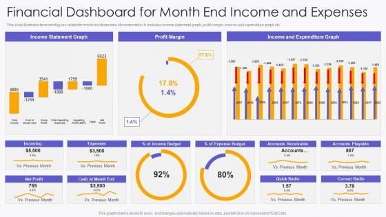
This slide illustrates facts and figures related to month end financials of a corporation. It includes income statement graph, profit margin, income and expenditure graph etc.
People who downloaded this PowerPoint presentation also viewed the following :
Financial Dashboard Snapshot For Month End Income And Expenses with all 7 slides:
Use our Financial Dashboard Snapshot For Month End Income And Expenses to effectively help you save your valuable time. They are readymade to fit into any presentation structure.






FAQs for Financial Dashboard Snapshot For Month End
Focus on the basics first - revenue, profit margins, cash flow, and burn rate. Those are your must-haves. Customer acquisition cost and monthly recurring revenue (if you're SaaS) come next. Don't forget accounts receivable aging either. I've seen way too many dashboards that are just cluttered messes nobody actually looks at. Stick to maybe 6-8 KPIs tops so you can actually catch problems before they get worse. Start there, then add whatever your leadership team keeps bugging you about. Much better than cramming everything in and having it be useless.
Dude, visual elements are a game changer for financial dashboards. You can spot trends and weird outliers right away instead of staring at boring spreadsheets forever. Red/green indicators work great for performance stuff, line charts show trends over time, and pie charts break down budgets nicely. The whole point is making your data actually tell a story. Figure out your most important KPIs first. Then pick visuals that make those numbers jump out at you - honestly, anything that helps you make decisions faster is worth it.
Update your key stuff like cash flow daily, but weekly works for the deeper analysis. Monthly audits are crucial - I can't tell you how many dashboards I've seen just sitting there looking pretty because all the connections broke. Set alerts for weird data spikes so you're not caught off guard. Quarterly KPI reviews matter too since priorities shift constantly. Oh, and definitely assign one person to own it - otherwise everyone thinks someone else is handling it and nothing gets done. Trust me on that one.
Yeah, user roles are huge for this stuff. Executives just want the big picture - KPIs, trends, that kind of thing. Analysts though? They need to dig into every transaction detail and drill down everywhere. Finance managers are kind of in the middle, wanting both overview stuff and department breakdowns. I always think of it like designing different workspaces for different jobs. Your permission settings control who can edit what, export data, or even see sensitive info. Honestly, the easiest way is mapping out what each role actually does day-to-day first, then build your layout around that.
Honestly? Just start with Excel or Google Sheets if you're doing basic stuff. They're flexible and you probably already know how to use them. Power BI and Tableau are where it's at for bigger datasets - way more interactive too. There's Looker, Qlik, bunch of others. Oh and financial-specific tools like Adaptive Insights if you want to get fancy. I've actually seen some crazy good dashboards people built just using Excel pivot tables (which always surprises me). Really comes down to your budget and how complex your data is. Don't overthink it - start with what you've got.
Dude, dashboards are seriously helpful for budgeting stuff. You'll see your spending patterns and revenue trends in real-time, which beats staring at endless spreadsheets any day. They make it super easy to catch seasonal changes and figure out which departments are blowing their budgets. Plus the visual charts actually make sense when you're trying to explain variances to your boss - way less awkward than those meetings used to be. Oh, and you can set alerts for when spending goes off track. Honestly saves you from those panic moments at month-end when everything's already gone wrong.
Your financial dashboard is pointless if it's showing yesterday's numbers. Real-time integration lets you catch problems before they blow up - like spotting cash flow issues or budget overruns while you can still do something about it. Markets move crazy fast these days, so stale data might as well be fiction. Live feeds mean you're making decisions on actual current info, plus you can set up automatic alerts for the stuff that matters. Honestly, I'd focus on getting your most critical data sources connected first rather than trying to do everything at once.
Honestly, most people just dump way too much stuff on one screen. Like, I get it - you want to show everything, but users will just bounce if they're staring at some crazy airplane cockpit situation. Pick maybe 5-7 metrics that actually matter for decisions. Don't use weird charts either - pie charts for financial trends are the worst. Oh, and make sure your data updates often enough to be useful. I always tell people to start by figuring out what decisions need to be made first, then work backwards from there.
Honestly, just think about what each group actually needs to see every day. Your executives want the big picture stuff - revenue growth, profit margins, cash flow. Finance people need all the detailed breakdowns like P&L, budget variances, that accounts receivable aging report they're always obsessing over. It's basically like cooking for different people - same data, totally different priorities. Set up role-based access so everyone sees their own metrics and can dig deeper into what matters to them. Pro tip: ask each team what decisions they're making weekly and build backwards from there. Way easier than guessing what they want.
Honestly, charts and graphs are game-changers for making sense of your money stuff. I used to get lost in those massive spreadsheets - such a headache. Now I just throw the numbers into visuals and boom, patterns jump right out at you. Revenue dropping? Expenses going crazy? You'll see it immediately instead of hunting through rows of data. Bar charts work great for comparing things, line graphs show trends over time. Oh, and your brain processes pictures way faster than numbers anyway, so it's like giving yourself a shortcut. Just start with your most important metrics first.
Honestly, start with whether people are actually using the thing - like, are they logging in regularly or just ignoring it? Then check if decisions are happening faster than before. The real measure though is forecast accuracy and hitting budget targets more often. Quarter surveys help too - ask users if it's genuinely useful or just another box to check. Also track decision speed compared to your old process. Think of it like... does your new route actually save time or just feel different? Oh, and set these metrics up from the start - way easier than scrambling later.
Most dashboards can pull from QuickBooks, Xero, your bank APIs, credit cards, invoicing tools - basically anywhere your money data lives. Even Excel if you're still doing that (no judgment, I was there for way too long). Payroll systems and investment accounts work too. The tricky part? Some need direct integrations, others you'll have to import CSVs or use connectors. I'd start with whatever sources have your most important data first. Then just keep adding more as you go. Way less overwhelming that way.
Look, mobile optimization is a game changer for financial dashboards. You can check your cash flow from literally anywhere instead of being stuck at your desk. The touch interfaces actually work properly too - no more zooming around trying to read tiny numbers on your phone (seriously, that's the worst). Push notifications keep you in the loop with alerts, and you can even view stuff offline. Honestly, if your dashboard isn't mobile-friendly, you're missing out on tons of users who need those financial insights while they're out and about. It just makes everything way more accessible.
Dude, static reports are perfect for the formal stuff - board meetings, compliance docs, anything that needs to stay exactly the same forever. My old boss was obsessed with printing everything out and scribbling notes in the margins, which was honestly kind of endearing. You'll want static when sharing with people outside your company who don't need live data access. Plus it gives you total control over what info goes where. Random thought - they're also way easier to email around without worrying about permissions breaking. If it's getting filed away somewhere, just go static.
Honestly, dashboards are game-changers for compliance stuff. They pull data automatically from your systems, so you won't have those "crap, I missed last quarter's numbers" disasters. Everything gets timestamped and tracked - regulators eat that up during audits. The best part? No more manual report building every month. Map out what compliance reports you need first, then see which dashboard metrics match up. It's way less painful than doing everything by hand, and the formatting stays consistent. Oh, and version control means you can actually prove what data you shared when. Trust me on this one.
-
Fantastic collection. Loved how we can personalize these templates as per the requirements.
-
Professional and unique presentations.