


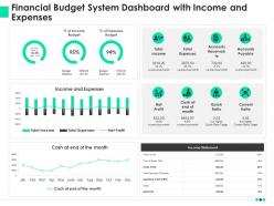
Financial budget system dashboard with income and expenses ppt file example file





Try Before you Buy Download Free Sample Product
 Impress Your
 Audience
 100%
100% Editable
 Save Hours
 of Time


Our Financial Budget System Dashboard With Income And Expenses Ppt File Example File are topically designed to provide an attractive backdrop to any subject. Use them to look like a presentation pro.
People who downloaded this PowerPoint presentation also viewed the following :
Financial budget system dashboard with income and expenses ppt file example file with all 2 slides:
Use our Financial Budget System Dashboard With Income And Expenses Ppt File Example File to effectively help you save your valuable time. They are readymade to fit into any presentation structure.
FAQs for Financial budget system dashboard with income and expenses ppt
Start with the basics - actual vs budgeted spending, cash flow trends, and your burn rate. Revenue tracking is a no-brainer too. Variance analysis helps you spot where things went sideways. I'd throw in budget utilization by category and maybe forecasted runway based on current patterns. Gross margin and operating margin are solid if they make sense for your setup. Honestly, the whole point is getting that quick snapshot of financial health in like 30 seconds. These core metrics should cover most situations, then you can always add more specific stuff later based on what your team actually looks at when making decisions.
Honestly, charts save you from drowning in spreadsheet hell. You'll spot budget problems instantly instead of hunting through rows of numbers. Bar charts show which departments are bleeding money. Sparklines work great for tracking trends over time. Pie charts get a bad rap but they're actually solid for showing spending breakdowns - people just love to complain about them. Heat maps are clutch when you need to find weird outliers across different categories. The trick is matching the right chart type to what you're trying to see. Way better than doing math in your head.
Weekly updates are your sweet spot, though monthly works if you're swamped. Automate data feeds wherever you can - I've seen too many dashboards become graveyards because someone got tired of manual updates. Clean visuals are key. Focus on metrics that actually matter for decisions, not every data point you can find. Oh, and validate your numbers against source systems regularly. Wrong data will tank your credibility faster than anything. Don't forget to check in with stakeholders periodically to make sure you're still showing them what they need.
Honestly, connecting your budget dashboard to accounting software is a game changer. No more manually typing in numbers and making stupid mistakes. Real-time data just flows in automatically, so you'll catch budget issues right when they happen instead of finding out weeks later like "oh great, we're $10k over." Way less stressful. It transforms your basic spreadsheet into something that actually works for you. The time you save on data entry means you can focus on figuring out what the numbers mean. First step is checking what accounting platform you use - most have built-in connections you can set up pretty easily.
Honestly, if your budget dashboard is confusing, people just won't touch it - especially when they're already stressed about money. Make the navigation super obvious and put the most important stuff right up front. Nobody has patience for hunting through messy charts when bills are due. Colors and fonts actually matter way more than you'd think because financial stuff makes people anxious anyway. The whole thing should feel calm, not like some overwhelming spreadsheet nightmare. Map out how someone would actually move through it - like, high-level view first, then they can dig deeper if they want. And definitely test it with real people who'll actually use it daily, not just other designers!
Dude, get a budget dashboard ASAP. You'll see your cash coming in vs going out in real time - like sales money hitting versus when rent and payroll are due. Saves you from those panic moments when you suddenly realize you're short. The visual stuff makes spotting patterns way easier too. Oh, and definitely set up alerts when your cash drops below whatever amount keeps you up at night. Trust me, catching problems early beats scrambling later. Way less stressful than constantly doing math in your head.
Depends what you're going for really. Excel's still my go-to for most stuff - yeah it's old school but you can't beat the control you get. Google Sheets works too if you're sharing with people. Business side? QuickBooks handles the heavy lifting, or Power BI if you want something prettier. Tableau's solid but honestly might be overkill unless you're doing serious analysis. For personal budgets, Mint and YNAB are decent - though I've heard mixed things about Mint lately. Personal Capital's good for investments. Just start with whatever you already know how to use, then move up if you need more bells and whistles.
Just add some columns to your dashboard that show actual vs budget, then calculate the variance and percentage. I always use conditional formatting - red for bad variances really helps stuff jump out at you. Set up different sections for revenue and expenses, plus maybe a summary of your biggest changes. Honestly, the visual part is what makes it work - you need to spot problems fast. Oh and make sure it updates automatically when you pull in new actuals, otherwise you'll be doing math all day which sucks.
Look, everyone cares about completely different stuff. Your CFO wants cash flow numbers and budget variance - the big picture money stuff. But department heads? They need to see exactly where their team's spending went. Sales folks literally don't care about IT costs at all - show them revenue targets and commission data instead. It's like everyone speaks their own language, honestly kind of annoying sometimes. When you build dashboards for each group specifically, they can actually make decisions fast instead of scrolling through tons of useless info. Just ask each team what three things they check every Monday morning and start there.
So basically, predictive analytics takes your historical spending data and tries to guess what's coming next. Pretty neat for catching budget disasters before they hit. You can set alerts when your spending looks like it's gonna blow past limits, and it gets better at predictions over time as it learns from your patterns. I'd honestly start small - just pick your biggest expense categories and add some basic trend forecasting there first. The seasonal stuff is really handy too, like knowing December always kills your budget. Way better than just staring at where your money went last month.
Honestly, data integration is going to be your biggest headache - finance probably pulls from like five systems that hate each other. Getting department heads to actually change how they do things? Good luck with that. User adoption makes or breaks these projects though, so start small with a pilot group. Oh, and figure out your data sources first before you go crazy with rollouts. Real-time updates matter, but what really matters is whether it answers actual questions people have instead of just looking flashy. Data accuracy is obviously huge too.
Having your budget on your phone is honestly a game changer. You can check if you can actually afford something right there in the store instead of guessing and regretting it later. I'm probably that weird person pulling up my banking app in the grocery checkout line, but whatever. It helps you catch when you're about to blow past your limit before it's too late. Plus you'll start noticing your spending habits way faster. Like realizing you drop $20 on coffee every week without thinking about it. The whole point is having real numbers when you're actually making decisions that matter.
Dude, real-time data integration is a total game changer for budget dashboards. Instead of just staring at pretty charts, you'll actually catch spending issues before they blow up. It pulls data straight from your accounting software and bank feeds - saves you from doing all that tedious manual entry (which honestly nobody has time for anyway). Your team sees the same live numbers you do, so no more awkward "wait, which version are we looking at?" moments in meetings. Set up alerts when you're hitting budget limits. That way you can fix problems fast instead of finding out about disasters weeks later.
Track your debt-to-income ratio and make sure you've got 3-6 months of expenses saved up. Your savings rate is huge - try hitting 10-20% if you can. I'd also watch your net worth growth and how diversified your investments are. Oh, and don't forget retirement contributions. Cash flow trends tell you way more than just looking at one month's numbers. Actually, that's probably the most telling metric tbh. Set up some alerts so you catch problems early instead of realizing you're screwed six months later.
Start with the big picture at the top - overall budget health, that kind of thing. Then walk people through where money flows in and out. I always think of it like explaining finances to my mom - what's the actual story here? Don't just dump charts everywhere. Each section should build on the previous one, you know? Add little notes explaining why certain numbers actually matter. Progressive disclosure works great for this stuff. Honestly, most dashboards fail because they skip the narrative part entirely. Arrange everything so it tells a logical story instead of looking like a data explosion.
-
Very unique, user-friendly presentation interface.
-
Use of icon with content is very relateable, informative and appealing.
-
Topic best represented with attractive design.
-
Awesome presentation, really professional and easy to edit.