


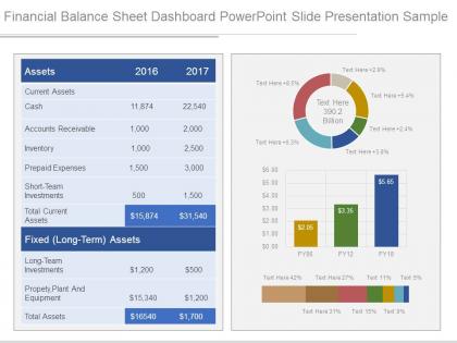
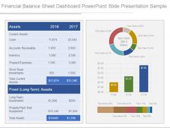
Financial balance sheet dashboard powerpoint slide presentation sample




Try Before you Buy Download Free Sample Product
 Impress Your
 Audience
 100%
100% Editable
 Save Hours
 of Time


Handle the inventory with our Financial Balance Sheet Dashboard Powerpoint Slide Presentation Sample. Ensure availability of critical components.
People who downloaded this PowerPoint presentation also viewed the following :
Financial balance sheet dashboard powerpoint slide presentation sample with all 4 slides:
You will find our Financial Balance Sheet Dashboard Powerpoint Slide Presentation Sample forever available. They never call it a day.
FAQs for Financial balance sheet dashboard powerpoint
Honestly, just track what actually moves the needle - revenue, profit margins, cash flow, and burn rate. Those are must-haves. I'd throw in accounts receivable aging too because cash timing screwed me over once (never again lol). Customer acquisition cost and lifetime value show if your unit economics make sense. Budget vs actual keeps you honest about spending. Oh, and gross margin by product line if you sell different stuff. Here's the thing though - don't go crazy with like 20 metrics or you'll lose focus. Stick to maybe 6-8 that'll actually help you figure out next quarter's moves. Less is more here.
Dude, get a financial dashboard if you don't have one already. It pulls everything from your bank accounts and invoicing stuff into one place automatically. No more digging through messy spreadsheets every time you need to check your cash situation - which honestly saves so much time. You'll see exactly what money's flowing in and out, plus what's expected over the next few months. Best part? You can catch cash problems way before they actually hit you. I'd start simple though - just track your top 3 or 4 cash flow numbers first.
Honestly? Tableau and Power BI are your best bet for financial dashboards - both handle complex calculations really well. Don't sleep on Excel though, it's still solid for simpler stuff if you're already comfortable with it. Python with Plotly is cool if you're into coding (probably overkill but whatever). Google Data Studio's free and cloud-based which is nice. I'd probably go with Power BI first since it plays nice with Excel and you're likely already using Microsoft stuff anyway. Makes the whole setup way smoother.
Your brain processes visuals way faster than endless spreadsheet rows - trust me on this one. Charts and graphs let you spot trends instantly instead of hunting through tables of quarterly data. Bar charts, line graphs, heat maps - they all beat staring at numbers any day. Plus dashboards are perfect when you need to explain stuff to people who aren't total data nerds. Different chart types work better for different things too. Line charts show trends over time really well, while pie charts are solid for breaking down budgets and spending.
Oh man, don't cram everything onto one screen - people just shut down when it's too much. Also those charts with cut-off y-axes? Super misleading and honestly kind of sketchy. I see this all the time - teams build dashboards for executives when analysts are actually using them, or vice versa. Mobile's huge too since everyone's checking stuff on their phones now. You'll want context everywhere - dates, benchmarks, whatever helps people understand what they're looking at. Numbers by themselves are basically worthless. And definitely test it with actual users first, not just your team.
Daily updates are usually the sweet spot for most financial dashboards. Really depends on your business though - if you're in something super volatile, you might need hourly refreshes for operational stuff. Cash flow and key metrics? Yeah, daily works great. Weekly is honestly too slow unless you're only looking at big picture strategic things. Match your update frequency to how fast you need to make decisions. Quick reactions need quick data, obviously. Start with daily and see how your team actually uses it - you can always tweak from there.
Honestly, real-time data is what separates useful dashboards from fancy paperweights. You can catch problems before they blow up instead of finding out about them next week. Day trading with yesterday's prices? Yeah, that's a recipe for disaster. With live feeds, you'll spot cash flow issues right when they start, watch your KPIs shift in real time, and actually react to market changes when it counts. Just make sure whatever data sources you pick can handle the constant updates - some of them will absolutely murder your system performance or cost way more than you'd expect.
Dashboards make forecasting so much easier because everything's visual and in one spot. You can track revenue growth, expenses, cash flow - all that stuff - and actually see the patterns over time. Seasonal trends jump out at you instead of being buried in endless spreadsheets. The what-if scenarios are honestly a game changer. Just tweak some variables and boom, you see different outcomes right away. Way better than spending forever digging through Excel files. Oh, and set up those automated alerts for your key metrics so you don't miss anything important happening.
So executive dashboards are more like your 30,000-foot view - revenue trends, cash flow, profit margins. Perfect for the C-suite people who want to catch problems quickly without getting bogged down in weeds. Operational ones? Completely different story. Those track your day-to-day stuff - AP aging, which departments are over budget, transaction volumes. I always think of it as "should I panic about Q3?" vs "why the hell did marketing blow $5K extra last Tuesday?" Really depends on who's using it and how much detail they can actually handle.
Honestly, dashboards are game-changers because suddenly everyone's performance is right there in the open. No more hiding behind "things are going well" updates. People actually start caring about their numbers when it's not buried in some random Excel file only they can see. You'll spot the chronic forecast-missers pretty quick too. Real-time data means you know exactly who's responsible for what metrics and whether they're actually hitting targets. Oh, and set up those automated deadline alerts - way better than constantly nagging people yourself. It becomes this shared scoreboard thing where accountability just happens naturally.
Cash runway is everything - literally how many months you've got left. After that, I'd watch your burn rate and monthly recurring revenue if you have it. Customer acquisition cost vs lifetime value is huge too, especially when talking to investors. They'll definitely ask about gross margins and unit economics. Oh and whatever your main engagement metric is - monthly actives or whatever makes sense for your thing. Honestly though, don't get sucked into tracking a million metrics that just make you feel good. Stick to maybe 5-7 that actually tell you if you're dying or growing, and update them weekly so you can pivot when needed.
Definitely split this up into different tabs for each team - they all want completely different stuff. Your exec team just needs the big picture KPIs like revenue and margins. Finance will want all the detailed cash flow and budget variance stuff (they're picky like that). Operations cares about cost centers and efficiency ratios. Sales wants pipeline data and commission tracking obviously. Just make sure you set up filters so people only see what matters to them - nobody wants to dig through irrelevant metrics when they're trying to make decisions.
Honestly, get your data formats sorted first - mixed date formats are a nightmare you don't want. Use real-time APIs for the critical stuff like cash flow, but batch processing is totally fine for monthly reports. Validate data quality at every integration point, especially with multiple ERPs (learned that one the hard way). Your most important data sources WILL crash at 2am on a Sunday, so build in backups. Oh, and don't try to do everything at once - nail your core KPIs first, then add the fancy stuff later.
Get automated checks running that'll catch outliers and missing data - manual reviews won't cut it with financial stuff updating all the time. Pull everything from one source instead of mixing systems with different update schedules (learned that the hard way). Document your data flow first and spot the biggest risks. Oh, and nail down who owns which data and when it refreshes. Otherwise you'll have people arguing over numbers that don't match. Set up flags for anything suspicious so your dashboard actually alerts you to problems.
Honestly, predictive analytics is where it's at now - dashboards that show what's coming instead of just old news. Real-time streaming is finally standard (took long enough). Mobile-first design is everywhere since bosses want to check numbers on the toilet, apparently. Interactive drill-downs let teams actually collaborate and leave comments right on the data. But here's the thing - skip the fancy charts if they don't tell people what to DO. Users need actionable stuff, not just pretty visuals to stare at.
-
Content of slide is easy to understand and edit.
-
Understandable and informative presentation.