


Financial summary presentation powerpoint


Try Before you Buy Download Free Sample Product
 Impress Your
 Audience
Editable
of Time


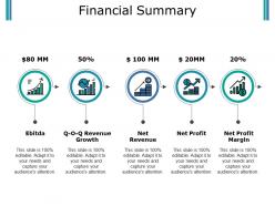
Do you want to design an expert presentation on the financial summary? Are you in search of professional visuals and graphics? Well if yes, then download our financial summary presentation PowerPoint template crafted by highly skilled PowerPoint experts. Showcase the financial activities and performance of the business using this financial report PowerPoint slide. With the application of the financial statement PPT slide, you will be easily able to explain the idea of numerous financial factors which are EBITDA, revenue growth, net revenue, net profit, and net profit margin. This financial overview presentation design will be an excellent tool for you to represent the monthly, half-yearly or annual financial performance of the business. To make the template look more professional and eye-catching, our PowerPoint designers, have made the use of icons such as financial bar graphs, growth bar chart, revenue coins, coins, and economic growth arrow, and profit arrow. A PPT on accounting statements, accounting reports, profit and loss report, statement of comprehensive income, statement of revenue & expense, and equity statement can be outlined utilizing this financial introduction presentation template. Explain the difficulties that crop up in the beginning with our Financial Summary Presentation Powerpoint. Elaborate on the initial hiccups.
People who downloaded this PowerPoint presentation also viewed the following :
Financial summary presentation powerpoint with all 5 slides:
Address the boastful with our Financial Summary Presentation Powerpoint. Expose the hollowness of their claims.

FAQs for Financial
Hit the big four: revenue trends, expenses, profit margins, and cash flow. Revenue first - show where you're crushing it and where things are rocky. Break down your major costs after that. Margins over time tell a great story if you let them. Cash flow matters tons, especially when you're stretched thin on working capital (been there). Definitely throw in some projections - bosses eat that stuff up. Oh and keep slides simple. Nobody wants to stare at spreadsheet hell for 20 minutes. Focus on what the numbers actually mean instead.
Honestly, charts and graphs are a lifesaver when you're dealing with financial stuff. People can actually see what's happening instead of drowning in spreadsheet hell. Bar charts work great for comparing things, line graphs show trends over time. Pie charts? Eh, everyone uses them but they're kinda meh most of the time. The trick is matching the right visual to what you're trying to show. Oh, and don't go crazy - pick your top 2-3 metrics first and make clean charts for those. Way better than overwhelming people with everything at once.
Tell the story, not just the numbers. Start with an exec summary, then dive into the stuff that actually matters - trends, budget misses, what's causing changes. Charts are your friend here because honestly, nobody wants to stare at spreadsheets forever. I always connect everything back to what it means for the business and what we're doing next. Keep the heavy details for areas that need fixing. The goal is insights first, then back it up with data. Make it digestible or people zone out halfway through.
Honestly, it's all about knowing your audience. Executives want the big picture stuff - trends, key metrics, strategic impact. Don't bog them down with every detail. Board members? They're looking for risk assessment and how you're hitting goals. Your finance team can obviously handle all the technical breakdowns since that's literally what they do. Department heads need to see how this affects their budgets and day-to-day operations. The real trick is dropping the jargon when you're talking to non-finance people. Explain what those numbers actually mean for their work instead of throwing around finance-speak that'll just confuse everyone.
Dude, nobody wants to sit through a bunch of spreadsheet numbers being read at them. You gotta turn your financial summary into an actual story. Walk them through where you started, what went wrong (or right), and where you're heading next. Like that Q3 drop? Don't just mention it - explain how it pushed you toward that new strategy that's crushing it now. People zone out with raw data, but they'll pay attention when there's a narrative connecting everything. Trust me, your recommendations will hit way harder when folks understand the journey behind the numbers.
Pick your 3-4 most important metrics and make those numbers HUGE on the slide. Seriously, like way bigger than everything else. Green for wins, red for... well, you know. Charts are solid but skip the crazy animations - they're just annoying. Here's what I do: for every metric, ask yourself "so what?" If you can't answer that in one sentence, ditch it. Nobody cares about vanity numbers. Oh and always add a quick note about what each number actually means for next quarter or whatever. People want to know where things are headed, not just where they've been.
PowerBI and Tableau are solid choices if you want those fancy interactive dashboards. Excel's still my go-to though - the new chart stuff is actually pretty decent, plus everyone knows how to use it. Google Sheets works too, especially when multiple people need to jump in and edit. Oh, and I've been seeing some surprisingly good presentations made in Canva lately (didn't expect that). For the heavy-duty analytics, there's Qlik Sense or Adaptive Insights, but honestly? Just start with whatever your team's already comfortable with. You can always level up later once you figure out what you actually need.
Keep your numbers realistic - I've watched so many pitches crash because people threw out crazy optimistic projections that made everyone cringe. Show your work too. Don't just say "we'll hit $2M in year two" without explaining how you got there. Smart executives want to see your thought process, not just the final number. Oh and definitely include best/worst case scenarios alongside your main projection. Makes you look way more prepared. Tie everything back to actual market data when you can. Honestly, underpromising beats overpromising every single time. You'll thank me later when you're exceeding expectations instead of scrambling to explain why you missed by 40%.
Dude, the biggest thing is don't dump every single detail on your slides. Your audience isn't living in those numbers like you are. Tell the story behind the data instead of just throwing spreadsheets into PowerPoint - honestly, those are the worst. Keep things high-level but explain what the numbers actually mean for the business. Always give context when something's off budget or whatever. Oh, and end each section by asking yourself "so what?" If you can't answer that clearly, your audience definitely can't either. Make it about the takeaways, not the raw data.
Start with the big four: revenue, expenses, profit margins, and cash flow. Can't skip those. For anything weird or trending, throw in quick explanations - but honestly, skip the finance department's love affair with footnotes. Charts beat number dumps every time. I'd go big picture overview, then get into the weeds. Oh, and definitely end with a summary slide covering your main points and what happens next. Your audience will thank you for not making them hunt through slides to figure out what actually matters.
Okay so basically treat your financial presentation like telling a story, not just throwing numbers at everyone. Start big picture first - "here's how we did this quarter" - then get into specifics. Visuals are your friend because honestly, staring at spreadsheets makes people's eyes glaze over. Mix in some questions to keep folks awake: "What do you think caused this Q2 jump?" Maybe throw in a poll or two. The whole thing should feel like you're actually discussing the business together, not reading from a script. Oh and definitely wrap up with clear action items - otherwise people walk away confused about what happens next.
Watch how people react during your presentation - are they actually engaged or just zoning out? Taking notes is always a good sign. But honestly, the real test comes after. Do they bring up your points in meetings later? Actually follow your recommendations? I'm kind of obsessed with sending those little feedback surveys afterward (yeah, super nerdy but whatever). The responses tell you so much about what actually stuck. Short sentences work. Also track if stakeholders make decisions based on your data - that's when you know your message really hit home.
Honestly, just ditch the jargon first - say "cash on hand" instead of "liquidity" and "operating profit" instead of EBITDA. I like comparing stuff to household budgets since everyone gets that. Break things down into bite-sized pieces too. Charts work way better than paragraphs of numbers (trust me on this one). The coffee test is gold - if you can't explain it to your neighbor casually, you're overcomplicating it. Oh, and definitely run it by someone who isn't in finance first. Their blank stares will tell you everything you need to know about what needs fixing.
Oh definitely start keeping notes after each presentation! I used to think I'd remember everything but then totally bombed this Q3 summary because I ignored feedback about my charts being way too cluttered. Now I write down what worked, what flopped, and any specific comments people made. Look for patterns too - like if multiple people say "too much detail" or ask for more context on the same stuff. Then actually use those notes when you're building your next deck. I know it sounds obvious but honestly most people just wing it and hope for the best next time.
Templates are honestly a game-changer - you'll save so much time not having to recreate the same charts and formatting every quarter. I learned this the hard way after spending way too many late nights rebuilding presentations from scratch. Your team can all use the same one too, so everything looks cohesive instead of like a random mess. They're also great for making sure you don't forget important metrics that your stakeholders always ask about. Start simple and tweak it based on what your audience actually cares about.
-
Out of the box and creative design.
-
Understandable and informative presentation.