


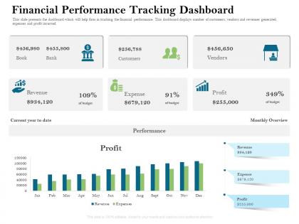
Financial performance tracking dashboard ppt powerpoint presentation professional diagrams




Try Before you Buy Download Free Sample Product
 Impress Your
 Audience
 100%
100% Editable
 Save Hours
 of Time


This slide presents the dashboard which will help firm in tracking the financial performance. This dashboard displays number of customers, vendors and revenues generated, expenses and profit incurred
People who downloaded this PowerPoint presentation also viewed the following :
Financial performance tracking dashboard ppt powerpoint presentation professional diagrams with all 2 slides:
Use our Financial Performance Tracking Dashboard Ppt Powerpoint Presentation Professional Diagrams to effectively help you save your valuable time. They are readymade to fit into any presentation structure.
FAQs for Financial performance tracking dashboard ppt powerpoint
Revenue growth, profit margins, cash flow, and accounts receivable aging - those are your core four. They'll tell you way more than any vanity metrics will. Customer acquisition cost and lifetime value are huge too if you're growing fast. Oh, and don't sleep on expense ratios and burn rate - sometimes they reveal problems before your revenue numbers do. My old boss used to say pick 6-8 KPIs max and actually stick with them. You don't want to drown in data. Just keep the dashboard updated so you're not making decisions off stale numbers.
You know those monthly reports that make you want to cry? Yeah, financial dashboards basically eliminate that nightmare. Real-time data means you can actually see what's happening with cash flow, revenue, and expenses without diving into spreadsheet hell. Honestly, once you start making decisions based on actual current data instead of guessing, it's kind of addictive. Your team will stop bugging you for updates since everything's right there visually. My advice? Pick 5-7 metrics that actually matter to your goals first - don't try to track everything at once or you'll go crazy.
Line charts work best for showing trends over time, bar charts for comparing stuff. KPI cards are perfect for your main metrics. Seriously though, avoid pie charts and gauges - they're just visual noise that nobody needs. Clean visuals are what execs actually want to see. You can use tables for detailed breakdowns, but make them easy to scan with some conditional formatting. Short sentences work better than long ones. If someone stares at your chart for more than 5 seconds trying to figure it out, you've overcomplicated it.
Daily updates are your best bet, but real-time is even better if you can swing it. Monthly? Way too slow - you'll miss everything important. Retail and e-commerce need hourly updates honestly, those numbers change fast. More stable businesses can probably get away with daily. Don't overwhelm your team though, that's counterproductive. I'd personally start daily and see how it goes. Oh, and make sure you're not just updating for the sake of it - your team actually needs to find the data useful or what's the point?
Don't cram everything onto one screen - that's the fastest way to confuse people. Vanity metrics are another trap, they look cool but won't help anyone make real decisions. I swear half the dashboards I see are just eye candy with zero substance. Your data needs to be solid and actually updated regularly (shocking how many aren't). Executives want different stuff than your analysts do, so think about who's using it. Stick to maybe 5-7 key metrics tops. Test it with real users first - saves you from looking like an idiot later when nobody can figure out what they're looking at.
First thing - figure out what metrics actually matter for your specific industry. Retail folks care about inventory turnover and same-store sales. SaaS? MRR and churn rates all day. Manufacturing companies obsess over production efficiency and cost per unit. Modern dashboard tools make this pretty easy since you can just drag and drop whatever widgets you need. I'd definitely throw in some industry benchmarks too - way more useful when you can see where you stand against competitors. Honestly, just pick like 5-7 metrics that directly hit your bottom line and start there.
Dude, real-time data is a game changer for dashboards. You'll catch cash flow problems before they wreck you. Revenue tracking happens as money hits your account - none of that stale report nonsense from last month. Quick decisions become way easier when you're working with current numbers instead of old data. Honestly, flying blind with yesterday's info is just asking for trouble. Trends pop up fast, so you can actually react to them. Oh, and definitely set alerts for your key metrics - that way the dashboard does the heavy lifting even when you're not glued to your screen.
Honestly, your dashboard becomes way more useful when you add outside data sources. Internal numbers only show half the picture - you need market data, competitor pricing, maybe even customer sentiment to understand what's actually driving those changes. Like, are your revenue numbers up because you're crushing it, or just because the whole industry is booming? That context makes all the difference. Pull in some economic indicators or industry benchmarks alongside your expense trends. Makes sense to start small though - pick 2-3 external sources that directly relate to your main metrics and go from there.
Honestly, cloud dashboards are a game changer for finance stuff. You can pull up your numbers from literally anywhere - coffee shop, home, whatever. Adding new users is super easy too, none of that IT nightmare stuff. The updates happen automatically which is nice because you don't get those annoying maintenance downtime emails (those are the worst). Oh, and you're paying monthly instead of dropping huge money upfront on licenses. Way more manageable. I'd probably look into which ones play nice with whatever systems you're already using first.
So basically you'd integrate forecasting models that crunch your historical financial data to predict what's coming next. Most dashboard tools already support this - you can throw in ML algorithms or just simple regression models to show projected revenue and cash flow next to your real numbers. Honestly the trend lines stretching into future months look pretty slick. Oh, and definitely include confidence intervals so people know how much to trust the predictions. I'd start with basic trend stuff first - your team can get weird about complex models if they don't understand them yet.
Start with good visual hierarchy - bigger fonts for your main KPIs, smaller for supporting stuff. Group related metrics together so it makes sense. Honestly, consistent color coding is huge - green for good, red for bad, that kind of thing. I've worked on dashboards that looked like someone threw up a rainbow, and nobody could read them! White space is your friend. Don't cram everything together. Stick to simple charts - bar graphs and line charts are solid choices. Oh, and sketch it out first on paper. Sounds old school but you'll thank me later when you're not redoing everything digitally.
Think of user roles like giving different people different keys to your building. CFOs get the master key, regional managers only access their floor - that kind of thing. Map this out super early because it'll shape your whole data setup. The annoying part? People hate hitting permission walls constantly, but you can't just give everyone everything either. I'd honestly start by just talking to the main stakeholders first - figure out what data they actually need for decisions before you build anything. Way easier than trying to retrofit permissions later.
Cash flow is everything - seriously, that's what keeps you alive. Track your revenue trends and gross profit margins first. Then watch accounts receivable aging like a hawk because that stuff hits your daily operations hard. Current ratio too for liquidity. I'd skip the flashy metrics honestly - seen way too many dashboards that look cool but tell you nothing useful. Expense ratios are solid though. Stick to maybe 5-7 core things max. You can always dig deeper when something's weird, but your main view should make sense instantly.
Honestly, the real test is whether people actually make better decisions faster. Check if your team's hitting budget calls quicker and if forecasts are getting more accurate. Usage stats tell the whole story - nobody logs into dashboards they don't find useful, trust me. Are you catching problems earlier than before? That's the money metric right there. I'd do quarterly check-ins asking what's broken and what's actually helping. But here's the thing - if your financial performance hasn't improved after six months, something's wrong. Time to go back to the drawing board.
So Tableau does these sick executive dashboards for retail - real-time sales, inventory, margins across all their stores. Netflix tracks subscriber growth and churn with custom setups (their content ROI stuff is wild). Manufacturing companies like GE have dashboards showing cash flow and equipment efficiency. Banks monitor loan portfolios and compliance metrics. The thing is, they all stick to like 3-5 key metrics instead of drowning people in numbers. I'd say figure out your biggest financial drivers first, then build everything around those. Don't overcomplicate it.
-
Excellent work done on template design and graphics.
-
Perfect template with attractive color combination.