

Financial performance summary ppt example




Try Before you Buy Download Free Sample Product
 Impress Your
 Audience
 100%
100% Editable
 Save Hours
 of Time


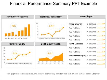
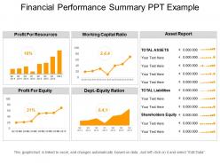
Introducing Financial Performance Summary PPT Example to showcase some techniques for an organization to make better economic decisions. With the help of this PowerPoint slide, you can review and evaluate the financial statements which help to earn in a more profitable way. This financial performance slide involves an engaging diagram depicting various methods which helps in maintaining the financial information in a structured way. This template particularly describes the notes of each product in the form of balance sheet, cash flow statement and income statement to provide management with a more detailed understanding of the facts and figures in order to generate more income. Financial performance has high-quality icons making the presentation even more reliable and easy to grasp. This PowerPoint slide includes a financial report depicting the activities related to revenues and expenses of the particular entity. Therefore, download this ready to use PPT for extracting more information about analysis of the financial statement.
People who downloaded this PowerPoint presentation also viewed the following :
Financial performance summary ppt example with all 5 slides:
Demonstrate high degree of integrity with our Financial Performance Summary Ppt Example. Establish the fact that your commercial deals are honest.

FAQs for Financial performance
Honestly, focus on the big four: revenue, profit margins, cash flow, and a couple key ratios like ROI or debt-to-equity. Revenue's your growth story. Margins show if you're actually efficient at making money. Cash flow though? That's critical - I've seen profitable companies go under because they couldn't pay their bills. Ratios depend on your audience, but executives love year-over-year comparisons. Oh, and whatever metric matters most to whoever's reading it should go first. One page max or people won't read it.
Look, current numbers only tell you part of the story. You need that historical stuff to see if you're actually trending upward or just got lucky this quarter. Think of it like - you wouldn't navigate somewhere without knowing the route you took, right? Pulling 3-5 years of data helps you spot those weird seasonal dips and figure out if you're beating your own records instead of just comparing to some random industry benchmark. Honestly, it's way more useful than I thought it'd be when I first started tracking this stuff. Historical trends don't lie.
Honestly, cash flow analysis is what separates the businesses that survive from the ones that don't. Your income statement might look great, but if customers aren't actually paying you or you've got all your money tied up in inventory, you're screwed. I've seen profitable companies go under because they couldn't pay their bills - it's wild how that works. The three types (operating, investing, financing) show you where money's really going. Never just look at profit margins alone. You need both to understand if you're actually making money or just playing an expensive game of pretend.
Look, having multiple revenue streams is basically your insurance policy against getting screwed over. When one source dries up (and it will), the others keep you afloat. But here's the thing - you can't just throw together random income sources and call it diversified. If they all tank during the same economic downturn, you're still fucked. I learned this the hard way honestly. Track how each stream performs separately and watch for patterns. Short bursts of income are great, but steady streams pay the bills. Don't put all your eggs in one basket, even if that basket looks really shiny right now.
Honestly, the worst thing you can do is cherry-pick all the good metrics while hiding anything ugly. Nobody trusts that BS. Don't flood them with spreadsheets either – I've seen too many presentations where people's eyes just glaze over. Tell the story behind your numbers instead. What's actually driving those trends? Also watch out for weird comparisons across different time periods, especially if you've changed how you measure things. Keep it straightforward and always tie everything back to what it means for the business. Oh, and have clear next steps ready.
Numbers tell you what happened, but talking to people tells you why. Declining revenue could mean anything - seasonal dip, bad management, market saturation. The real story comes from understanding brand reputation, leadership quality, all that stuff that doesn't show up on financial statements. I've watched companies with solid financials completely fall apart because nobody caught the operational red flags. Oh, and definitely chat with people from different departments when you're analyzing. They'll spot risks and opportunities that your spreadsheets totally miss. Sometimes the best insights come from random conversations.
Honestly, just start with Excel or Google Sheets - they handle calculations fine and basic charts look decent enough. Power BI and Tableau are where it gets interesting though, way better for dashboards that don't look like garbage. QuickBooks has reporting too if you're using it already, but the customization kinda sucks. For presentations, I usually dump everything into PowerPoint or Canva afterward. My take? Don't overthink it at first. Master whatever you already know, then upgrade once you figure out what your boss actually wants to see. That part always takes longer than expected anyway.
Look, without benchmarking you're basically flying blind with your numbers. Your 8% profit margin might feel decent until you realize everyone else is hitting 15% - then it's like, oh shit. Compare yourself to 3-5 similar companies every quarter so you can actually tell if you're crushing it or just treading water. I mean, it's literally grading on a curve. You'll spot exactly where you're falling behind competitors instead of just patting yourself on the back for beating last year's numbers. Makes prioritizing fixes way easier too.
So financial ratios are like getting a peek under the hood of how a company actually runs things day-to-day. Asset turnover shows if they're squeezing decent sales from their resources. Inventory turnover? That'll tell you if they're drowning in unsold stuff - which honestly never ends well. Operating margin reveals profit efficiency once they cover operating costs. Then there's receivables turnover for seeing how fast they collect from customers. The real magic happens when you track these over time and stack them against competitors. That's where patterns jump out at you.
Look, you definitely need both but here's the thing - short-term stuff like cash flow and quarterly numbers helps you react quickly to problems. But long-term analysis? That's where you actually see what's happening with your business once you strip away all the random noise and seasonal weirdness. Most people I know get totally obsessed with every quarter (guilty of this myself sometimes) and completely miss the real trends. Do monthly check-ins for the immediate stuff, but always compare it against your longer-term data. Otherwise you'll drive yourself crazy reacting to every little blip.
Skip the jargon and just talk normally. Different people care about different stuff - investors want ROI, employees want job security, you know? Don't just throw out "revenue up 12%" without explaining why or what's next. Honestly, people can tell when you're being fake, so admit when things suck too. I always do an executive summary first, then dump the detailed charts after for whoever wants to geek out. Context is everything - like if that 12% growth came from one big client, say that. Makes a huge difference in how people read your numbers.
Stick with simple charts - bar graphs for comparing stuff, line charts when you're showing trends. Keep colors basic, maybe 2-3 max, and don't cram everything together. I always mess this up and make mine too busy lol. Pick the metrics your audience actually cares about instead of throwing in every single number you have. Keep your formatting consistent and add context like "up 15% from last quarter" so people know what they're looking at. Honestly, the best thing? Show it to someone else first. What seems obvious to you might make zero sense to them.
Oh man, seasonal stuff totally messes with financial reports. Q4 retail numbers always look insane because of Christmas shopping, but it doesn't mean the company suddenly got way better at business, you know? Compare against the same quarter last year instead of just looking at consecutive quarters. Tourism and agriculture get hit with this too - like, ski resorts obviously crush it in winter but look terrible in July. I always make sure to point out these seasonal factors when I'm explaining the numbers, otherwise people think every spike is some miracle growth strategy when it's just... timing.
You definitely need them when pitching to investors or lenders - they want to see your future, not just past performance. Budget season too (the worst time of year, honestly). Major investments or acquisitions? Absolutely. Historical data is great for showing what happened, but forecasts prove your business model actually works long-term. Basically anytime someone's making a big financial decision based on your summary, throw in projections. They're looking ahead, so your data should too.
Okay so non-financial metrics basically tell you *why* your numbers look the way they do. Revenue might be solid this quarter, but what if customer retention is falling off a cliff? That's trouble brewing. I'd track things like customer satisfaction, employee turnover, market share - stuff that actually drives your financial results but shows up way earlier. You'll catch problems before they hit your bottom line. Honestly, financial reports without this context are pretty useless for making real decisions. Pick maybe 3-5 metrics that matter most for your specific business and watch them religiously alongside your usual financial stuff.
-
Easily Understandable slides.
-
Top Quality presentations that are easily editable.