


Quarterly Financial Performance Dashboard By Power BI




Try Before you Buy Download Free Sample Product
 Impress Your
 Audience
 100%
100% Editable
 Save Hours
 of Time


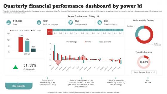
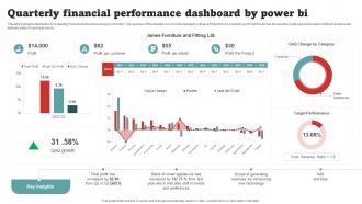
This slide highlights dashboard for evaluating financial performance using power bi tool. The purpose of this template is to provide managers with an efficient tool for comparing profit metrics across the quarters. It allows users to select different quarters and estimate sales of various products.
People who downloaded this PowerPoint presentation also viewed the following :
Quarterly Financial Performance Dashboard By Power BI with all 10 slides:
Use our Quarterly Financial Performance Dashboard By Power BI to effectively help you save your valuable time. They are readymade to fit into any presentation structure.








FAQs for Quarterly Financial Performance Dashboard
Start with revenue and gross profit margins - those are non-negotiable. Cash flow and operating expenses come next. If you're focused on growth, definitely track customer acquisition cost and lifetime value too. Those metrics actually get pretty interesting when you watch them over months. Year-over-year and quarterly comparisons are clutch since everyone wants to see trends. Oh, and throw in your debt-to-equity and current ratios for the financial health picture. That's like eight solid metrics to start with. You can always pile on more once people start asking specific questions during your reviews.
Charts and graphs are total game-changers for financial stuff. Instead of squinting at endless spreadsheet rows, you can spot trends and weird outliers instantly. Bar charts work great for comparisons, line graphs for showing changes over time. I'm a big fan of the red/yellow/green color system for performance - your brain just gets it immediately. Nobody has time to dig through columns of numbers anymore. Match your visual to what you're trying to show though. Revenue over time? Line chart. Budget vs actual spending? Side-by-side bars work way better. Focus on your most important metrics first, then expand from there.
Honestly, just go with Tableau or Power BI for quarterly stuff - they're what everyone uses for finance dashboards. Power BI's great if you're already using Office 365 since it plays nice with Excel (which I'm guessing your finance people love). Tableau looks way better but costs more. You could try Excel with pivot tables if budget's tight, though it gets messy when you're pulling from different places. I'd probably start with Power BI - easier to learn and you can get something decent up pretty fast.
Honestly, I'd check it monthly even though it's called a "quarterly" dashboard - sounds weird but hear me out. Big updates should happen every 6 months or whenever your priorities change. Those metrics that felt super important in January? They'll probably be useless by September if your strategy shifts. Monthly reviews help catch when your KPIs stop making sense or when people start asking totally different questions. Watch what charts your team actually uses in meetings versus the ones everyone ignores. That's usually a dead giveaway for what needs to get swapped out.
Dude, your data HAS to be spot-on or you're screwed. Bad numbers = bad decisions, and when your quarterly reports are way off, the higher-ups will definitely notice. Clean, consistent data is everything - otherwise you're just making fancy charts full of junk. Financial metrics especially will bite you because even tiny errors snowball fast. I learned this the hard way at my last job, honestly. Set up some validation checks and have someone eyeball the key numbers each month. Catches problems before they become disasters. Worth the extra time, trust me.
Dude, financial dashboards are a game changer for spotting growth opportunities. You can track cash flow, profit margins, and revenue trends without waiting around for those boring quarterly reports. Which products make you the most money? Dashboard shows you instantly. It'll also reveal when cash flow typically dips - super helpful for planning ahead. I swear, it's like having your own financial guru on speed dial. Oh, and set up alerts for important numbers so you don't miss anything big. Way better than staring at spreadsheets all day trying to figure out if you're actually growing or just treading water.
Start with the basics - revenue growth, gross margin, and operating margin. These show up in pretty much every industry comparison. EBITDA margin is clutch if you're dealing with heavy equipment or manufacturing stuff. Working capital ratios like days sales outstanding matter too, though honestly they're more relevant for some businesses than others. ROA and debt-to-equity give you the bigger picture on financial health. Just grab quarterly reports from your top competitors and pull these numbers. Maybe start with 3-5 companies so you don't go crazy with data overload.
Honestly, the timeline view is a game changer for spotting trends. You get all your key metrics - revenue, expenses, margins - laid out quarter by quarter so patterns just jump out at you. Super easy to see if you're growing consistently or hitting those annoying seasonal dips. I'm always hovering over the data points to grab exact numbers (probably more than I need to, but whatever). The percentage changes between quarters make it obvious what's actually working. Oh, and definitely try filtering by business units - that's where you'll find your real growth drivers hiding.
Dude, real-time integration is a total game changer for quarterly dashboards. You'll actually want to check your numbers instead of dreading them. Live revenue and expense tracking means you can catch problems early in the quarter, not when it's already too late to fix anything. I made the mistake of trying to connect everything at once my first time - don't do that. Start with revenue and cash flow first, then add other stuff later. Once you get hooked on seeing real data as it happens, going back to waiting weeks for updates feels prehistoric.
Honestly, less is more with dashboards. People get excited and cram every metric in there, but then nobody uses the thing because it's overwhelming. Pick the KPIs that actually matter for decisions - like 3-5 max to start. Stick with simple stuff like trend lines instead of complicated tables. I swear half the dashboards I see are just digital junk drawers. Test it with real users and ask what's confusing. You'll be surprised what trips people up. Add more metrics later only if people ask for them specifically.
So basically, you'll want different views for different people. Executives just need the big picture stuff - revenue trends, profit margins, keep it clean. Department heads though? They want the nitty-gritty for their specific areas, like budget breakdowns. Finance teams are honestly the worst because they want to see literally everything (but organize it somehow). Set up role-based access so people only see what they need. Oh, and ask each group what their top 3 metrics are first - saves you from guessing what matters to them. Some groups need real-time updates, others can handle daily refreshes.
Oh man, seasonal stuff will mess you up every time! Your Q4 looks incredible because of holiday sales, then Q1 tanks and everyone freaks out. But it's literally just normal seasonal patterns - happens every year. I'd compare the same quarters year-over-year instead of quarter-to-quarter. Way more useful. Maybe throw in some trend lines that smooth out those predictable dips and spikes? Otherwise you'll be chasing ghosts instead of real problems. Trust me, I've watched so many teams spiral over this exact thing when the data was actually fine.
So predictive analytics basically turns your dashboard into a fortune teller - well, sort of. Instead of just seeing what already happened, you'll get heads up about cash flow problems or revenue dips before they smack you in the face. Super helpful for scenario planning too. Like, what if sales drop 15%? What if that big client bails? You can model all that stuff ahead of time. Honestly beats scrambling to explain why numbers tanked after the fact. Your quarterly meetings become way less awkward when you're talking future moves instead of past mistakes. Start simple with basic trend forecasting first though.
Honestly, dashboards are game-changers for planning ahead. Instead of staring at endless spreadsheets (ugh), you get visual patterns that show what's actually driving your numbers. I always tell people to pick their top 3-5 metrics that historically predict performance - then watch how they move quarter to quarter. You'll start seeing seasonal trends and can model different scenarios instead of just winging it. Like, instead of guessing what Q3 looks like, you're basing projections on real data patterns. Way better than the old "cross your fingers and hope" method we used to rely on.
Don't jam everything onto one screen - I know it's tempting but people just freeze up when there's too much stuff. Think about who's actually using this thing. Finance folks want different details than the C-suite, you know? And please make it interactive! Static charts are basically useless for quarterly reviews. People need to drill down and compare time periods. Oh, and here's what I learned the hard way - test it with real users first. Can't tell you how many "amazing" dashboards I've built that just sat there collecting digital dust because they didn't match what people actually needed daily.
-
Extremely professional slides with attractive designs. I especially appreciate how easily they can be modified and come in different colors, shapes, and sizes!
-
The designs are very attractive and easy to edit. Looking forward to downloading more of your PowerPoint Presentations.