

Trend analysis of financial statements powerpoint layout




Try Before you Buy Download Free Sample Product
 Impress Your
 Audience
 100%
100% Editable
 Save Hours
 of Time


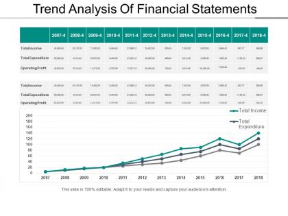
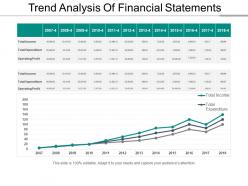
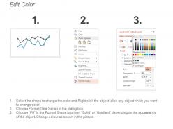
Allow the direct comparison of your business progress through this Trend Analysis of Financial Statements PowerPoint Layout. Easily show the change in business trends over time with this trend analysis PowerPoint graph. Reveal the complex data in an easy to understand way. The fundamental quality of a graph is that it is clear and readable. Use this line chart PPT graph to make a presentation that is comprehensive for your audience. Concisely convey as much information as possible through this statistical forecasting PPT slide. Evaluate and display the financial status of your company with the help of this line PPT graph. Increase productivity by working on stressful areas. Conducting statistical forecasting will help you evaluate your competitive advantage. Work towards the better functioning of your organization. Analyze the targets achieved and the ones you still need to accomplish. This line PowerPoint graph is professionally designed for your convenience. Make an impact on your audience with a visually appealing yet simple PowerPoint presentation.
People who downloaded this PowerPoint presentation also viewed the following :
Trend analysis of financial statements powerpoint layout with all 5 slides:
Create an air of cheer and celebration with our Trend Analysis Of Financial Statements Powerpoint Layout. It helps commemorate every eve.
FAQs for Trend analysis of financial
Honestly, cash flow statement is where the real story is - way more telling than the other two. Start with income statement basics: revenue, gross profit, operating income, net income. Balance sheet stuff matters too - assets, liabilities, equity, debt-to-equity ratios. Then dive into cash flows: operating, investing, financing activities. I'd grab quarterly data going back maybe 3-5 years? Calculate year-over-year changes for everything. That's where you'll catch the patterns and spot any red flags. Super boring but totally worth it.
Look, trend analysis is a game changer for forecasting – way better than just winging it with last quarter's data. Plot your key metrics over 3-5 years and you'll start seeing patterns everywhere. Seasonal dips, growth cycles, all that stuff becomes obvious. I literally watched a colleague completely whiff on Q4 revenue predictions because they ignored the obvious December spike that happens every single year. Once you spot these patterns, predicting cash flow changes or profit margin shifts gets so much easier. Just map out your ratios over time and project those trends forward.
Honestly, just start with Excel or Google Sheets - they're perfect for basic percentage changes and ratio stuff. Power BI's solid if you need to wow people with fancy charts (stakeholders eat that up). Bloomberg Terminal's amazing but costs a fortune, so maybe skip that unless you're at a big firm. Focus on horizontal analysis first - comparing periods side by side. Vertical analysis and ratio trends come next. Year-over-year growth rates are super straightforward to calculate. Moving averages help smooth out the noise too. Don't overthink it initially, you can always get more sophisticated later once you've nailed the basics.
Dude, you NEED industry benchmarks or you'll have no clue what's actually happening. Like, a 15% revenue drop sounds awful, right? But if everyone in your industry dropped 25%, you're killing it. I totally freaked out once over shrinking margins that turned out to be happening everywhere - felt pretty stupid after that. Benchmarks help you figure out if it's just you or if the whole market's going through something. Plus they show whether your wins are real competitive advantages or just you riding the wave. Always check against 4-5 similar companies first.
Seasonality will totally screw up your analysis if you're not watching for it. Never compare Q4 to Q1 - that's just asking for trouble since holiday sales make everything look crazy. Year-over-year is the way to go instead. So Q1 2024 vs Q1 2023, that kind of thing. Rolling 12-month averages work great too for smoothing out all those ups and downs. Honestly, I learned this the hard way when I kept wondering why our numbers looked terrible every January - turns out December was just artificially high.
So basically, you're looking for patterns in the numbers over time - stuff like revenue growth, debt levels, profit margins. I usually track 3-5 key metrics quarterly (though honestly, more than that gets overwhelming). If you see margins consistently dropping or debt piling up, that's your cue to run. But steady revenue growth? Rising efficiency? Those are good signs the company isn't going anywhere. The trick is watching multiple periods, not just comparing this year to last year. Look for anything that breaks the usual pattern - that's where you'll spot trouble or opportunity before everyone else catches on.
Ugh, the worst part is you can't compare apples to apples when companies mess with their fiscal calendars. Your trend analysis gets completely screwed up - you're suddenly comparing a 10-month stretch against 12 months or whatever. Growth rates? Forget about it. Seasonality adjustments become a nightmare since nothing lines up anymore. I swear some companies do this just to confuse analysts. Anyway, your best move is probably annualizing everything first or breaking it down quarterly so you actually have consistent periods to work with before diving into the real analysis.
Dude, charts are a game-changer for spotting financial trends. I can catch red flags in minutes that would take me forever scrolling through spreadsheet cells. Line charts work perfect for revenue trends over time. Bar charts? Great for comparing different periods or business segments. Honestly, staring at rows of numbers just makes my eyes glaze over after a while. Start with simple trend lines for your main metrics - you'll be shocked how much the story jumps out at you. Sometimes patterns that seem invisible in raw data become super obvious once you visualize them.
Dude, the timeframe you pick totally changes your whole story. Like, 2-3 years might look like steady growth, but zoom out to 10 years? You'll probably see it was just bouncing back from some crash. Quarterly data is super detailed but honestly gets messy with all the seasonal stuff - I swear it'll make you second-guess everything. Annual data's cleaner but you might miss big shifts that happened mid-year. Just pick based on what you're actually deciding, and definitely check multiple timeframes. Otherwise you're basically letting the data lie to you.
Honestly, the biggest trap is comparing stuff that doesn't actually match up. Like if there's a one-time expense or they bought another company - suddenly your year-over-year numbers are totally useless. Also watch the percentages thing - 50% growth from $100 to $150 isn't exactly earth-shattering, you know? I always pull at least 3-5 years of data because one year tells you nothing. Don't forget about inflation and seasonal stuff either. Oh, and those footnotes? Read them. That's where they hide what's really going on with the numbers.
Show 3-5 years of your key numbers - revenue, margins, cash flow stuff. Way better than just one year because people can actually see where you're going. Charts make it super easy for busy board members to get it instantly. I always think the visual piece is underrated, honestly. Don't just highlight the good trends either - call out concerning ones too and explain what's causing them. Builds way more trust. Single-year snapshots are basically useless compared to showing real momentum over time. Your stakeholders will get the full picture of your trajectory, not just a moment in time.
Honestly, it's mostly about what data you can actually get your hands on. Public companies have to file standardized, audited reports every quarter - makes comparison super easy. Private companies though? Total nightmare. Their financials might be unaudited, use weird accounting methods, or they only report once a year if you're lucky. You can't benchmark them against competitors either since that data just isn't out there. I'd figure out what info you can realistically access first. Otherwise you'll be analyzing basically nothing.
Yeah, so economic conditions can really mess with your trend analysis. Like, if you're looking at a company during a recession and their sales are dropping, that might just be the economy tanking - not necessarily bad management. Inflation's tricky too because it makes revenue look great when really it's just higher prices, not more customers buying stuff. I always compare companies to their industry peers and check what's happening with GDP, inflation rates, all that macro stuff. Otherwise you'll totally misread what's actually going on with the business itself.
Honestly, trend analysis is like having a crystal ball for your finances. You can spot whether revenue is picking up steam or starting to tank quarter by quarter. Super helpful for planning ahead. The expense side shows you if costs are spiraling out of control faster than you're bringing money in - which is never good! Plus you'll catch seasonal patterns and see if your cost-cutting efforts are actually doing anything. Here's the kicker though: comparing both trends side by side tells you if your profit margins are holding steady or getting squeezed. That's where the real insights happen.
Quarterly at the bare minimum, but monthly's way better if you can swing it. Most places I know just fold it into their regular financial stuff - becomes pretty automatic once you get going. Consistency matters more than being perfect about it though, so whatever you can actually keep up with. Monthly's clutch if your industry moves fast or you're dealing with big changes since you'll spot trends quicker. I'd start with the basics like revenue and cash flow, maybe margins. Then just add more metrics as it becomes routine. Honestly, once you get the rhythm down it's not that bad.
-
Awesomely designed templates, Easy to understand.
-
Awesome use of colors and designs in product templates.