


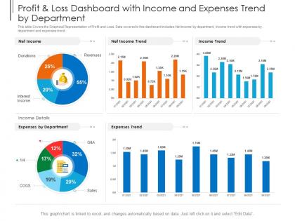
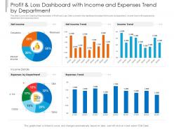
Profit and loss dashboard with income and expenses trend by department powerpoint template




Try Before you Buy Download Free Sample Product
 Impress Your
 Audience
 100%
100% Editable
 Save Hours
 of Time


Our Profit And Loss Dashboard With Income And Expenses Trend By Department Powerpoint Template are topically designed to provide an attractive backdrop to any subject. Use them to look like a presentation pro.
People who downloaded this PowerPoint presentation also viewed the following :
Profit and loss dashboard with income and expenses trend by department powerpoint template with all 2 slides:
Use our Profit And Loss Dashboard With Income And Expenses Trend By Department Powerpoint Template to effectively help you save your valuable time. They are readymade to fit into any presentation structure.
FAQs for Profit and loss dashboard with income and expenses trend by
Start with your main revenue stuff - total sales, breakdown by product line, gross margins. Then flip to expenses: COGS, operating costs, overhead. Net profit margin is the big one everyone cares about. Definitely add some comparisons too - month over month or year over year so you can spot trends fast. Oh, and throw in relevant KPIs like customer acquisition cost if that matters for your business. Honestly, I'd keep it simple at first. You can always add more detailed breakdowns later once people get used to reading the dashboard.
Honestly, these dashboards are game-changers because you can actually see what's making money vs. what's just bringing in revenue - totally different things. You'll catch trends as they happen instead of discovering problems weeks later during your monthly panic session. The real magic is spotting which products are secretly draining your profits so you know where to cut costs or double down. Just make sure you're tracking the metrics that actually matter for your business, and check it regularly. Otherwise it's just another fancy spreadsheet collecting digital dust.
Honestly, I'd go with **Power BI** or **Tableau** for P&L stuff - they're both really solid with financial data and have decent templates already built in. Excel still works great too if your team's already comfortable with it (and let's be real, most finance people are). Start by figuring out what accounting system you're using first. Then pick whichever tool connects easiest to that. Looker and Qlik are options too if you need fancier analytics, but they might be overkill. The main thing is being able to drill down from your summary view into the nitty-gritty details when someone inevitably asks "wait, why is this number so high?"
Honestly, monthly is the bare minimum but weekly's way better if you can manage it. You'll catch problems faster that way. Monthly gives you solid trend data without getting sucked into daily drama - and trust me, daily P&L checking is a rabbit hole you don't want to go down. Weekly updates let you pivot quicker when something's off. Got a seasonal business? Maybe check it more during your busy months. The key thing is just being consistent about it, whatever schedule you pick. Stale numbers = bad choices.
Don't cram everything onto one screen - it's like information overload central. Your categories should actually match how your business works, not just boring accounting stuff. Honestly, I've seen so many "pretty" dashboards that are completely useless for making real decisions. Skip the vanity metrics that don't connect to actual profit. Time comparisons are crucial too - people always forget those. Here's what works: ask your team what questions they actually need answered first, then build from there. Way better than throwing every possible metric at the wall and hoping something sticks.
Honestly, historical data is what makes your P&L dashboard actually useful instead of just pretty numbers. You can see patterns and trends that would totally fly under the radar otherwise. Like, that scary 15% revenue drop in January? Turns out it happens every year – who knew. You'll start catching problems way earlier and actually know if your strategies are doing anything. Plus you can make better forecasts instead of just guessing. I'd throw in at least 12-24 months of past data so you can compare year-over-year right off the bat.
Honestly, segmenting your P&L is a game changer. Break down your data by product, location, customer type - whatever fits your business. Otherwise you're flying blind with just those top-line numbers. I've seen companies think they're crushing it overall while one product line is actually hemorrhaging cash. Pretty scary stuff. Start with your biggest revenue buckets first, then dig into anything that looks weird or surprising. You'll spot problems way faster this way, plus you can double down on what's actually working instead of guessing.
Honestly, it's all about knowing your audience. Executives just want the big picture - show them profit trends, gross margins, budget vs actual. They'll glaze over if you dump every line item on them. But team leaders? They need the nitty-gritty stuff like department costs and project numbers they can actually do something about. I usually build different tabs in the same dashboard - way easier than creating separate reports every time. Make sure your filters let people drill down to what matters for their role. Trust me, matching the data to what people actually need to decide makes all the difference.
Static P&L dashboards are basically just glorified screenshots - you get fixed data from one point in time and that's it. Interactive ones let you actually play around with the numbers. Filter by dates, drill into different departments, mess with scenarios in real-time. For board meetings? Static works fine since you just need clean visuals. But honestly, interactive is way more useful day-to-day. You can spot trends, compare different time periods, answer random questions that come up. Go interactive unless you specifically need something printable. Way more bang for your buck.
Honestly, P&L dashboards are game-changers for budgeting. You'll actually see your revenue patterns and expenses in real-time instead of guessing with old spreadsheets. Seasonal trends become super obvious, and you can catch costs spiraling before they wreck your margins. The forecasting is probably my favorite part - you can run different scenarios based on what's actually happened. Set up alerts for when you're off budget too. Trust me, it beats that end-of-month panic when numbers don't add up. Way better than wondering where your money went.
Dude, real-time P&L data is seriously worth it. You'll catch revenue drops and cost spikes right when they happen instead of finding out weeks later when it's too late to fix anything. Honestly beats the hell out of those useless month-end reports that just tell you what already happened. The tricky part? Your data feeds better be solid or you're just getting faster garbage. I'd start with your biggest revenue sources first - maybe sales and your main expenses. Build it piece by piece from there. Game changer for actually managing instead of just reacting.
Honestly, P&L dashboards are game-changers for cash flow stuff. You'll catch revenue dips and expense spikes way before they become real problems. Like when clients are slow-paying or your costs are creeping up without you noticing - the visual breakdowns show trends that spreadsheets just can't. I'd set up alerts for things like margin drops or weird spending patterns. Also do weekly check-ins with the data. That way you're spotting cash crunches 30-60 days out instead of scrambling last minute. Way less stressful than the old guessing game approach, trust me.
Honestly, you'll want to set up daily automated checks between your dashboard and source data - catching issues early is a lifesaver. Assign specific people to own each P&L line item so there's accountability. Document how you calculate everything and track changes as you go. Build in flags for weird variances that don't make sense. Monthly stakeholder reviews are clutch too - sometimes the math works but the business logic doesn't. Oh, and reasonableness checks will save your sanity when numbers go sideways unexpectedly.
Honestly, just connect your accounting software and sales platforms directly to your dashboard - saves you from all that annoying copy-paste work. Real-time updates are a game changer. Set up alerts for when your margins tank or expenses go crazy, trust me on this one. I'd start by making a list of everything you're manually updating right now. Those are gonna be your easiest wins. The whole thing runs on autopilot once it's set up, which is pretty sweet.
Honestly, most finance teams I know are still glued to Excel and Google Sheets for P&L stuff. If you want something fancier, check out Tableau or Power BI - they're great for dashboards and connecting to live data. QuickBooks has P&L reports built in, but they're pretty meh. Starting with whatever your accounting software already has makes sense. Then you can always jump to Excel if you need more control over the layout. Companies with serious money sometimes go for things like Adaptive Insights, but that's probably overkill unless you're huge.
-
The content is very helpful from business point of view.
-
Awesome use of colors and designs in product templates.
-
The content is very helpful from business point of view.
-
Informative design.
-
Topic best represented with attractive design.
-
Very unique and reliable designs.