

Company expense breakdown dashboard with category




Try Before you Buy Download Free Sample Product
 Impress Your
 Audience
 100%
100% Editable
 Save Hours
 of Time


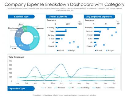
This slide showcase company expense breakdown dashboard with major categories and employee spending. It includes major categories such as- total expense, employee spending etc.
People who downloaded this PowerPoint presentation also viewed the following :
Company expense breakdown dashboard with category with all 2 slides:
Use our Company Expense Breakdown Dashboard With Category to effectively help you save your valuable time. They are readymade to fit into any presentation structure.
FAQs for Company expense breakdown
Start with your big money drains - payroll, rent, utilities, marketing. Track spending trends over time so you catch problems early. Budget vs actual comparisons are clutch for seeing where you're bleeding money. Break things down by department too, and throw in cost per employee metrics. If you've got approval workflows, show pending stuff. Honestly, I'd rather have something simple that everyone can actually understand than some fancy dashboard nobody looks at. The whole point is one quick glance tells you where your cash is going and whether you're screwed or not.
Honestly, dashboards are game-changers for catching spending patterns you'd totally miss otherwise. Like, you'll spot which departments are blowing their budgets or if you're getting double-charged by vendors. The charts make weird stuff super obvious - suddenly you're like "wait, why did marketing spend 40% more this quarter?" You can dig into specific categories, compare months side by side, and set alerts for spending spikes. Oh, and definitely start with your biggest expense buckets first since that's where the real money is hiding.
Honestly, donut charts are your best bet for expense breakdowns - they show proportions really well. Bar charts work too, especially if you've got tons of categories since pie charts get messy fast. Have you ever tried treemaps? They're actually pretty cool for showing spending hierarchies, though most people skip them. Don't bother with line charts since you're not tracking trends here. I'd start with a donut for the big picture, then switch to bars when you want to dig into subcategories. Way cleaner that way.
Weekly updates work best for most people, though daily's obviously better if you're not swamped. I've seen teams try daily and honestly? It burns out the finance folks pretty fast with all the constant data requests. High-spend periods are different - then you want that daily pulse. But for regular monitoring, weekly hits that sweet spot where you're current without being annoying. Just pick whatever schedule and actually stick to it so people know when fresh numbers drop. Start weekly and see how your team uses it - you can always ramp up later if needed.
So expense dashboards - there's actually a bunch of decent options out there. Power BI and Tableau are pretty powerful but they'll cost you and take some time to learn. Google Data Studio is free though, works great if you're already using Google stuff. Honestly? Sometimes I just stick with Excel or Google Sheets for basic dashboards - pivot tables do most of the heavy lifting anyway. QuickBooks and Expensify have their own reporting built in too, which is nice if you want something that just works out of the box. I'd figure out what you actually need to track first, then go from there based on your budget.
Real-time data gets rid of that awful delay between spending money and actually seeing it hit your books. You'll spot budget issues way faster instead of getting blindsided later. Manual uploads are honestly such a pain and always happen at terrible timing. With live feeds, your team makes decisions on current numbers, not last week's stale data. Way fewer mistakes too since there's less manual entry involved. Oh and the accuracy improvement is pretty dramatic - missed transactions become rare. If you can swing it, definitely set up those automated feeds from your cards and accounting software.
Accessibility matters way more than people think for expense dashboards. Make sure there's good color contrast so visually impaired folks can read everything. Keyboard navigation is a must - not everyone uses a mouse. Also, don't just rely on colors for expense categories because that's useless for colorblind users. Throw in some icons or patterns instead. Your fonts need to be big enough that people aren't squinting at their screens all day (seriously, why do so many dashboards have tiny text?). Clickable stuff should actually be clickable - meaning big enough to hit easily. Test it with real users first.
Honestly, having a dashboard is a game-changer because you can see exactly where your money's going in real-time. No more waiting for those monthly reports that are basically useless by the time you get them. You'll catch stuff early - like when marketing goes crazy over budget or travel expenses start piling up again. Plus the visual format makes it dead simple to show your team what's happening. I'd definitely set up alerts for budget limits so you don't get any nasty surprises. Makes reallocating funds way easier too when you can actually see the patterns.
Don't cram everything onto one screen - seriously, it's like visual overload. Group your smaller expenses into "Other" instead of listing every tiny thing. Pie charts? Only use them if you've got 4-5 categories max, otherwise they look like a hot mess. I learned this the hard way when I made charts so small nobody could actually read them. Keep your time periods the same across all charts or people won't know what they're comparing. Start with your biggest expense categories first, then let people dig deeper if they want the nitty-gritty details.
Throw in some trend lines and comparison charts - they'll show you patterns over time next to your current spending. Month-over-month percentages right beside the numbers help you catch whether things are creeping up. Side-by-side bar charts are honestly way better than those messy combined graphs that try to do everything at once. A "same period last year" column gives you instant context too. The whole point is making historical stuff visible immediately instead of buried in some separate report you'll never actually look at. Makes spotting trends so much easier when it's all right there.
Okay so first thing - set up role-based access so random people can't peek at your expense data. Multi-factor authentication is a pain but trust me, you need it for anything money-related. Encrypt everything - data moving around AND stored data. Back up regularly with encryption too. Oh, and data masking is clutch if you have users who need dashboard access but don't actually need to see the real numbers. I'd probably run security audits every few months just to stay ahead of any issues. Better safe than sorry with financial stuff, you know?
Dude, you HAVE to get user feedback or you'll build something nobody wants to use. Trust me on this one. Ask people what expense categories they actually care about and how they like seeing data presented. I've watched so many teams waste months building dashboards that just sit there collecting digital dust. Talk to your key stakeholders first - what's driving them crazy about current expense reporting? Which time periods do they need? Then build piece by piece based on what they tell you. Short interviews upfront will save you tons of headaches later.
Honestly, expense dashboards are game-changers for getting departments to actually talk to each other about money. When everyone can see what marketing spent versus IT, those weird budget surprises in meetings just disappear. I remember the first time I saw one - kind of shocking how much stuff adds up. Finance stops being the villain constantly asking for explanations because now everyone's proactive about their spending. Departments can back up their requests with real data. Plus you'll spot collaboration opportunities you never noticed before. It's like having x-ray vision for company spending, which sounds dramatic but it's true.
Dude, segmentation is a game changer - you'll actually know where your cash is disappearing instead of just seeing one massive number that makes you panic. Break it down by department, project, whatever works for you. Like, "$50K spent last month" tells you nothing useful, but "$30K on marketing, $5K on IT" - now we're talking. You can spot weird patterns, catch overspending before it gets crazy, and figure out who needs more budget (or less, honestly). My old boss used to just wing it until we started tracking by team. Start with categories that make sense for how you guys actually spend money.
Honestly, dashboards are total lifesavers for compliance stuff. They automate all that boring reporting so you don't have to manually track expense categories or hunt down weird spending patterns. Real-time monitoring is clutch. You'll never again be scrambling at month-end trying to pull data from like five different systems - trust me, that's the worst. Plus everything stays consistent across reports, which auditors actually love. It'll automatically flag anything that breaks your spending rules too. Just make sure your data sources aren't garbage or you'll look dumb when someone questions your numbers later.
-
Great designs, Easily Editable.
-
Excellent Designs.