


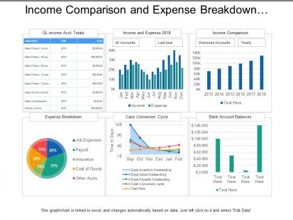
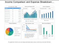
Income comparison and expense breakdown utilities dashboard




Try Before you Buy Download Free Sample Product
 Impress Your
 Audience
 100%
100% Editable
 Save Hours
 of Time


Be the darling of the audience with our Income Comparison And Expense Breakdown Utilities Dashboard. Woo them with your ideas.
People who downloaded this PowerPoint presentation also viewed the following :
Income comparison and expense breakdown utilities dashboard with all 5 slides:
There are some points you need to emphasise. Earmark them with our Income Comparison And Expense Breakdown Utilities Dashboard.
FAQs for Income comparison and expense
Honestly, most dashboards are garbage because people cram too much stuff on them. Pick your 3-5 most important numbers and put those front and center - no scrolling required. Real-time data is clutch if you can swing it. Keep the design super clean with consistent colors and fonts. I swear half the dashboards I've seen look like someone just vomited charts everywhere. Fast loading matters too. Here's the thing though - start by figuring out what decisions your team actually needs to make first, then work backwards from there.
Look, charts and graphs are total game-changers for dashboards. Nobody wants to stare at endless rows of numbers anymore - we're all too busy for that nonsense. Bar charts and heat maps let people spot problems in like 3 seconds flat. Plus consistent colors and formatting just makes everything flow better when you're walking through the data. I'd honestly start by swapping out your messiest tables for simple visuals first. Progress bars are clutch too since they show what's urgent. Your team will actually understand what you're presenting instead of glazing over.
Honestly? Just go with Tableau or Power BI - they're both solid choices for making really nice-looking dashboards. Power BI might be easier if you're already using Microsoft stuff. Google Data Studio is decent too and won't cost you anything, which is always a win. You'll probably need Excel for cleaning up your data first (unless you're into Python, but that's a whole other thing). My advice: pick whichever one your company already pays for and just get really good at it. Don't bounce around between tools - you'll never actually master any of them that way.
Figure out what decisions your dashboard actually needs to support first - that's where your key metrics live. Work backwards from the specific actions people will take when they see the data. I've watched too many teams dump every chart they can think of onto one screen (total nightmare). Stick to 5-7 metrics that actually connect to your goals. Each one needs someone who can jump in when things get weird. Run it by real users for a week. Then cut anything that doesn't spark actual conversations or decisions.
Honestly, the worst thing you can do is cram everything onto one screen - it's like visual overload. Make sure your fonts aren't tiny and use good color contrast (I've debugged way too many unreadable dashboards). Put your most important stuff up top where people actually look. Oh, and don't go crazy with different chart types just because they look cool. Stick with consistent styling throughout. White space isn't wasted space - it helps people focus. Test it with real users before you ship anything, trust me on that one.
Honestly, dashboards live or die by UX. People bail fast if they can't find what they need – I've seen beautiful dashboards that nobody touches because they're just too confusing. Start by figuring out what decisions your users actually need to make, then build around that. Put the critical stuff front and center, organize everything logically, and don't clutter it up with nice-to-have metrics that just add noise. Think about their workflow too. Are they checking this daily or just for monthly reports? That changes everything about how you'd design it.
So there are basically three types you'll run into. Operational ones are for real-time stuff - like monitoring customer service queues or checking if systems are down. Then you've got analytical dashboards that help you spot trends and dig into patterns (monthly sales, user behavior, all that). Strategic dashboards are more the executive-level view - quarterly revenue, market share. Honestly? Most teams end up using all three because different people need different info. I'd say start with figuring out what decisions your audience actually needs to make, then match the dashboard type to their timeline. Works way better than trying to cram everything into one massive dashboard.
Honestly, real-time data is a game changer for dashboards. You'll stop refreshing like crazy hoping for updates. When something breaks or sales suddenly spike, you know immediately instead of finding out way too late. Your team actually trusts what they're seeing because it's current, not some stale snapshot from yesterday. The thing is, not every metric needs to be real-time - that'd be overkill. Figure out what absolutely has to update live versus stuff that's fine refreshing daily. Makes your whole dashboard feel more like mission control than just another boring report.
Honestly, color is huge for dashboards because people need to scan data fast. Pick a primary color for your most important stuff first. Then build out from there, but cap it at 3-4 colors total or it gets messy. Skip the red/green thing - I know it seems obvious for good/bad data, but it's so overdone plus colorblind people can't see it. Blue and orange work way better, or just change how saturated the same color is. Use darker shades for your main metrics, lighter ones for background info. Creates that visual hierarchy without being annoying about it.
Dude, interactive dashboards are seriously a game changer. People actually want to click around when you give them filters and drill-downs instead of just staring at boring static charts. It's kinda like the difference between watching TV versus playing a game - one keeps you zoned out, the other gets you hooked. Users dig being able to slice the data however they want to answer their own questions. Honestly, I've seen dashboards that nobody touched suddenly become everyone's go-to once they added simple hover tooltips. Start basic with clickable stuff and filters. You'll notice people hanging around way longer.
Put your most important metrics right at the top - single column layout works best. Make those buttons at least 44px so people don't get frustrated trying to tap them. I'd honestly cut out anything that's not super critical, mobile screens are just too cramped otherwise. Collapsible sections help a ton with the clutter. Oh, and definitely test on real phones, not just your browser made smaller (learned that one the hard way). Users can always tap for more details if they need them. Start with your top 3-5 KPIs and go from there.
First thing - check your data sources are actually clean and reliable. Set up automated checks too because I learned this lesson when our Q3 numbers were totally off from a busted API connection. Super embarrassing. You'll want clear rules about who can change what data, plus timestamps so people know if they're looking at fresh info. Alerts help catch weird spikes or drops. Oh and document how you calculated everything - sounds boring but trust me, future you will thank you when someone asks "wait, how'd we get this number?" Regular spot-checks against source systems don't hurt either.
Think of dashboards as your data command center - they're honestly a game changer. You get all your important metrics in one visual place instead of hunting through endless spreadsheets (ugh, the worst). Real-time insights are clutch when you're in meetings or when things start going off the rails. No more guessing what's actually working. I'd focus on metrics that directly tie to your biggest business goals though - otherwise you'll just have pretty charts that don't really help you make decisions.
Think of your dashboard like telling a story - big picture KPI goes right at the top as your "headline." Then walk people through the supporting details that explain what's actually happening behind those numbers. I totally used to just dump charts everywhere until someone taught me this trick! Short sentences work great. Use callouts or annotations to guide people through the flow naturally. The whole point is figuring out what story your data's trying to tell, then organizing everything so users can follow it from "oh interesting" to "now I know what to do." Makes such a difference honestly.
So dashboards are getting way smarter - think AI that spots weird patterns and actually tells you what to do about them instead of just showing pretty charts. Real-time collaboration is huge too. Mobile design isn't optional anymore since everyone's checking data on their phones (I'm guilty of this). Voice commands are picking up steam - you can literally ask "how'd we do last quarter?" without hunting through menus. Oh, and everything's getting more personalized based on your role. Focus on what'll genuinely help your users though, not just flashy features that look impressive in demos.
No Reviews