


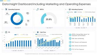
Data insight dashboard snapshot including marketing and operating expenses


Try Before you Buy Download Free Sample Product
 Impress Your
 Audience
Editable
of Time


Our Data Insight Dashboard snapshot Including Marketing And Operating Expenses are topically designed to provide an attractive backdrop to any subject. Use them to look like a presentation pro.
People who downloaded this PowerPoint presentation also viewed the following :
Data insight dashboard snapshot including marketing and operating expenses with all 2 slides:
Use our Data Insight Dashboard Snapshot Including Marketing And Operating Expenses to effectively help you save your valuable time. They are readymade to fit into any presentation structure.
FAQs for Data insight dashboard snapshot including marketing
Pick metrics that actually move the needle - revenue, customer acquisition costs, conversion rates, engagement stuff. Don't get sucked into vanity metrics (page views are the worst offender honestly). Operational things like response times matter too if they affect real decisions. Show current numbers AND trends so you can catch patterns early. Here's my rule: if a metric doesn't make you want to DO something, ditch it. Oh and each one should answer "so what?" Start small with maybe 5-7 core ones, then build from there.
Okay so data visualization is basically taking boring spreadsheet numbers and turning them into something your brain can actually understand fast. Like, I've watched people stare at endless rows of data for hours when a simple bar chart would've shown them the answer in seconds - it's kinda painful to watch honestly. The trick is picking the right visual for what you're trying to prove. Scatter plots work great for seeing if two things are connected, heat maps show you where the action is happening, and line charts are perfect for tracking stuff over time. Just ask yourself what story you're telling first, then figure out how to show it. Makes the whole process way less overwhelming.
Put your biggest metrics right at the top - people need to see the important stuff in like 3 seconds max. Group similar data together and don't cram everything in there. I swear, some dashboards look like someone just vomited numbers everywhere! Use the same colors throughout and make sure it actually works on phones too. Quick test: if someone needs you to explain how to read it, you messed up. Oh, and definitely have real people try it out first - you'll catch weird stuff you never thought of.
Honestly, real-time data is what separates useful dashboards from fancy wallpaper. You'll catch problems as they're happening instead of discovering them way too late. I've watched teams make terrible calls because their data was hours old - not fun. Live updates mean you can actually react to performance changes, user behavior shifts, whatever matters to your business right now. Pretty charts are nice, but they're useless if they're showing yesterday's story. Figure out which data sources actually need real-time feeds first though. Some stuff can wait for daily refreshes.
Oh, so audience segmentation is just showing different people the dashboard stuff they actually care about. Like your sales guys don't want to see marketing's conversion funnel data, you know? Custom views work way better than dumping everything on everyone. Think of it like Netflix recommendations - you get action movies, your mom gets rom-coms. First figure out what each team actually uses to make decisions (this part's kinda tedious but worth it), then build their dashboards around those specific metrics. Way less overwhelming for everyone.
Think of your dashboard like telling a story - big picture first, then dive into the details. I usually start with whatever metric matters most, then explain why those numbers look the way they do. Honestly, the best dashboards feel like you're just walking someone through what happened to the business. Don't forget to call out the weird stuff - those random spikes that'll make people wonder what's going on. Make it flow visually so their eyes follow your logic. Oh, and always end with "so what does this mean" or what they should actually do about it.
So for dashboards, Power BI is honestly where I'd start - it's gotten really good and plays nice with most stuff. Tableau's more powerful but pricey. If you're broke, Looker Studio works fine (used to be Google Data Studio). Grafana's solid too if your team doesn't mind getting their hands dirty with open source. I'd probably just grab the Power BI free trial first though. Oh and don't overthink it - half the battle is just picking something that connects to whatever data sources you're using.
Pick your top 3-5 KPIs and call it a day - cramming everything in just creates noise. Set up alerts for threshold breaches so you're not glued to screens all day (seriously, life's too short). Make the important stuff pop visually. Your data needs to refresh often enough to actually matter for decisions you're making. Design for quick glances, not deep dives - save detailed breakdowns for when you drill down. Oh, and work backwards from the decisions these numbers should drive. That's where I'd start anyway.
Honestly, the biggest mistake is cramming way too much stuff on one screen. I've seen dashboards that look like a spreadsheet exploded everywhere - total nightmare. Figure out what decisions your users actually need to make first, then build around that. Don't get sucked into vanity metrics that look cool but are basically useless. Keep your charts simple - if people need a manual to understand a basic graph, you've gone too far. Oh, and test it with real people early! You'll catch so many issues you never saw coming.
Look, if your dashboard sucks on mobile, people just won't use it when they're out of the office. Your team needs to check data during meetings or when they're traveling - that's kinda the whole point of real-time insights, right? Most dashboards still prioritize desktop which is honestly ridiculous at this point. I'd test it on your actual phone regularly, not just resize your browser window (we've all done that lol). Focus on your most critical metrics for small screens. Otherwise you're missing out on quick decisions when they matter most.
Start with customer data - that's pure gold for figuring out what people actually want. Sales and marketing metrics come next, plus your main business KPIs. Financial stuff is obviously important but don't go crazy trying to connect every single data source right away. Pick the cleanest, most reliable ones first. Market trends and competitor data are nice bonuses if they're easy to grab. Honestly, I've seen too many people get overwhelmed trying to do everything at once. Better to nail a few high-impact sources then build from there.
Honestly, feedback mechanisms are the only way you'll know if your dashboard actually helps people or just sits there looking nice. Users rating insights or flagging confusing charts gives you real data on what works. Simple thumbs up/down buttons work great to start - way better than guessing what people need. Then throw in comment boxes for the stuff they actually use. It's basically having a conversation instead of shouting into nothing. Plus you'll catch blind spots you'd never notice just staring at the data side of things.
Honestly, it's all about knowing what each person actually does with your data. Executives just want the big picture - quick summary cards they can glance at between meetings. Managers need the operational stuff so they can catch problems and make calls. Analysts? They're gonna dig into everything anyway, so give them all the filters and granular data they want. Way better to build separate views for each group instead of cramming everything into one messy dashboard that nobody loves. Just ask yourself - what decisions is each person trying to make? That'll tell you exactly what they need to see.
Red screams "something's wrong" while green feels like success - our brains just get it automatically. For primary data, blue works perfectly since it feels trustworthy. Orange is killer for highlighting important stuff. I'd stick to maybe 3-4 colors tops because more than that looks messy as hell. Keep backgrounds neutral so your actual data stands out. Oh, and definitely check your colors with a colorblind filter! Way more people than you'd think can't tell red from green. Consistent color rules across all your charts makes everything way easier to read.
Set up automated validation rules first - they'll catch the worst stuff like missing data or crazy outliers before anyone sees them. Trust me, way better than explaining why sales look like -$1M. Also add timestamps so people know if they're looking at stale data (honestly this saves so many headaches). You want clear data lineage too - basically being able to trace where each number actually comes from. Oh and run regular audits comparing your dashboard against the original source systems. That validation step though? Start there. It'll handle like 80% of your data quality problems right off the bat.
-
Enough space for editing and adding your own content.