



 0 Comment
 Customer Reviews

Do you know where your business's running expenditures are going? The truth is that on a real-time basis, the majority of companies do not. You're already behind if you still have to go through spreadsheets or wait for reports at the end of the month to figure out how you spent your money.
If you don't keep track of your operating expenditures (OPEX), they may swiftly eat into your earnings. Every decision you make about operations, from hiring workers to buying supplies, impacts your bottom line. That's why successful businesses use OPEX Dashboards to track spending, where it goes, and how they can make it better.
The OPEX Dashboard Templates from SlideTeam are designed to make this easy. You can easily keep an eye on cost analysis, performance indicators, and budget monitoring using these dashboards without having to look at a lot of unprocessed statistics. These templates provide you real-time information that helps you make faster, wiser choices, whether you're a company owner or operations manager.
These PPT Templates make every department more open and organized, whether it's for allocating resources, improving processes, or making improvements all the time.
Let’s explore!
Template 1: Annual Financial Health Assessment with KPI Dashboard
This PPT Template displays a full yearly financial health evaluation that includes KPI measurements in visually appealing charts and graphs. The layout features circular progress indicators for profit margins, OPEX breakdowns, and EBIT trend analysis, as well as a structured income statement. The use of graphics like trend lines, bar charts, etc. enhances understanding as well as visual appeal of the slide. This template is suitable for business analysts, finance managers, and consultants who are delivering annual performance reports. Download now!

Template 2: Financial Report Dashboard for Assessing Business Profits
This PowerPoint Template presents a financial dashboard meant to measure company revenues through smart data display. The layout includes critical profit margins, monthly OPEX monitoring charts, earnings overviews, and a comprehensive income statement breakdown. The design features summary sections and important information panels for tracking efficiency. Financial analysts, company managers, and business leaders can use this template to give profit evaluations and financial performance reports.

Template 3: Dashboard to Track Business Financial Performance Post Strategy Implementation
This PowerPoint Slide illustrates an exhaustive business information dashboard designed to track financial performance after plan execution. The structure includes revenue analysis, income statements, and KPI dashboard components including profit margin metrics and payment data. The template offer a clear visual representation of growth in revenue and operational shortcomings. Grab it now!

Template 4: KPI Dashboard to Measure Strategic Financial Performance
How can companies correctly evaluate their strategic financial health at a glance? This PowerPoint Template features a thorough KPI dashboard with circular progress indicators for major profit margins, earnings trend analysis, and a full income statement. The structure provides effective performance tracking through visual data display and budget tracking via month-to-month comparisons. This template is suitable for financial analysts, company strategists, and department heads who want to track and communicate strategic financial data. Grab today!

Template 5: IT Team Project Operational Analytics Dashboard
Managing IT project performance demands continuous access into many operational KPIs. This PowerPoint Template consists of a complete operational reporting dashboard with strategic insights. It covers investment tracking, revenue evaluation, and project completion dates. The layout also includes customer satisfaction statistics, monthly expenditure breakdowns, and SLA status monitoring. Circular charts, bar graphs, and stacked visualizations enable effective resource allocation decisions as well as improves visual appeal of the slide. Download today!

Template 6: Profit and Loss Dashboard Indicating OPEX and EBIT
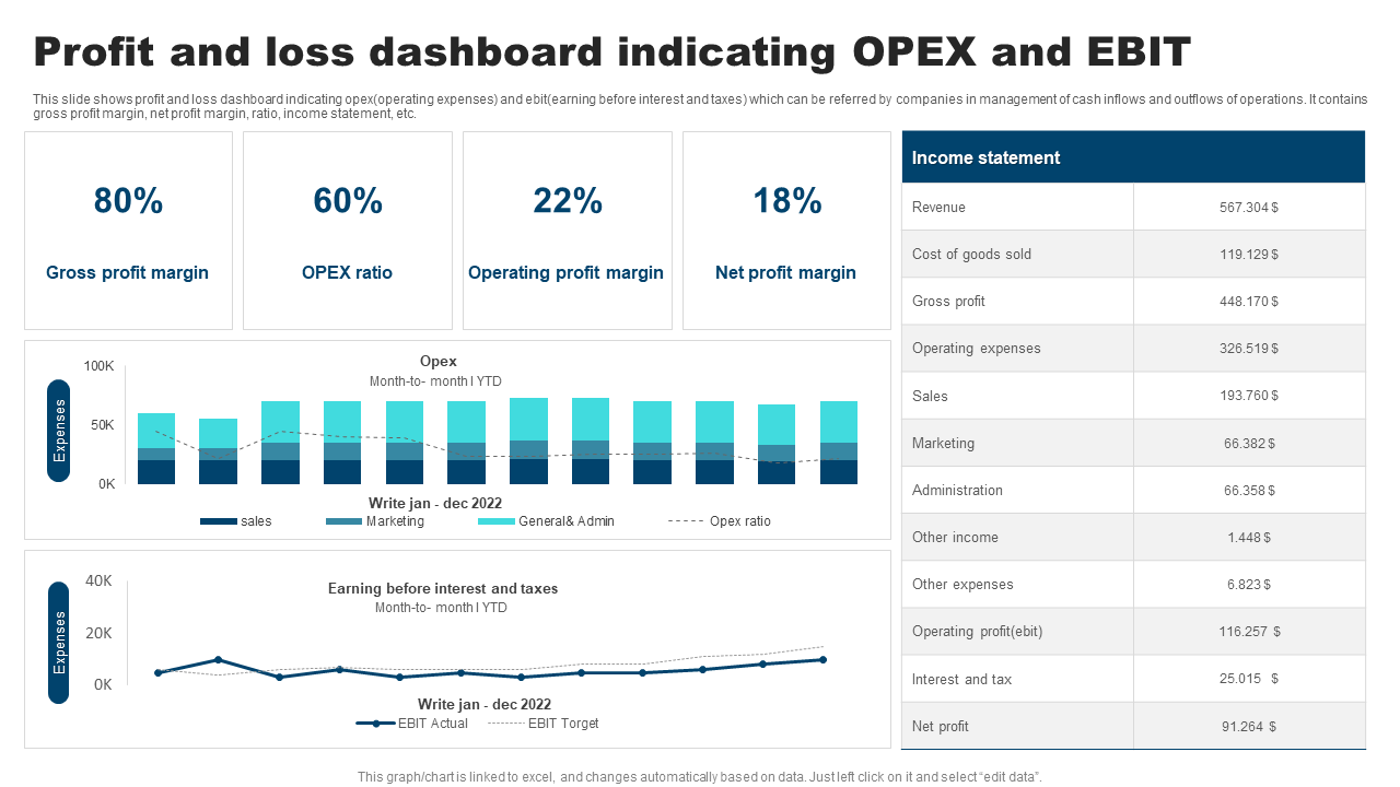
This PowerPoint Slide presents a complete profit and loss dashboard that analyzes OPEX and EBIT performance using straightforward financial measures. The layout includes noticeable percentage indications for crucial profit margins. It provides thorough OPEX tracking with easy month-by-month comparisons. These comparisons include the sales, marketing, and administrative categories. The template also contains an EBIT trend analysis that compares actual and projected performance lines. In addition, it presents a comprehensive income statement summary for in-depth financial analysis. Financial analysts, company controllers, and executive teams can use this template for presenting profit and loss statements. Download now!
Template 7: OPEX to Sales Ratio Dashboard of Company Over Years
This PowerPoint Template presents an in depth OPEX to sales ratio dashboard designed to monitor a company's financial performance over time. The layout comes with an evident gauge that shows the current ratio for easy financial review. It provides an overview of overall costs, a sales comparison, and a year-over-year trend analysis for 2021 to 2025. Bar charts show category breakdowns, displaying the top and worst performing parts. This template allows for efficient budget monitoring and ratio analysis for strategic decision-making. Grab it today!

Template 8: OPEX Dashboard Indicating Revenue and Costs Metrics
Effective cost management requires complete awareness of operating expenses across several company dimensions. This PowerPoint Template features comprehensive operational reporting with a full cost center breakdown and a centered donut graphic. It includes revenue per headcount comparisons across companies and detailed revenue tables with company codes. The framework allows for strategic budget management as well as informed resource allocation options via visual expenditure classification. Download today!

Template 9: OPEX Monitoring Dashboard with Budget Analysis
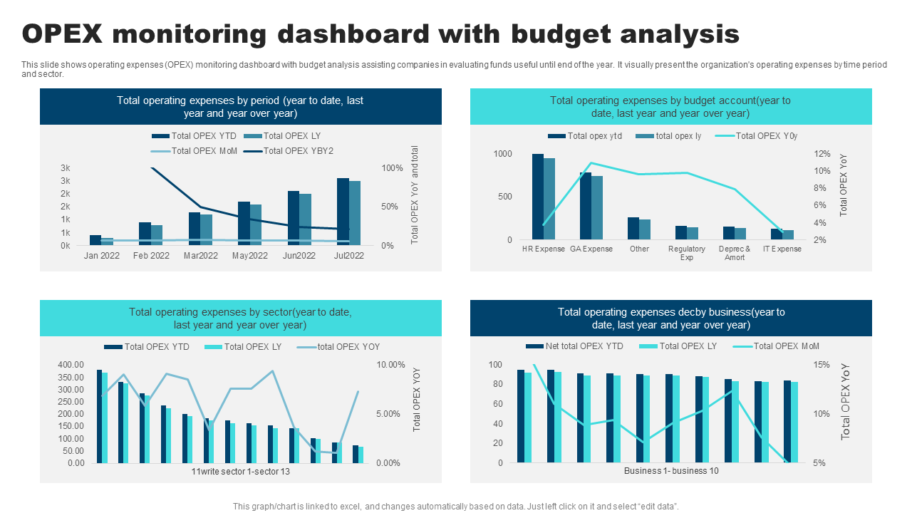
How can businesses successfully track operational spending versus budget allocations throughout multiple time periods and business divisions? This PowerPoint Template provides complete operational reporting with four separate analytical viewpoints. It offers keeping track of spending from period to period, budget account analysis, expenditure breakdowns by sector, and business unit comparisons. The design incorporates bar charts, line graphs, and dual-axis visualizations that allow for budget tracking and year-over-year performance analysis. Grab today!
Template 10: Sales and Operations Dashboard for Ecommerce Business
This PowerPoint Template illustrates a complete sales and operations dashboard created exclusively for ecommerce companies. The structure has four important performance indicators that display total sales, brands, income, and units sold. It is accompanied with significant revenue analysis charts for more financial understanding. It also contains age-based category breakdowns and gender-specific sales distribution graphs. Ecommerce managers, digital marketing teams, business analysts, and online store managers may all benefit from this template. Grab it now!

KNOW REAL STATUS IN REAL-TIME
With SlideTeam’s Dashboard Templates, you can track KPIs, see how things are going in real-time, and save expenditure. These templates help in planning better, making better choices, and keeping better track of your money. The above-mentioned pre-designed, entirely editable dashboards help you in remaining on track with business objectives including cost saving , enhancing processes, or keeping better track of your budget.
PS: Follow this link for our top operational dashboard templates with samples and examples now!
FAQs
1. What KPIs are used to measure operational cost efficiency?
Some KPIs that showcase how a business keeps its operating expenses under control include:
- Cost per Unit, which tells you how much it costs to create one item
- Operating Expense Ratio, which compares all of your expenditures to all of your profits.
- Labor Cost Percentage shows how much money is spent on workers.
- Inventory turnover indicates how frequently items are sold and replaced, which helps keep storage costs down.
- Tracking energy and utility costs is another way to save money.
2. How is departmental or cost center-level spending monitored?
We keep an eye on departmental or cost center-level expenditure by reviewing how much money each department is spending on a regular basis. Managers maintain track of expenditure using reports and cost monitoring technologies, and they create budgets ahead of time. A department is highlighted for review if it spends too much or too quickly. To make sure the money is being spent correctly, finance teams compare what was actually spent to the budget.
3. How is the OPEX-to-revenue ratio represented?
The OPEX-to-revenue ratio reveals how much of a company's income goes toward operational costs. OPEX is the money a firm spends on things like paying employees, rent, and utility bills to keep things running smoothly. To get the ratio, divide total revenue by operational expenditures. A lower ratio is desirable since it indicates the organization is making more money while spending less.