


Risk Management Kpi Dashboard Showing Cost Of Control And Risk Score





Try Before you Buy Download Free Sample Product
 Impress Your
 Audience
 100%
100% Editable
 Save Hours
 of Time


Our Risk Management Kpi Dashboard Showing Cost Of Control And Risk Score ensure a cozy feeling. They will fit your thoughts like a glove.
People who downloaded this PowerPoint presentation also viewed the following :
Content of this Powerpoint Presentation
Description:
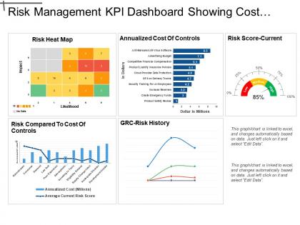
The image contains multiple visual elements that form a comprehensive Risk Management KPI (Key Performance Indicator) Dashboard with a focus on displaying the costs associated with various risk controls.
1. Risk Heat Map:
A grid that plots 'Impact' against 'Likelihood', showing relative risk levels using color codes (green for low risk, yellow for medium risk, orange for high risk, and gray for no data). Each cell within the grid contains a number corresponding to specific risks.
2. Annualized Cost of Controls:
A bar graph indicates the monetary amount (in millions of dollars) spent on various risk control measures, such as anti-malware solutions, advertising budgets, financial compensation, insurance policies, and more.
3. Risk Score-Current:
Represented by a speedometer-style gauge showing the organization's overall current risk level at 85%, categorized as 'high'.
4. Risk Compared to Cost of Controls:
A dual-axis chart comparing the average current risk score (line) with the annualized cost (bar) for various risk controls, suggesting the cost-effectiveness or ROI of these controls.
5. GRC-Risk History:
A chart tracking the history of Governance, Risk Management, and Compliance (GRC) over time, plotting three unidentified variables through a line graph.
A note in the bottom right corner indicates that the data in the charts/graphs is linked to an Excel spreadsheet and can be updated by clicking on the chart and selecting "Edit Data."
Use Cases:
This dashboard-style can be applied in a variety of industries, providing strategic insight for decision-makers:
1. Finance:
Use: Tracking financial risks and the cost-effectiveness of mitigation strategies.
Presenter: Chief Financial Officer or Risk Manager.
Audience: Board members, investors, financial analysts.
2. Information Technology:
Use: Monitoring cybersecurity risks and investments in IT security measures.
Presenter: Chief Information Security Officer.
Audience: IT management team, stakeholders, cybersecurity personnel.
3. Healthcare:
Use: Managing patient safety risks and associated control costs.
Presenter: Head of Risk Management.
Audience: Hospital administration, healthcare providers, compliance officers.
4. Insurance:
Use: Analyzing risks and operational control costs for underwriting and claims management.
Presenter: Actuary or Risk Analyst.
Audience: Underwriters, claims adjustors, insurance executives.
5. Manufacturing:
Use: Assessing the impact of supply chain disruptions and quality control risks against their mitigation costs.
Presenter: Operations Manager.
Audience: Production managers, quality assurance teams, supply chain partners.
6. Energy:
Use: Evaluating infrastructure risks and regulatory compliance costs.
Presenter: Energy Risk Management Specialist.
Audience: Regulators, environment, health and safety officers, operations staff.
7. Retail:
Use: Understanding customer data breaches risks and loss prevention expenses.
Presenter: Chief Risk Officer.
Audience: Retail executives, data protection teams, store managers.
Risk Management Kpi Dashboard Showing Cost Of Control And Risk Score with all 6 slides:
Conquer the floor with our Risk Management Kpi Dashboard Showing Cost Of Control And Risk Score. Get folks clapping and clamoring away.
FAQs for Risk Management Kpi Dashboard Showing Cost Of Control
Start with incident frequency and severity - that's your bread and butter for seeing if risks are actually hitting. Track exposure levels by category, how fast you're knocking out mitigation tasks, and resolution times. Compliance scores and audit stuff are boring but keep the executives off your back, so include those too. Leading indicators like assessment completion rates help catch problems early. Oh, and don't forget training metrics - people always skip those. Cap it at 6-8 KPIs initially. You'll want to add more later once everyone gets the hang of it.
Honestly, start with what actually matters to your business goals first. If you're pushing for revenue growth, focus on operational risks that could tank that plan. Don't let your risk team pick metrics in a vacuum - get both sides talking. I've watched so many companies track completely irrelevant stuff! Your KPIs should answer "how does this mess with our targets?" not just list every possible risk. Also, check these quarterly since priorities change constantly. And yeah, make sure the executives actually use this data for decisions, otherwise you're just making pretty charts nobody reads.
Honestly, heat maps are your best friend here - red for high risk, yellow for medium, green for low. Super intuitive. You'll want to show current status plus trends over time, so throw in some sparklines next to your main metrics. Risk matrices work great too because people just get them immediately. Put your scariest risks at the top and don't cram too many KPIs on one screen (learned that the hard way). Make sure you can click through from high-level views down to detailed registers. Oh, and set up alerts when risks hit your thresholds - way better than babysitting dashboards all day.
Monthly updates work for most companies, but it really comes down to your industry. Fast-moving sectors or high-risk stuff? Go weekly. More stable operations can probably get away with quarterly, though I wouldn't push it. Pick whatever frequency makes sense and stick with it - your team needs reliable data they can count on. Don't just update the numbers either. Actually look at whether you're still measuring the right things. And honestly, set up those automated alerts for critical stuff so you're not sitting around waiting for the next update when things go south.
Power BI is probably your best bet, especially if you're already using Microsoft stuff. Way cheaper than most alternatives too. Tableau's got more bells and whistles for customization, but honestly? Most people don't need all that fancy stuff. Both handle complex risk data pretty well though. If you're feeling ambitious, Excel with Power Query actually works better than you'd think - I've seen some surprisingly decent dashboards built that way. But yeah, I'd still go with Power BI first. It plays nice with most risk systems and you won't spend forever setting it up.
Track stuff that actually matters - incident frequency, how fast you fix things, what each incident costs. Don't just look at lagging indicators like actual losses. Leading ones matter too, like training completion rates or how your controls test out. So many teams obsess over metrics that look impressive in presentations but tell you nothing useful (guilty of this myself). Trends over time beat single snapshots every day. Set up alerts when your KPIs go sideways so you're not finding out about problems three months later in some boring quarterly review.
Dude, you've gotta talk to the people who'll actually use this thing. Hit up your executives, department heads, the managers - figure out what's keeping them awake at night worrying about risks. Trust me, I've watched so many beautiful dashboards just sit there unused because nobody bothered asking what people actually needed. Your CFO cares about totally different stuff than operations does - one wants financial exposure, the other's all about incident rates. Get them involved early and check back regularly. Their priorities shift constantly. Oh, and don't make it too pretty if it won't be functional - that's just expensive wall art.
So quantitative KPIs are your hard numbers - incident counts, financial losses, compliance rates, that kind of stuff. Way easier to put on dashboards and show trends over time. Qualitative ones are trickier since they're more subjective, but they capture things like how mature your risk culture is or whether stakeholders actually trust what you're doing. Here's the thing though - I'd argue the qualitative metrics actually tell you more about if your program's working. Numbers are great for exec reports, but the softer stuff helps you spot gaps you'd totally miss otherwise. You need both, just use them differently.
Don't cram everything onto one screen - seriously, I've watched teams do this and people just stop using the dashboard completely. Historical data means nothing without context or benchmarks to compare against. Focus on 5-7 metrics that actually connect to business results, not just pretty numbers that make executives feel good but don't change anything. Oh, and definitely test it with real users first - like, actually sit with them and watch them try to use it. You'd be surprised how confusing something can be when you're not the one who built it.
Honestly, tech just kills all that tedious manual tracking stuff and makes your data way more solid. Instead of waiting around for monthly reports, you'll get real-time dashboards. Automated alerts ping you when metrics go wonky. The predictive stuff is pretty cool too - catches trends before they blow up into actual problems. Integration tools grab data from everywhere automatically, so bye bye Excel nightmare! Though I still end up in spreadsheets more than I'd like. Visualization makes it dead simple to spot patterns and explain things to stakeholders. I'd start by automating whatever's eating up most of your time first.
Pull your incident data from the past 2-3 years - near-misses, actual losses, all of it. Map that against your current KPIs and see what actually predicted real problems versus what was just noise. Most companies honestly track way too much irrelevant stuff at first (guilty as charged on that one). Focus on frequency and severity patterns. What kept showing up before things went sideways? That'll show you which metrics matter and which are just vanity numbers. Use this historical context to set realistic thresholds too. Every industry's different - what's normal risk for you might be crazy for someone else.
So for those heavily regulated industries, compliance breach rates are your bread and butter - track those religiously. Regulatory capital ratios and audit findings too. Time-to-remediation matters because dragging your feet just pisses off regulators more. Financial services? Add liquidity coverage and operational risk losses to the mix. Healthcare's all about patient safety incidents and HIPAA violations. Energy companies can't ignore environmental incidents - that stuff makes headlines fast. I'd honestly start with compliance KPIs since one major fine can wreck your whole quarter. The penalties are absolutely insane in these sectors.
Dude, real-time data integration is clutch because you catch problems while they're actually happening. No more finding out weeks later through some boring monthly report. Your dashboard pulls live data from everywhere, so patterns jump out immediately - customer complaints spiking, operations going sideways, whatever. Honestly way better than the old "cross your fingers and hope" method we used to deal with. You get those early warning signals to pivot fast, move resources around, or sound alarms before everything hits the fan. Oh, and set up alerts for key stuff so you're not glued to your screen 24/7.
Look, without proper risk tracking you're basically guessing at what could hurt your business. Emerging threats? You'll miss them completely until something breaks. Response times crawl because nobody saw it coming. When budget meetings happen, good luck explaining how you're actually handling risks - that conversation gets awkward fast. Different teams end up measuring stuff their own way, so you can't even figure out what deserves attention first. Honestly, I'd just pick your 5 biggest risk indicators and start there. Get those nailed down before worrying about anything fancy.
Honestly, the biggest thing is just getting those metrics in front of people constantly. We stick ours on big screens around the office and bring them up in every team meeting. Once people can actually see the risk trends happening in real-time, they start making smarter choices without you even having to nag them about it. Connect the dashboard stuff to people's goals too - that's when they really pay attention. Oh, and use the data to celebrate wins, not just call people out when things go sideways. Nobody likes being the dashboard villain, you know? The whole transparency thing really does change how teams think about their day-to-day decisions.
-
mantul
-
Use of icon with content is very relateable, informative and appealing.
-
Very unique and reliable designs.