


Risk Management Dashboard For Information Risk Assessment And Management Plan For Information Security


Try Before you Buy Download Free Sample Product
 Impress Your
 Audience
Editable
of Time


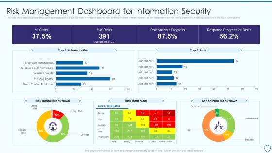
This slide showcases dashboard that can help organization to track the major information security risks and resolve them in timely manner. Its key components are risk rating breakdown, heat map, action plan and top 5 vulnerabilities
People who downloaded this PowerPoint presentation also viewed the following :
Risk Management Dashboard For Information Risk Assessment And Management Plan For Information Security with all 7 slides:
Use our Risk Management Dashboard For Information Risk Assessment And Management Plan For Information Security to effectively help you save your valuable time. They are readymade to fit into any presentation structure.


FAQs for Risk Management Dashboard For Information Risk Assessment And Management Plan
Look, track what actually moves the needle - risk exposure, how often stuff breaks, and how fast you fix it. Assessment completion rates matter too (spoiler: they're always behind). I'd throw in control effectiveness scores since those show if you're not just throwing money at problems. Compliance metrics are obvious but necessary. Budget variance keeps the finance folks happy. The real trick? Make it visual so people can spot issues without getting lost in spreadsheets. Nobody has time for that.
Honestly, visualizing your risk data is a game changer. Those endless spreadsheets with probability percentages? Nobody has time for that. Heat maps and charts let you spot problems instantly - like which regions are blowing up or what trends you missed. Our brains just work better with visuals than numbers in rows. Color-coded dashboards make it obvious what needs fixing right now versus what's chill. And here's the thing - when you're presenting to stakeholders, they'll actually stay awake if you show them compelling visuals instead of boring data tables. Trust me on this one.
Tableau and Power BI are probably your best bets - they handle complex risk data really well. If your company's already using ServiceNow or MetricStream, those work too but might be more than you need. Don't laugh, but Excel with decent pivot tables actually works fine for basic stuff when money's tight. Qlik Sense is pretty user-friendly if you've got non-tech people using it. Honestly though, I'd figure out what risk metrics you actually want to track first. Then just pick whatever fits your data sources and doesn't blow your budget. Sometimes the fanciest tool isn't the right answer.
Set up automated feeds from your source systems - APIs, database connectors, whatever works. Tableau and Power BI handle this stuff pretty well once you get the connections right. There's always that one legacy system that won't cooperate though, isn't there? Build in some validation checks so bad data doesn't slip through. Honestly, the data source compatibility thing is usually where people get stuck. Start with hourly updates, then tweak the timing based on how quickly you actually need to spot issues. Real-time sounds cool but hourly works fine for most risk stuff.
Map out risks across your business - operations, finances, regulatory stuff, cyber threats, whatever applies. Score each one on impact and probability, maybe 1-5 for both. Your dashboard should highlight the high-impact, high-probability ones first since those'll actually hurt you. Honestly, I'd throw in some black swan events too even if they seem crazy unlikely. Update everything quarterly and get input from different teams - not just the obvious departments. Keep your dashboard to 10-15 max risks though. Any more than that and you'll just stare at it without doing anything useful.
Honestly, risk dashboards are game-changers for getting stakeholders actually engaged. Everyone sees the same data instead of playing telephone with updates. You can tailor views too - execs get their bird's-eye summaries while PMs dive into the nitty-gritty action items. Visuals beat boring reports every time (seriously, who reads those anymore?). Real-time updates keep people in the loop, plus automated alerts mean they're only bothered when stuff actually matters. Just schedule regular review meetings so the momentum doesn't die. Oh, and make sure the dashboard doesn't look like it was designed in 2005.
Honestly, UX makes or breaks these things. During a crisis, you don't have time to figure out where stuff is or decode weird charts. Quick decisions need quick clarity. I've watched teams ignore gorgeous dashboards because they're impossible to use when things get crazy. Fast loading is huge too - nobody's waiting around when there's an actual emergency happening. Keep layouts simple and visual hierarchy obvious. Oh, and definitely bug your users for feedback regularly. They'll tell you what sucks way better than any design book will.
Look, historical data beats guessing every single time. You'll actually see patterns instead of flying blind - seasonal stuff, warning signs that keep popping up, trends that matter. It's honestly pretty cool how clear things become when you can spot correlations you'd never catch otherwise. Like certain market conditions always happening right before major risk events hit. Pull at least 2-3 years of data if you've got it. Then set up alerts based on what you find. Way better than that "crystal ball" nonsense people talk about.
You need both leading and lagging indicators to see what's actually happening. Track your risk exposure reduction percentages, incident trends, and how fast you detect/respond to issues. Cost avoidance numbers are gold - executives love seeing money saved from prevented problems. Compliance scores matter too since auditors always ask about those anyway. Don't skip the softer stuff like stakeholder confidence and team risk awareness. Honestly, 5-7 core metrics work way better than a data dump that nobody reads. Pick what actually moves the needle for your business first, then expand from there.
Honestly, just ask each team what stresses them out most and build from there. Sales will want credit risks and pipeline threats. IT's obsessing over cyber attacks and vulnerabilities - which makes sense these days. HR cares about compliance stuff and safety metrics. Pretty much every dashboard tool lets you set up different views for each role. The trick is letting teams pick their own alert thresholds instead of using some generic setup. I'd start simple though - don't try to track everything at once or you'll overwhelm people. Focus on what actually keeps each department awake at night.
Heat maps are your best friend here - you'll instantly see where the scary stuff lives when you plot likelihood vs impact. Red-amber-green works great for quick status updates. I'd skip pie charts completely (they're pretty useless for risk data anyway). Network diagrams help if risks are connected to each other. Trend lines? Super helpful for watching how things change over time. But honestly, don't go overboard. If people can't figure out your dashboard in like 30 seconds, you've made it too complex. Start simple with a heat map and add pieces as needed.
So basically you'd want to add forecasting models that look at your historical risk data to predict what's coming next. Heat maps work great for this - they'll show probability scores and trend indicators for your main risk factors. I'd honestly start small though, maybe pick your top 3-5 risk categories first and build models around those. Machine learning is pretty solid at catching patterns we'd totally miss. You can set up early warning alerts that ping you when things hit certain thresholds. The cool thing is these models can forecast anything from operational stuff to market volatility using data you've already got.
Don't cram everything onto one screen - people get overwhelmed fast. Those red/yellow/green lights seem helpful but they actually hide the real story behind your numbers. I've seen teams build these drop-dead gorgeous dashboards that nobody could actually use (total waste). Talk to whoever's gonna stare at this thing every day before you start building. Make sure your data's actually reliable and updates often enough to matter. Pretty colors won't save you if the underlying info sucks. Their daily workflow should basically dictate how you set everything up.
So you want your dashboard to actually get better over time? Track what alerts people ignore vs act on - that's pure gold right there. Also watch which visualizations actually lead to decisions and whether your predictions match reality. Honestly, most dashboards just sit there being static, but yours can evolve. Set up monthly reviews where your team talks through what's working and what sucks based on real usage. It becomes this thing that learns your workflow patterns. Short story: capture the feedback loop data, then actually use it to iterate. Game changer.
Start with role-based access - only show people what they need for their actual job. Strong authentication is key, so set up SSO or MFA. Session timeouts are a must because you don't want someone walking up to an unlocked screen. Encrypt everything in transit and at rest since risk data is pure gold to hackers. Audit logs will track who's looking at what and when. Here's the thing that drives me nuts though - always review access permissions regularly. People switch roles but somehow keep their old access forever! It's like digital hoarding.
-
The team is highly dedicated and professional. They deliver their work on time and with perfection.
-
Definitely a time saver! Predesigned and easy-to-use templates just helped me put together an amazing presentation.