


Risk Management Dashboard For Information Security Information Security Risk Management




Try Before you Buy Download Free Sample Product
 Impress Your
 Audience
 100%
100% Editable
 Save Hours
 of Time


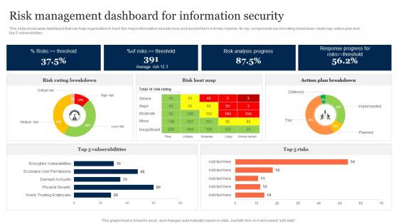
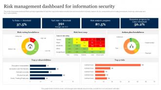
This slide showcases dashboard that can help organization to track the major information security risks and resolve them in timely manner. Its key components are risk rating breakdown, heat map, action plan and top 5 vulnerabilities.
People who downloaded this PowerPoint presentation also viewed the following :
Risk Management Dashboard For Information Security Information Security Risk Management with all 7 slides:
Use our Risk Management Dashboard For Information Security Information Security Risk Management to effectively help you save your valuable time. They are readymade to fit into any presentation structure.





FAQs for Risk Management Dashboard For Information Security Information
Start with risk exposure levels, trend analysis, and compliance status - that's your foundation. Leadership will definitely grill you about incident counts and your top risks by severity, so have those ready. Track mitigation progress too. Oh, and risk appetite vs actual exposure is huge - executives love that comparison. Keep your heat maps dead simple because honestly, fancy charts just confuse people. Real-time updates are ideal but close to it works. Don't forget regulatory deadlines you're monitoring. Build from these basics, then add whatever keeps coming up in meetings.
Heat maps are your best friend here - they'll show you problem areas instantly. Color coding helps too, so you can see what's urgent versus what can wait. Trend lines are great for tracking if things are improving or going downhill. I've noticed execs really appreciate dashboards they don't need to squint at for ten minutes to understand. Interactive charts work well because you can zoom into details without cluttering the main view. Oh, and definitely start with your biggest risks first. Pick visuals that actually tell the story your team needs to see.
Dude, you absolutely need real-time data for risk dashboards. Markets crash fast, systems go down without warning, fraud happens in seconds - monthly reports are useless for that stuff. It's like trying to drive while looking in the rearview mirror. Set up automated alerts for your biggest risk factors so the dashboard screams at you when something's off. I'd focus on maybe 3-5 key indicators that actually matter. Trust me, catching problems as they develop beats finding out after everything's already gone sideways.
Honestly, these dashboards are total lifesavers when you're drowning in risk data. You get everything in one spot instead of hunting through a million spreadsheets - which, let's be real, nobody has time for. Real-time visibility is huge because you'll actually see what's happening as it happens. The visual stuff makes explaining things to your boss way less painful too. I'd start small though - pick your top 5 risk indicators and build from there. Once you see trends and can prioritize what needs fixing first, you'll wonder how you survived without one.
Honestly, the worst part is trying to show everything important without making people's heads explode from info overload. Getting everyone to agree on what metrics actually matter? Good luck with that - it's like trying to get your family to pick a restaurant. Your data better be solid and fresh too, otherwise what's the point? Executives just want the big picture stuff while your analysts are digging into every little detail. Different people, totally different needs. I'd say start small with what you absolutely need first. Don't try building some perfect masterpiece right out the gate - you'll drive yourself crazy.
Yeah, so companies basically pick what they're most paranoid about. Healthcare goes crazy over patient safety stuff and compliance issues. Finance people obsess over market swings and credit problems. Manufacturing? Supply chain nightmares and broken equipment keep them busy. Retail's weird though - their dashboards change constantly because they're tracking inventory and seasonal trends. I'd say figure out your top 5-7 nightmare scenarios first. Then build around those. Like, what would actually make your boss freak out if it popped up red on Monday morning?
Most people go with Tableau, Power BI, or Excel for basic stuff. Excel works fine at first but gets super messy once you have complex risk data - trust me on that one. There's also specialized GRC platforms like Archer and ServiceNow, plus dedicated risk tools like Resolver and LogicGate with dashboard features built in. Teams with data science folks sometimes build custom solutions using Python or R, but that's honestly way more than most organizations need. I'd start with Power BI or Tableau - they handle risk metrics pretty well and won't fight you when connecting to existing data sources. Just pick whatever your team can realistically keep running.
Okay so three main things you gotta tackle: data sources, validation, and audits. Get someone to own each data input - like actually assign responsibility and update schedules. Automated validation rules are a lifesaver for catching weird outliers early (learned this the hard way). Your team should manually check the dashboard against source systems regularly too. Document your data flows and criteria - I know it's boring but you'll thank yourself later. Oh and definitely audit what you have now this week. Find your biggest gaps first, then work backwards from there.
Definitely automate those data refreshes - daily or weekly works best. Monthly reviews are crucial for spotting weird anomalies or metrics that don't make sense anymore. Quarterly stakeholder check-ins keep everyone aligned on what risks actually matter (trust me, priorities shift fast). Archive the dead risks nobody cares about. Add new ones as things change. Oh, and set up threshold alerts so you're not glued to the screen all day. Nothing kills credibility faster than outdated dashboards - learned that one the hard way!
Just ask your users, seriously. They'll tell you if they're wasting time hunting for alerts or if your color coding is confusing as hell. I've watched so many dashboards that looked perfect on paper completely flop because nobody bothered checking with the people who'd actually use them daily. Run feedback sessions every few months and actually make the changes they suggest. Even moving widgets around can make a huge difference. Your users know their workflows way better than you do, so let them guide what works and what doesn't.
So predictive analytics flips your dashboard from "here's what happened" to "here's what's probably coming." Pretty cool shift honestly. You can spot trouble brewing before it actually hits, which means your team can move resources around or change course way earlier. No more constantly putting out fires. But here's the thing - you need solid historical data and someone who gets how these models work. Otherwise you're just making fancy-looking guesses. I'd test it on one specific risk area first. See how accurate it actually is before you go nuts with it everywhere.
Honestly, risk dashboards are game-changers for getting departments on the same page. You know how finance always talks in numbers while ops uses flowcharts? This fixes that mess. Everyone sees the same visual story - real-time risk levels, who's responsible for what, mitigation progress, all that stuff. No more meetings where people argue over different data sources (ugh, the worst). Pick your 3-5 most important risk indicators that actually matter to all teams first. Then build around those. When everyone's looking at the same dashboard, those cross-departmental meetings become way less painful.
Honestly, dashboards are a game-changer for compliance stuff. They pull all your risk data automatically into whatever format regulators want - no more spreadsheet nightmare. You can set alerts for when metrics go crazy, and quarterly reports? Just click a button. The cool part is spotting problems before auditors show up by seeing trends across everything. Oh, and audit trails get tracked automatically which is clutch. I'd start by figuring out what reports you're doing now and see what's worth automating first. Trust me, it'll save your sanity.
Oh totally, culture massively affects how people read dashboard data. Some teammates freak out over tiny risks while others ignore major red flags - depends on their background with uncertainty. Hierarchy's huge too - junior people might not speak up even when they spot problems. Time perspective varies wildly... some focus on immediate issues, others think long-term. I learned this the hard way on a project last year. You really need different viewpoints when reviewing that stuff. Ask people directly what they think - don't just assume everyone's seeing the same patterns you are.
Definitely check out JPMorgan Chase - they cut operational risk incidents by 40% with their dashboard rollout. Boeing's another good one, their supply chain visibility improved so much they started catching disruptions weeks earlier. Even Patagonia (random but cool) uses dashboards to track sustainability risks across operations. Leadership buy-in seems crucial from what I've seen. Real-time data integration is key too. I'd honestly dig into case studies from your industry though, since approaches vary a lot based on risk profiles. Each company kinda does their own thing.
-
Great product, helpful indeed!
-
Their products can save your time, effort and money. What else you need. All in one package for presentation needs!