


Risk Management Dashboard For Information Security Cybersecurity Risk Analysis And Management Plan




Try Before you Buy Download Free Sample Product
 Impress Your
 Audience
 100%
100% Editable
 Save Hours
 of Time


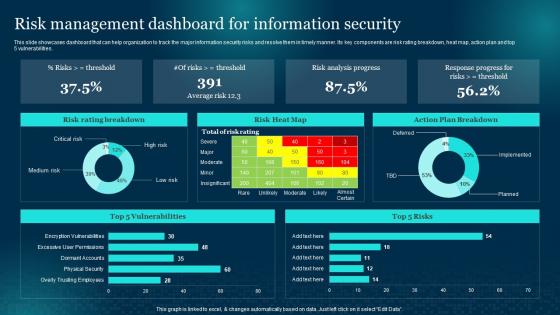
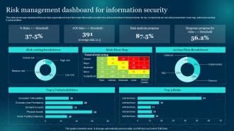
This slide showcases dashboard that can help organization to track the major information security risks and resolve them in timely manner. Its key components are risk rating breakdown, heat map, action plan and top 5 vulnerabilities.
People who downloaded this PowerPoint presentation also viewed the following :
Risk Management Dashboard For Information Security Cybersecurity Risk Analysis And Management Plan with all 7 slides:
Use our Risk Management Dashboard For Information Security Cybersecurity Risk Analysis And Management Plan to effectively help you save your valuable time. They are readymade to fit into any presentation structure.





FAQs for Risk Management Dashboard For Information Security Cybersecurity Risk Analysis
Start with the basics - risk exposure levels, how much risk you actually want vs what you're seeing, and your top emerging threats. Track your mitigation progress too. Incident trends and control effectiveness scores are honestly where you'll find the real insights about what's going down. Heat maps are solid for showing leadership where risks cluster across different units. Always show current state plus trends so they can catch patterns before they blow up. Once everyone's comfortable with these fundamentals, you can get fancier with the metrics later.
Dude, visualizations are a lifesaver for risk data. Heat maps instantly show you where problems cluster across departments - way better than staring at endless spreadsheets. Color-coded dashboards with red/yellow/green? Total game changer for figuring out what needs your attention first. You'll spot trends and outliers that would take hours to find otherwise. Interactive charts let people dig deeper when they want specifics. Honestly, even basic bar charts and gauges work magic - suddenly everyone's paying attention instead of zoning out during meetings. Your stakeholders will actually care about the data.
Dude, you absolutely need real-time data for risk management. Risks don't just politely wait around for your monthly reports, you know? Live feeds let you catch problems while they're still small instead of waiting until everything's on fire. It's like having a smoke detector vs just hoping you smell the smoke eventually. Plus, automated alerts are clutch - you're not glued to your screen 24/7 but you'll still know when something's going sideways. Honestly, trying to manage risk with old data is like driving while only looking in your rearview mirror.
First thing - figure out what actually scares your industry. Healthcare? Compliance nightmares. Tech? Getting hacked. Manufacturing? Supply chains falling apart. Build your dashboard around those specific fears, not some cookie-cutter template. Banks obsess over credit risk and capital ratios. Construction companies track safety incidents and delayed projects. Map your real vulnerabilities to the right data sources. Honestly, generic dashboards are useless - yours should reflect whatever's making your C-suite lose sleep. What keeps them pacing around at 2am? That's what belongs on your screen.
Put your biggest risks right up top where people can't ignore them. Color coding helps tons - red for scary stuff, you know the drill. Don't cram everything on one screen though, that's just chaos. I've literally seen dashboards that look like slot machines with all the flashing! Your users need to dig deeper easily, so make sure they can click through from big picture to details. Oh, and show trends over time instead of just frozen moments - way more useful. Test it with real people first because if they're confused after 30 seconds, you've lost them.
Looking at historical data basically turns your risk dashboard into a fortune teller. You can see what risks actually happened versus what you worried about, then use that to fix your scoring models. The dashboard spots early warning signs and adjusts probability ratings based on real outcomes instead of just guessing. I'd pull at least 2-3 years of incident data – any less and the patterns won't mean much. It'll automatically flag similar conditions as they pop up. Pretty cool how past problems can predict future ones, honestly.
Honestly depends on your budget and how complex you wanna get. Power BI and Tableau are great if you don't mind the learning curve - solid visualization options. Don't let anyone give you crap about using Excel though, it still works perfectly for basic dashboards. My old manager swore by it lol. For bigger enterprise stuff, check out ServiceNow or MetricStream - they've got templates built in. LogicGate's pretty decent too for risk management. I've literally seen people create killer dashboards in Google Sheets. Start with whatever your team already knows, then level up later when you need more features.
So predictive analytics is basically like having a crystal ball for your business risks - you'll spot trouble before it actually hits. Right now you're probably just tracking what already happened, which honestly doesn't help much. This stuff analyzes patterns in your data that you'd never catch yourself and spits out probability scores for different scenarios. Think weather forecast but for potential problems. The key is setting up alerts when something looks dicey, so your team can jump on issues early instead of scrambling to fix disasters after they happen. Way better than always being reactive.
Don't cram 50 metrics on one screen - people will just ignore the whole thing. I learned this the hard way when I built a dashboard with literally every KPI imaginable. Nobody touched it! Pick metrics that actually help with decisions, not just ones that look cool. Your data needs to be reliable and fresh enough to matter. Here's what really makes or breaks it though: talk to the people who'll actually use this thing before you start building. Otherwise you'll create something gorgeous that collects digital dust.
Daily updates are your best bet, but real-time is even better if you can swing it. Risk stuff changes so damn fast these days - stale data is honestly worse than having nothing. Most companies do fine with daily refreshes since it balances accuracy without burning out your team. Weekly *might* work if you're in a super low-risk industry, but longer than that? You're just guessing at that point. Try setting up automated feeds so you don't have to manually update everything (learned that one the hard way). Pick whatever frequency you can actually stick to consistently.
Honestly, most risk dashboards fail because people build them in a vacuum. Get your stakeholders involved from day one - let them help design it so they actually want to use the thing. Customize views for each department so marketing isn't drowning in IT security risks, you know? Set up alerts for the big stuff so they're not constantly logging in to check. The real trick though is making it part of their regular meetings. I've watched so many fancy dashboards just... sit there collecting dust because nobody tied them to actual work processes. Oh, and automate whatever you can - people forget to check static reports.
So basically it gives you one place to see all your compliance stuff instead of hunting through a million spreadsheets - which honestly is a lifesaver when auditors show up. You get automatic reminders for deadlines, proper documentation trails, and reports that actually make sense. Best part? It catches problems before they turn into violations. I'd start by figuring out your main compliance requirements first, then match those to specific dashboard metrics. That way nothing falls through the cracks. Way better than the old scrambling-around method most companies use!
Track adoption rates first - are people actually using this thing? Response times matter too, especially for critical alerts. False positives will kill you; nobody trusts a system that's always screaming about nothing. I'd also watch engagement patterns - do users dig into the data or just peek at surface-level stuff? Survey them every few months about what's missing or confusing. The gold standard though? Compare how fast you resolve risks the dashboard catches versus ones you find other ways. That'll tell you if it's actually worth having around.
Oh dude, this is a game changer. Instead of getting pinged for every tiny blip, you only get alerts when stuff actually crosses your threshold lines. The dashboard shows green/yellow/red so you instantly know what needs fixing vs what's fine. Honestly, half the battle is just not getting overwhelmed by false alarms - I swear some dashboards cry wolf constantly. Your team stops running around putting out fake fires. Takes maybe an hour to set up the thresholds properly, but then you're saving like 5+ hours weekly not chasing random spikes that don't matter.
Look, you absolutely need feedback from the people actually using your dashboard every day. Those are the ones who know what's broken or confusing. Monthly check-ins work great - just ask what's driving them crazy and what data they wish they had. Without that input, your dashboard turns into one of those pretty but useless things that nobody wants to touch. Their insights show you which metrics suck and where the interface makes zero sense. I've seen too many dashboards die because nobody bothered asking users what they actually needed.
-
“I required a slide for a board meeting and was so satisfied with the final result !! So much went into designing the slide and the communication was amazing! Can’t wait to have my next slide!”
-
The slides are remarkable with creative designs and interesting information. I am pleased to see how functional and adaptive the design is. Would highly recommend this purchase!