


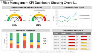
Risk Management Kpi Dashboard Showing Overall Security Risk And Regulatory


Try Before you Buy Download Free Sample Product
 Impress Your
 Audience
Editable
of Time


Give clear and concise directions to follow with our Risk Management Kpi Dashboard Showing Overall Security Risk And Regulatory Compliance. You will be the boss of their dreams.
People who downloaded this PowerPoint presentation also viewed the following :
Risk Management Kpi Dashboard Showing Overall Security Risk And Regulatory with all 6 slides:
Increase the degree of informality with our Risk Management Kpi Dashboard Showing Overall Security Risk And Regulatory Compliance. Get folks to indulge in friendly chats.
FAQs for Risk Management Kpi Dashboard Showing Overall Security
So you'll definitely need risk exposure levels and those probability vs impact scores - that's your bread and butter. Track how risks are trending over time too. Your risk register status is huge (open/closed/overdue stuff). Heat maps are honestly a lifesaver for board meetings - way less painful than tables of numbers. Key risk indicators work like early warning bells, which is pretty clutch. Mitigation progress tracking matters obviously. Oh, and compliance metrics if you're in one of those heavily regulated industries. Start simple though. You can always get fancier with the analytics once you've got the basics down.
Honestly, heat maps are where it's at for this stuff. You can spot your biggest risks instantly instead of squinting at endless spreadsheet rows. Color coding works great too - like red/yellow/green for different risk levels. Bar charts are super simple to set up and give you quick wins. I'd probably start there first, then maybe add some interactive filters so you can dig into specific time periods or whatever. The whole point is turning those mind-numbing numbers into something your brain can actually process fast. Way better than trying to find patterns in raw data.
Put your biggest risks right at the top - traffic light colors work great for quick scanning. Honestly, execs need to spot the red flags in like 10 seconds or they'll just move on. Group similar stuff together and use the same metrics throughout so people aren't constantly figuring out how to read it. Don't dump every detail on the main screen though - keep those drill-downs tucked away. Oh, and definitely add those little trend arrows or sparklines. Shows whether things are improving or going downhill. Test it with real users first - I can't stress this enough. Their feedback will save you so many headaches down the road.
Daily updates are your bare minimum, but real-time is where you want to be if possible. Stale risk data is literally worthless - I've watched teams get completely blindsided by stuff they would've caught with fresh numbers. Market conditions change fast. Your dashboard can look perfect but if the data feeding it is old, you're flying blind. Weekly updates? Hard pass. Set up automated feeds wherever you can swing it, then work toward real-time once you get the hang of daily workflows. Oh, and operational risks move even faster than market ones sometimes.
Dude, you absolutely need real-time data for that risk dashboard. Markets crash in minutes, not months - by the time your weekly report updates, you're already screwed. Cyber attacks happen instantly, operations go sideways without warning. It's like trying to drive while staring at yesterday's GPS, honestly makes no sense. Set up those automated alerts so the thing actually warns you when trouble's brewing. That way you're putting out small fires instead of watching everything burn down. Trust me, being reactive instead of proactive will cost you way more in the long run.
Your dashboard's scoring system is your best friend here - sort risks by severity or check out those heat maps. Visual stuff really does make spotting problems way easier. Go after high-impact, high-probability risks first, obviously. Then work down from there. Pro tip: filter by department or timeline to see what's actually urgent for your team right now (saves so much time). I'd honestly just focus on your top 3-5 highest scores this quarter. Don't overwhelm yourself trying to fix everything at once.
You'll want all three for sure. Financial stuff is obvious - cash flow, defaults, market swings. But operational risks can absolutely wreck you too. Think system crashes, supply chain disasters, compliance screwups. Reputational hits from social media blowups or data breaches? Those hurt more than people realize. Strategic risks matter too - new competitors, regulatory shifts. Honestly, I'd start with whatever's making your CEO lose sleep right now. You can always expand the dashboard later, but nail the big scary stuff first.
So basically it gives you a real-time view of how you're doing compliance-wise across everything. You can catch problems before they blow up into actual violations. All your key stuff - control effectiveness, audit findings, regulatory deadlines - sits in one spot instead of scattered everywhere. Trust me, during regulatory reviews this thing is gold. No more digging through a million spreadsheets at 2am! It cranks out automated reports and tracks how you're fixing issues. Auditors actually appreciate seeing you've got a real system going instead of just winging it. Figure out your most critical metrics first, then make sure it updates often enough to catch trouble early.
Ugh, data inconsistencies are gonna be your biggest headache. Your financial stuff probably uses totally different formats than operational tools - legacy databases are honestly the worst for this. Plus you'll get conflicting info between sources, which is super annoying. Real-time sync is another pain since some systems update hourly, others daily. Oh and the API compatibility issues... don't even get me started. Honestly though, map out all your data sources first. Find the worst inconsistencies before you start building anything or you'll just be fixing stuff forever.
Honestly, just ask your users what sucks about it. They'll tell you exactly what's missing or what alerts they ignore. I do quick 15-minute chats monthly with the main users - sounds like overkill but it's not. Different teams read the same risk data totally differently, which you'd never guess otherwise. You'll hear stuff like "I always have to check three other places for this one number" or "these alerts go off constantly for nothing." That's pure gold right there. Use it to fix layouts, add the charts people actually need, and tune those thresholds so alerts mean something. Way more effective than guessing what works.
Real-time alerts are absolutely critical - you can't be finding out about problems hours later when you're finally back at your computer. Touch navigation should feel natural, and you want widgets you can actually customize based on what matters most to your situation. Offline access is huge too. Charts need to be readable without squinting (I hate when mobile dashboards just shrink everything down). Quick drill-downs are essential for investigating issues, plus you should be able to assign tasks or escalate stuff right from the app. Honestly, if it takes more than three taps to find critical info, it's probably not worth your time.
Here's the thing - you gotta tailor dashboards to what people actually do all day. Your executives? They want the big picture stuff, high-level KPIs and trends. Risk managers are totally different - they need all the detailed metrics and ways to dig deeper into problems. And honestly, operations teams just want to see risks that mess with their daily work, not some enterprise strategy nonsense cluttering everything up. Set up role-based permissions so people only see what matters to them. I'd start by literally asking each person "what decisions do you make every day?" Then build dashboards around that. Saves everyone from drowning in irrelevant data.
So predictive analytics is basically your early warning system - it spots trouble before it actually hits. You're not just looking backward at what went wrong, you're catching patterns that scream "problem incoming!" Honestly, it's way better than playing cleanup crew after everything falls apart. Your dashboard starts flagging risky customers, equipment that's about to die, cash flow disasters weeks ahead of time. Instead of scrambling when stuff breaks, you actually get to prevent it. Think less fire drill, more fortune teller (but one that's actually right). Pretty sweet deal if you ask me.
Put that heat map right on your main dashboard - front and center where people can't miss it. Use the obvious color scheme: red for critical risks, yellow for moderate, green for good. But here's the thing - make it clickable so when someone sees a red zone, they can drill straight into what's causing it. I can't tell you how many times I've seen these buried in some random submenu where they basically become useless. Position it next to your other key metrics and trend stuff. The whole point is letting users spot problems and actually do something about them instantly.
Tableau and Power BI are probably your best bet if you need something robust - they handle complex data really well. Google Data Studio's free though, so that's worth checking out for simpler stuff. Excel dashboards actually work fine too if you're just getting started (I know, I know, but hear me out). GRC platforms usually have dashboard features built right in. Really depends on what kind of data you're working with and how much you want to spend. My coworker swears by Tableau but honestly it can be overkill sometimes. Start with figuring out your requirements first, then pick whatever fits.
-
Enough space for editing and adding your own content.
-
Excellent products for quick understanding.