


OPEX Monitoring Dashboard With Budget Analysis




Try Before you Buy Download Free Sample Product
 Impress Your
 Audience
 100%
100% Editable
 Save Hours
 of Time


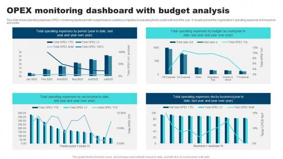
This slide shows operating expenses OPEX monitoring dashboard with budget analysis assisting companies in evaluating funds useful until end of the year. It visually present the organizations operating expenses by time period and sector.
People who downloaded this PowerPoint presentation also viewed the following :
OPEX Monitoring Dashboard With Budget Analysis with all 7 slides:
Use our OPEX Monitoring Dashboard With Budget Analysis to effectively help you save your valuable time. They are readymade to fit into any presentation structure.






FAQs for OPEX Monitoring Dashboard
Focus on stuff that actually matters - cost per unit, total OPEX vs budget, and expense variance trends. Labor costs as percentage of revenue is huge too. Add utility costs per square foot and maintenance expenses. Honestly, most dashboards are just expense theater - tracking a million things but telling you jack shit. Stick to 6-8 KPIs your leadership can act on. Set up alerts when metrics hit certain thresholds so you're not just playing dashboard detective all day. Way better than staring at pretty charts that don't change anything.
So basically an OPEX dashboard shows you where your cash is going in real-time. You can catch cost spikes super fast, like when departments blow through budgets or some process costs way more than it should. It's kinda like your banking app but for company spending - those little inefficiencies suddenly jump out at you when they're in charts. Honestly, the visual aspect makes such a difference. Set up alerts for weird spending patterns so you don't get hit with nasty surprises later. I'd start with just your biggest 3 cost areas first though.
Look, real-time dashboards are honestly a lifesaver. You'll catch budget spikes the moment they happen instead of finding out weeks later when it's too late to fix anything. Your team stops working off ancient spreadsheets and actually sees what's happening right now. Makes decision-making so much faster when everyone's on the same page. I'd start small though - pick your biggest 3-5 cost drivers and get those hooked up first. Don't try to track everything at once or you'll go crazy. The monthly report thing becomes way less stressful when you're not constantly wondering if something's blown up behind the scenes.
First thing - map out which expenses each department actually owns. Then build your views around those categories. Marketing gets campaign spend, agency fees, event costs. Finance sees software licenses and audit fees. Operations needs utilities and facility maintenance - that kind of stuff. Most platforms have role-based access so people aren't drowning in irrelevant data (honestly, nobody wants to see everyone else's budget anyway). I'd start with just one department and expand from there. Way less overwhelming that way.
Power BI or Tableau are your best bets for OPEX dashboards. Both handle financial data well. Power BI's cheaper and plays nice with Excel - finance people eat that stuff up. Tableau's got fancier visuals though. Honestly? Don't overthink it. I've watched teams waste weeks debating features when either tool would've worked fine. If you're already using Microsoft stuff, just go with Power BI. My advice: build something simple first with your current expense data. Show stakeholders what's possible, then add the bells and whistles later. Way easier than trying to build everything upfront.
Your OPEX dashboard is gonna get weird with seasonal stuff if you don't plan for it. Like, utilities always spike when it's hot or freezing, maintenance happens in clusters, staffing changes with busy seasons. I learned this the hard way last year - thought we were hemorrhaging money in July but turns out AC costs are just brutal. Compare to the same month last year instead of month-to-month. Rolling averages work too. Set up year-over-year views right next to current numbers so you can tell if something's actually broken or just normal seasonal weirdness.
So basically, OPEX dashboards show you what you're spending right now instead of waiting around for those useless monthly reports. You can see exactly which departments are burning through cash or which projects are way over budget. The visual stuff makes it obvious when something's weird - then you just click in deeper to figure out what's going wrong. Honestly, I wish more companies would actually use them instead of drowning in Excel hell. Makes decisions way faster when you're not working with data that's already two weeks old.
Dude, UX is huge for OPEX dashboards - way bigger than most people realize. Your stakeholders need to find what they're looking for fast. Otherwise they'll either wing it with bad data or just ignore the whole thing. I've watched some gorgeous dashboards collect dust because they were impossible to use (such a waste). Put your key KPIs right up front. Make filtering dead simple. Oh, and definitely grab feedback from real users while you're building it - not after. Trust me on that one. Clear visual hierarchy matters more than fancy charts.
Honestly, data integration will make or break your whole dashboard project. You've got to get clean, real-time data flowing from all your systems - ERP, maintenance, quality control, whatever you're using. Map out every data source first, then focus on connecting the ones hitting your biggest pain points. I've watched so many dashboards crash and burn because they're just pulling random stuff from systems that don't talk to each other. The real magic happens when everything syncs up automatically. Otherwise you'll just have a bunch of fragmented insights that don't actually help anyone make decisions. Trust me on this one.
So predictive analytics transforms your OPEX dashboard from just showing what happened into actually predicting what's coming. You'll spot spending patterns and catch budget overruns before they wreck your plans. Equipment maintenance, seasonal spikes, resource crunches - it flags all that stuff early. The scenario planning is honestly where it gets interesting though. You can test different what-if situations right there in real time. I'd probably start small - figure out your biggest cost drivers first, then see which models actually make sense for how your operation runs. Way better than flying blind.
Honestly, the worst thing you can do is jam every possible metric onto one dashboard. It just turns into chaos. Focus on what actually matters for decisions - not every tiny expense line item. Also, watch your chart scales! Starting Y-axes at weird numbers instead of zero will mess with people's heads every time. Always add context too - like last year's numbers or targets. Otherwise nobody knows if that $50K jump is awesome or catastrophic. Oh, and definitely test it with real users first. Clean beats cluttered.
At minimum, do it monthly. But honestly? Weekly or daily is way better if you can manage it. Fresh data means you'll catch cost spikes before they wreck your budget. I've watched too many teams get completely blindsided by quarterly reports that missed major overruns. Finance will actually thank you for spotting problems early - trust me on that one. Plus you won't be second-guessing your own numbers all the time. Start monthly though, then ramp up frequency once you've got your data pipeline figured out.
Manufacturing and healthcare get the most out of OPEX dashboards, hands down. Logistics too - they're all dealing with crazy variable costs every day. Supply chains, equipment breaking down, labor fluctuations. Without good visibility, costs just spiral out of control. Energy companies love them as well, though I'd probably put retail right behind that. The trick is having operational expenses that are both huge AND unpredictable enough that tracking them in real-time actually matters. My advice? Pick your three biggest cost headaches first and build around those.
Look, stakeholder feedback is what separates dashboards people actually use from ones that just collect digital dust. Your users will tell you straight up if something's confusing or buried too deep. They know which metrics matter for their daily work - not what you assume they need. Monthly check-ins work great, or even just quick surveys. Trust me, some requests will sound random at first, but they're living in this thing every day. Without their input, you're just building something pretty that nobody opens. Their feedback turns your dashboard into something they can't function without.
Start with your big KPIs at the top, then let people dig deeper if they want. Red for over-budget, green for savings - you know the drill. Group stuff logically by department or whatever makes sense for your team. I swear, half the dashboards I see look like someone just barfed Excel everywhere! Use sparklines for quick trend checks and save the heavy data tables for when people actually need them. Oh, and definitely test this with real users first - they'll spot the weird stuff you totally missed. Don't try cramming everything on one screen either.
-
Fantastic collection of visually appealing PowerPoint templates. They certainly uplift the look of the presentation.
-
Their designing team is so expert in making tailored templates. They craft the exact thing I have in my mind…..really happy.