

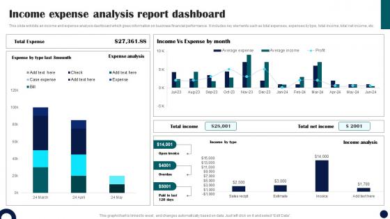
Income Expense Analysis Report Dashboard




Try Before you Buy Download Free Sample Product
 Impress Your
 Audience
 100%
100% Editable
 Save Hours
 of Time


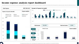
This slide exhibits an income and expense analysis dashboard which gives information on business financial performance. It includes key elements such as total expenses, expenses by type, total income, total net income, etc.
People who downloaded this PowerPoint presentation also viewed the following :
Income Expense Analysis Report Dashboard with all 7 slides:
Use our Income Expense Analysis Report Dashboard to effectively help you save your valuable time. They are readymade to fit into any presentation structure.





FAQs for Income Expense
Look, focus on the stuff that actually matters - revenue, conversion rates, how much you're spending to get customers, cash flow. Page views and likes? Total waste of time, honestly. Those numbers look nice but won't help you make real decisions. Throw in some operational metrics too - inventory, how productive your team is, whatever actually drives results in your space. But seriously, keep it under 7 metrics or you'll go crazy trying to track everything. Quick test: if seeing the number doesn't make you want to DO something about it, ditch it.
So visual hierarchy is basically how you guide people's eyes to the important stuff first. Make your key metrics big and bold at the top, then put supporting details smaller underneath. Color and positioning matter too - honestly, most people go way overboard with trying to fit everything in. White space actually helps (I know it feels like wasted space but trust me). Short attention spans mean users will bounce if they can't quickly scan and find what they need. Try squinting at your dashboard - whatever jumps out first is probably what users will focus on.
Look, data viz is what saves your dashboard from being a total mess of numbers nobody wants to look at. Your brain processes charts and graphs way faster than scanning endless spreadsheets - it's just how we're wired. Good visuals let you catch trends and weird outliers instantly. Nobody's got time to dig through rows of data when they need answers now. Pick the right chart type and don't overcomplicate it. Figure out what story your data's telling first, then choose visuals that actually support it. Oh, and clean designs always win over cluttered ones.
So basically, you want different dashboards for different people based on what they actually need to see. Execs want the big picture stuff - KPIs and trends. Operations teams need real-time data they can actually do something with right now. Sales wants pipeline info, finance cares about revenue and costs. Totally different worlds, you know? Here's what works: set up role-based access so people only see their relevant stuff. Same data underneath, just different views on top. Honestly, the best approach is just asking each team what decisions they're making every day, then build around that. Cuts through all the dashboard clutter that nobody looks at anyway.
Pick chart types based on what story you're telling. Bar charts work great for comparisons, line charts show trends over time. Pie charts? Only use them for parts of a whole - though honestly, I almost always go with bar charts instead since they're clearer. Tables are perfect when people actually need the exact numbers, not just the visual. Think about what question your audience wants answered when they look at it. If someone glances at your chart and gets confused about what they're seeing, that's your cue to try something different.
Dude, real-time data is what makes dashboards actually worth having. Without it, you're basically making decisions with old info while everything's already changed. Think of it like GPS - you want to know about traffic jams now, not from last week's drive. Your team can jump on problems the second they pop up instead of finding out days later when it's too late. Plus you'll beat competitors who are still working off yesterday's reports. Oh and set up alerts for the important stuff so you don't have to babysit the dashboard constantly. Makes life way easier.
Honestly, the worst thing you can do is cram everything onto one screen - it just becomes this overwhelming mess. Start by figuring out who's actually going to use this thing and what decisions they need to make. Skip the vanity metrics that look cool but are totally useless for actual work. Oh, and make sure your data updates often enough to matter - stale dashboards are pointless. Don't just steal ideas from other companies either. Their needs aren't yours. I learned this the hard way when I copied a competitor's setup and it made zero sense for our team.
Honestly, user feedback is like having a cheat sheet for what's actually broken vs. what you *think* needs fixing. People will straight up tell you "I can't find the revenue numbers" or "this chart makes no sense" - boom, there's your problem areas. I've watched teams spend months building these beautiful dashboards that nobody could actually use because they never asked what users needed upfront (kind of painful to watch tbh). The feedback shows you which widgets actually matter and helps you cut through interface clutter. Just set up quick feedback sessions or throw out a simple survey. Users spot accessibility issues you'd totally miss otherwise.
So for dashboards, Tableau and Power BI are probably your best starting points - super intuitive and they handle messy data pretty well. D3.js is incredible for customization but honestly, it's a pain to learn unless you're already comfortable coding. Plotly Dash rocks if you're doing Python stuff anyway. Google Data Studio works fine for basic dashboards, especially when your data's already living in Google. I'd figure out what data sources you're dealing with first - that usually makes the choice way easier. Also, how fancy do you actually need this thing to be?
Honestly, mobile optimization is a game-changer for dashboards. Your layouts, text sizes, and buttons all adjust automatically so people aren't squinting at microscopic charts or accidentally hitting the wrong thing. Trust me, there's nothing worse than trying to check analytics on your phone and the whole interface is a mess. It works across iPhones, Android devices, whatever. Loading times get faster too, plus you can actually swipe around naturally. My advice? Test your dashboard on a few different devices first - you'll probably spot issues you never noticed. Then just tackle the biggest problems one by one.
Okay so KPIs basically cut through all the noise and show you what's actually moving the needle. You'll see your conversion rates, revenue, customer satisfaction - whatever matters most to your specific goals. No more drowning in random data points. They're honestly like a quick health check for your business. Spot trends fast, make decisions quicker, keep everyone on the same page. Your stakeholders will thank you too since they won't have to decode spreadsheets anymore. Oh and start small - pick maybe 3-5 KPIs that directly connect to your main objectives. Trust me on that one.
Think of your dashboard like telling a story - big picture KPI goes at the top, then break down what's driving that number. I sketch mine out on paper first (sounds old school but it actually works). Your eye should flow naturally from most important stuff to the details. Make it scannable in 30 seconds max because honestly, that's all the time most people will give it. Each chart needs to connect to the next one logically. It's basically a pyramid structure with your main metric as the peak, then everything else supporting that story underneath.
Start with role-based access - that's where you'll get the biggest bang for your buck. People should only see what they need for their job, period. Strong authentication is crucial (SSO if you've got it), and definitely set up session timeouts so dashboards don't just sit there logged in all day. SSL encryption isn't optional anymore - just do it. Auto-refresh actually helps here since it keeps people from walking away with sensitive stuff still on screen. Oh, and watermarks are pretty smart for tracking who saw what. Honestly though, nail the access controls first and you're like 80% there.
Look, slow dashboards are basically the kiss of death for your analytics strategy. People just stop using them - I've seen it happen so many times. They'll go back to trusting their gut or pulling up those ancient Excel reports instead. Fast dashboards get used constantly, which means your team actually makes decisions based on real data. The flip side? When things are laggy, your analysts waste half their time fixing technical issues instead of spotting trends. You'll end up playing catch-up rather than staying ahead. Monitor those load times religiously and keep optimizing queries. Trust me, nothing kills adoption faster than waiting 30 seconds for a chart to load.
Honestly, templates are a lifesaver. Building dashboards from scratch is such a pain - you'll spend hours just on formatting instead of focusing on your actual data. With templates you get layouts that already work, plus all those design tricks you probably wouldn't think of yourself. I've picked up so many good visualization habits just by tweaking existing templates. Sure, custom builds give you more freedom, but who has time for that? Find something close to what you want and modify it. Way easier than starting with a blank canvas, trust me.
-
I am so thankful for all of the templates I've found on your site. They have saved me hours every week and helped make my presentations come alive. Keep up with these amazing product releases!
-
SlideTeam never fails to surprise me with its amazing PPT designs. Thanks team for providing me with your constant support!