


Project Monitoring And Evaluation Dashboard




Try Before you Buy Download Free Sample Product
 Impress Your
 Audience
 100%
100% Editable
 Save Hours
 of Time


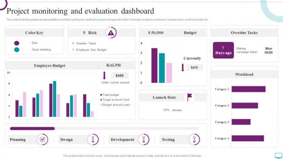
This slide illustrates graphical representation and facts and figures relating to project management data. It includes budget by employee, overdue tasks, workload charts etc.
People who downloaded this PowerPoint presentation also viewed the following :
Project Monitoring And Evaluation Dashboard with all 7 slides:
Use our Project Monitoring And Evaluation Dashboard to effectively help you save your valuable time. They are readymade to fit into any presentation structure.





FAQs for Project Monitoring
Pick timeline stuff first - percent complete, missed milestones, schedule slippage. Budget's obvious too (spent vs what you have left). Quality metrics matter - defect rates, whether deliverables actually get approved. I swear, half the dashboards I see are just metric soup that executives scroll past. Resource utilization tells you if people are swamped or sitting around. Don't forget risk indicators. Honestly? Five to seven metrics tops. Pick ones your stakeholders will actually look at and do something about. The fancy stuff can wait.
Honestly, color coding is a game changer - green for good stuff, red when things are going sideways, yellow for the "eh, keep an eye on it" items. Charts beat boring spreadsheets every time because who wants to stare at rows of numbers? Progress bars are clutch for showing completion status instantly. Don't forget about white space though - cramming everything together just makes people's eyes glaze over. Oh, and throw in some icons to help categorize things quickly. I'd start with maybe 2-3 visuals that match what your team actually looks at most.
Honestly, most teams I know use the big ones - Microsoft Project, Asana, Trello, Monday.com. Notion's been blowing up lately and I get why, the customization is insane. Smartsheet's solid if your people are spreadsheet nerds (you know the type). Tech teams usually go with Jira, works really well for that stuff. Oh and if you need crazy data viz, Tableau or Power BI are your friends. I'd just look at what tools you're already using and find something that plays nice with those. Way easier than forcing everyone to learn a completely new system.
Really depends who's gonna look at it. Executives just want the big picture stuff - green/yellow/red status lights, high-level numbers. They're not scrolling through task lists, trust me. Project managers though? They actually need the nitty-gritty details like individual deliverables and who's working on what. I always think about what decisions they're making with this data - that's your north star. Oh and start basic! You can always add more later when people bug you for specific stuff. Your dashboard should answer their top 3 questions right away without them having to hunt around.
Don't cram everything onto one screen - that's the biggest mistake I see. People think they need to show every metric they can track, but honestly it just creates a mess. Nobody knows what to focus on first. Skip the generic KPIs that sound impressive but don't actually help your team do anything. Design for whoever's using this thing daily, not the executives who peek at it once a quarter. I'd stick to maybe 5-7 key metrics tops. For each thing you add, ask yourself "okay, so what?" - if you can't answer that clearly, cut it.
Dude, real-time data integration is a total game changer for dashboards. You're seeing what's happening NOW instead of stale info from last week. Your dashboard automatically pulls from Jira, GitHub, whatever tools you use - no more manual spreadsheet hell. Problems get caught immediately, so you can actually fix stuff before it spirals. The trick is starting with your most important data sources first. I made the mistake of trying to connect everything at once initially... terrible idea. Build it up gradually and you'll see why fresh data makes such a huge difference in decision-making.
Honestly, getting stakeholder input upfront is make-or-break for dashboards. I'd start by mapping out who'll actually use this thing - executives want big-picture KPIs, but project managers need the nitty-gritty details. Schedule some quick 15-minute chats and just ask what questions they're trying to answer every day. Trust me on this one - I've seen too many gorgeous dashboards that collect dust because nobody bothered asking what people actually needed. Different users care about completely different stuff. Yeah, it's extra work upfront, but way better than rebuilding the whole thing later when nobody's using it.
Honestly, you gotta tailor this stuff based on who's actually using it. Executives want the big picture - budget health, timeline status, major risks. Those fancy charts that look impressive in meetings? Yeah, they eat that up. Your team needs completely different info though. Task assignments, what's blocking them, sprint updates, resource stuff. Makes sense when you think about it - your CEO doesn't need to see every bug report, but they definitely need to know if you're burning through budget too fast. Just ask each group what decisions they're trying to make, then show them only the data that matters for those choices.
Honestly, templates are a game changer - you'll skip all that tedious setup work every time you start something new. Everything stays consistent too, so comparing projects actually makes sense instead of being a total mess. Your team won't waste time digging around for basic stuff like budgets or deadlines since it's always in the same spot. The real benefit though? You can actually focus on the work that matters instead of messing around with layouts and formatting. Oh, and definitely start simple then tweak it as you go.
Honestly, dashboards are a game changer - you get all your important metrics in one spot instead of hunting through a million emails and random spreadsheets. When budget issues or timeline problems pop up, you'll catch them way before they turn into total disasters. Real-time updates mean you can actually pivot fast when things go sideways. I've seen too many projects crash because people were flying blind. Set yours up to track whatever matters most for your specific goals, and you'll wonder how you managed without it.
Start with your most important stuff in the top-left corner - that's where people look first. Stick to maybe 3-4 colors tops and don't be afraid of white space. Seriously, I've seen dashboards that look like a unicorn exploded on them. Group similar metrics together so users aren't jumping all over the place hunting for info. Your main KPIs should pop out immediately. Oh, and definitely test it with real people first - what seems obvious to you might confuse the hell out of everyone else. Trust me on that one.
Honestly? Daily is best if you've got an active project running. Weekly works too, but I've watched so many dashboards turn into dust collectors when people don't keep them updated. Match it to your project's speed - sprints and tight deadlines definitely need daily check-ins. Longer projects can probably get away with weekly updates. The real question is whether your team actually looks at the thing. Pick a schedule and stick with it, even when there's barely anything new to add. That consistency matters more than you'd think.
Dude, dashboards seriously save your ass in risk management. You'll spot budget overruns and missed deadlines way before they become disasters. Set up alerts for the stuff that usually sneaks up on you - resource shortages, timeline slips, whatever keeps you up at night. Weekly check-ins work best for me. The visual setup makes it so much easier to catch patterns than scrolling through endless spreadsheets (ugh). Your stakeholders will love the clear picture too. Just throw your key risk indicators into widgets and you're golden. Way better than playing catch-up when everything's already on fire.
Honestly, dashboards work best when you've got those messy projects with tons of moving pieces - software builds, marketing campaigns, construction stuff. You know the ones where people constantly Slack you "hey what's happening with that thing again?" Multiple stakeholders make dashboards clutch because everyone stops bothering you for updates every ten seconds. Tight deadlines too. If you've got more than 3-4 people involved or it's running several weeks, I'd definitely set one up. Cross-functional teams especially love them since they can just check progress themselves instead of playing telephone.
Honestly, dashboards are a game-changer for agile teams. You get real-time visibility into sprints without digging through tons of different tools during standups. Burndown charts help you spot blockers early, and seeing which stories are moving keeps everyone aligned. Set yours up to show current sprint status and team workload - trust me, it makes retrospectives actually useful instead of just complaining sessions. Oh, and people genuinely get excited about those kanban boards, which is weird but whatever works! Having sprint goals and capacity all in one spot saves so much time.
-
The way SlideTeam professionals work is exceptional. Thanks for being so helpful!
-
I faced no difficulty while searching for the slide I wanted. Honestly, the website’s interface is easy to use and can be navigated easily!