Opex to sales ratio dashboard snapshot of company over years powerpoint template
Our Opex To Sales Ratio Dashboard Snapshot Of Company Over Years Powerpoint Template are topically designed to provide an attractive backdrop to any subject. Use them to look like a presentation pro.
Our Opex To Sales Ratio Dashboard Snapshot Of Company Over Years Powerpoint Template are topically designed to provide an a..
- Google Slides is a new FREE Presentation software from Google.
- All our content is 100% compatible with Google Slides.
- Just download our designs, and upload them to Google Slides and they will work automatically.
- Amaze your audience with SlideTeam and Google Slides.
-
Want Changes to This PPT Slide? Check out our Presentation Design Services
- WideScreen Aspect ratio is becoming a very popular format. When you download this product, the downloaded ZIP will contain this product in both standard and widescreen format.
-

- Some older products that we have may only be in standard format, but they can easily be converted to widescreen.
- To do this, please open the SlideTeam product in Powerpoint, and go to
- Design ( On the top bar) -> Page Setup -> and select "On-screen Show (16:9)” in the drop down for "Slides Sized for".
- The slide or theme will change to widescreen, and all graphics will adjust automatically. You can similarly convert our content to any other desired screen aspect ratio.
Compatible With Google Slides

Get This In WideScreen
You must be logged in to download this presentation.
PowerPoint presentation slides
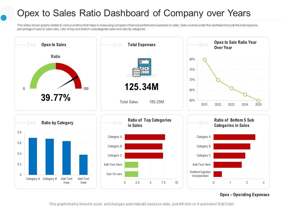
This slides shows graphs related to various metrics that helps in measuring companys financial performance expenses to sales. Data covered under this dashboard include the total expense, percentage of opex to sales ratio, ratio of top and bottom subcategories sales and ratio by categories. This is a Opex To Sales Ratio Dashboard Snapshot Of Company Over Years Powerpoint Template drafted with a diverse set of graphics, that can be reformulated and edited as per your needs and requirements. Just download it in your system and make use of it in PowerPoint or Google Slides, depending upon your presentation preferences.
People who downloaded this PowerPoint presentation also viewed the following :
Opex to sales ratio dashboard snapshot of company over years powerpoint template with all 2 slides:
Use our Opex To Sales Ratio Dashboard Snapshot Of Company Over Years Powerpoint Template to effectively help you save your valuable time. They are readymade to fit into any presentation structure.
-
Nice and innovative design.
-
Great product with highly impressive and engaging designs.
-
Commendable slides with attractive designs. Extremely pleased with the fact that they are easy to modify. Great work!
-
Designs have enough space to add content.
-
Good research work and creative work done on every template.


