Digital marketing dashboard with revenue by channel

Rating:
90%
Digital marketing dashboard with revenue by channel
Slide 1 of 2
Favourites Favourites

Try Before you Buy Download Free Sample Product

Audience Impress Your
Audience
Editable 100%
Editable
Time Save Hours
of Time
The Biggest Sale is ending soon in
0
0
:
0
0
:
0
0
Rating:
90%
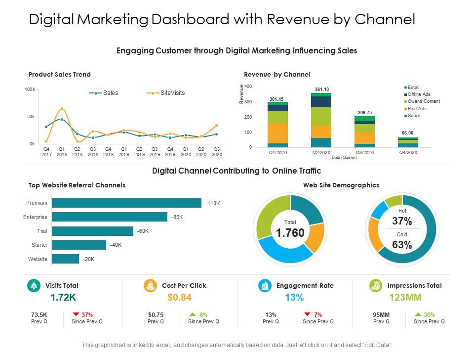
Presenting this set of slides with name Digital Marketing Dashboard With Revenue By Channel. The topics discussed in these slides are Engagement Rate, Revenue, Impressions Total. This is a completely editable PowerPoint presentation and is available for immediate download. Download now and impress your audience.

FAQs for Digital marketing dashboard with

Honestly, stick to metrics that actually matter for decisions - skip the vanity stuff. Traffic sources and conversion rates are non-negotiable. Cost per acquisition and customer lifetime value too. Revenue attribution is where it gets interesting though - you need to know which channels are bringing in actual money vs just clicks. Bounce rate and time on site give you the engagement picture. Email open rates if you're doing that. Keep your main dashboard to maybe 8-10 metrics max or you'll get overwhelmed. Start simple with these basics - you can always dig deeper into the weeds once you're comfortable reading everything.

Dude, visualizations are game-changers for making sense of messy data. Charts turn those endless spreadsheet rows into actual patterns you can see right away. I used to stare at tables for hours trying to figure out CTR trends - what a nightmare. Now? Heat maps show me top content instantly. Line charts reveal trends over time, and pie charts break down traffic sources super fast. Oh, and seasonal patterns become obvious too. Start with maybe 3 key metrics and chart those first. Trust me, you'll spot insights that were totally invisible before. Way better than drowning in raw numbers.

Google Analytics and Google Ads are probably your best starting points - they plug into pretty much everything. Facebook Ads Manager and HubSpot are solid too. Don't forget your email stuff like Mailchimp. Setting up all those API keys is honestly such a pain at first, but it's worth it once everything's running automatically. I'd skip the smaller channels initially and just focus on wherever most of your traffic comes from. Oh, and Zapier's actually pretty handy if your dashboard doesn't play nice with something specific. Social media platforms connect through their APIs too, though some are trickier than others.

Think of it like this - you've got to match what people actually need to see. CMOs want ROI and attribution data right there when they log in. Social media managers? They're looking for engagement rates first thing. I've watched dashboards crash and burn because they tried cramming everything onto one screen - nobody could find what they needed. Way too cluttered. The smart move is building different views for different roles. Show them their main numbers upfront, then they can dig deeper if they want. It's like organizing your apps - you don't put everything on the home screen, right?

Focus on your 2-3 most important metrics first - the ones that actually move the needle on revenue. Those go right at the top where everyone sees them immediately. After that, add the context metrics underneath (traffic sources, conversion rates, etc.) to explain what's driving those main numbers. Don't try to fit everything on one screen though - I've seen way too many dashboards that look like someone threw up data everywhere. Group similar stuff together and make it obvious what matters most. Honestly? If someone can't figure out your dashboard in 30 seconds, you've overdone it. Keep it simple and actionable.

Honestly, just focus on the metrics that actually matter for your business - ditch all the vanity stuff that looks impressive but doesn't help you decide anything. Most dashboards have drag-and-drop features, so put your most important channels front and center. If social's your main thing, don't bury those engagement numbers under email stats or whatever. You can set custom date ranges and automate reports for different people on your team. Oh, and be ruthless about cutting widgets that don't help you make decisions faster. Less clutter = better insights.

Okay so data visualization is like having a translator for all those messy marketing spreadsheets. Your brain processes pictures way faster than numbers, which is honestly a lifesaver when you're drowning in CAC data and conversion rates. Charts and graphs let you spot trends and weird outliers instantly - no more squinting at endless rows trying to figure out what's actually happening. Bar charts work great for comparing stuff, line graphs show changes over time, heat maps are perfect for engagement patterns. I swear it makes stakeholder meetings so much easier when everyone can actually see the story behind the numbers.

Honestly, dashboards are a game changer - you can finally see which campaigns actually make money instead of just burning cash. I used to jump between like 5 different platforms and it was a nightmare. Now everything's in one spot: cost per acquisition, lifetime value, conversion rates, all that stuff. Just make sure your attribution tracking is set up right so you're not getting fooled by clicks that don't convert. Start simple though - track your revenue-to-spend ratio first, then get fancy with the details later. Way less headache that way.

Ugh, data integration is such a pain - you'll be pulling your hair out trying to get Google Analytics to talk to your social tools and email platforms. Half this stuff just refuses to connect properly. Getting your team on board is another nightmare since everyone's married to their little Excel sheets. I swear some people would rather die than change how they've always done reports. Oh, and don't make my mistake of tracking every possible metric right away. You'll drown everyone in data they don't care about. Pick maybe 3-4 key things first, then slowly add more once people actually understand what they're looking at.

Start by grabbing 3-6 months of data from your dashboard - that's usually enough to see real patterns. Focus on the big stuff: conversion rates, CTR, customer acquisition costs. Don't just pick your best months though (trust me, I've seen people do this and it backfires). Use that baseline to set targets you can actually hit - maybe 10-15% bumps each quarter. Your dashboard will show you how you're doing against these benchmarks as things happen. Oh, and honestly? Sometimes the "bad" months teach you more than the good ones anyway.

Dude, automating data collection is seriously worth it. No more copying numbers from Google Analytics or Facebook Ads - it all flows in automatically. Saves me hours every week, honestly. Your dashboards update in real-time, so no more stale data or copy-paste screwups. Plus your team can actually dig into what the numbers mean instead of just collecting them all day. Oh, and start small with your key metrics first. I made the mistake of trying to automate everything at once and it was a nightmare to troubleshoot.

Make some test cards that show control vs variant side-by-side. Green/red color coding works great - makes wins obvious right away. Include conversion rates, CTR, and statistical significance. Oh and sample size too, otherwise people get hyped over tiny tests that don't mean anything yet. Split your dashboard into running tests and completed ones. I'd add winner badges to the finished tests so everyone can quickly see what actually worked. Being able to drill into raw data is clutch. Honestly, the visual layout matters more than you'd think - stakeholders love dashboards they can scan fast.

Honestly, social media metrics are like having a crystal ball for your content. You'll see which posts actually get people talking and when your audience is scrolling around. Demographics, click-through rates, how people feel about your brand - it's all there. The conversion tracking shows if you're making real money from your posts, not just getting likes. Oh, and you can catch industry trends before everyone else jumps on them (which is pretty cool). Start with engagement rate and reach though. Those two will quickly tell you if people actually care about what you're posting or if you're just shouting into the void.

Honestly, I'd say daily if you can swing it - weekly at minimum. Real-time data is pretty useless if you're checking it once a month, you know? Most teams I know do key metrics daily, then dive deeper once a week. Paid ads especially can shift fast, and seasonal stuff throws curveballs all the time. Set up whatever automated pulls you can so you're not manually updating everything like it's 2010. The whole point is making decisions based on what's actually happening now, not some outdated snapshot from two weeks ago.

Start with cleaning up who has access to your dashboards - you'd be surprised how messy that gets over time. Set role-based permissions so people only see what they need (no point letting interns peek at revenue data). Strong authentication is key - use SSO or 2FA for anything sensitive. Never email screenshots or PDFs when sharing externally, those files have a way of wandering. Stick to secure platforms instead. Oh, and strip out any customer data or internal-only stuff before sharing outside your team. Honestly, most security headaches come from being too loose with permissions in the first place.

Ratings and Reviews

90% of 100
Write a review
Most Relevant Reviews
  1. 80%

    by Edwardo Wheeler

    Awesomely designed templates, Easy to understand.
  2. 100%

    by Dorian Armstrong

    Nice and innovative design.
  3. 100%

    by Taylor Hall

    Innovative and Colorful designs.
  4. 80%

    by Dewayne Nichols

    Out of the box and creative design.

4 Item(s)

per page: