


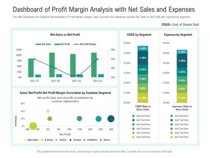
Dashboard of profit margin analysis with net sales and expenses powerpoint template




Try Before you Buy Download Free Sample Product
 Impress Your
 Audience
 100%
100% Editable
 Save Hours
 of Time


Our Dashboard Of Profit Margin Analysis With Net Sales And Expenses Powerpoint Template are topically designed to provide an attractive backdrop to any subject. Use them to look like a presentation pro.
People who downloaded this PowerPoint presentation also viewed the following :
Dashboard of profit margin analysis with net sales and expenses powerpoint template with all 2 slides:
Use our Dashboard Of Profit Margin Analysis With Net Sales And Expenses Powerpoint Template to effectively help you save your valuable time. They are readymade to fit into any presentation structure.
FAQs for Dashboard of profit margin analysis with net sales and
Track your gross, operating, and net profit margins - they'll show you the whole story from product costs down to what you actually pocket. Revenue growth matters too since margins without context don't tell you much. I'd also look at margins by product line and cost breakdowns to see where money's disappearing. Margin per customer is honestly where the real insights are if you can get that data. Oh, and make sure you can filter by different time periods - super helpful for spotting trends. Comparing against industry benchmarks will show you if you're actually doing well or just think you are.
Dude, visualizations are a game changer for this stuff. You can spot trends and weird outliers instantly instead of going cross-eyed staring at endless spreadsheet rows. Line charts work great for tracking margins over time, and heat maps? Those are honestly my favorite - they'll show you exactly where you're killing it vs. bleeding money. Compare different products or regions super easily too. I'd start simple with just a basic trend chart first, then get fancier if you need to. Way better than drowning in numbers.
Honestly, just start with Excel or Google Sheets if you're new to this stuff - they're perfectly fine for basic profit tracking. Power BI and Tableau are way better though if you want something that actually looks legit and updates automatically. Looker Studio's free which is nice. The key thing is figuring out where your profit data currently sits first. Then pick whichever tool connects to it without being a massive pain. I spent way too much time fighting with data connections once - not fun. Real-time dashboards are pretty sweet when they work right, but don't overcomplicate it starting out.
Look, benchmarks are basically your reality check for profit margins. Say you're hitting 15% and feeling pretty good about it - but if everyone else in your industry averages 25%, you're actually behind. Margins are weird though, they're all over the place depending on what business you're in. Like a grocery store might only get 2% margins while a software company would panic at anything under 20%. Your dashboard should show where you stack up against competitors so you know if you need to fix things or if you're crushing it compared to everyone else.
Honestly, the worst thing you can do is just stare at your profit margins without any context. Like, are they good for your industry? What about seasonal stuff? I've seen people mix up gross and net margins constantly - that'll mess up everything. One-time costs or random revenue spikes will totally skew your numbers too. Oh, and don't compare different products or time periods without breaking them down first. My advice? Segment by product and timeframe, then check how you stack up against industry averages. That's where you'll actually see what's going on.
Honestly? Daily updates are your best bet. Margins can shift crazy fast these days - like, one supply chain hiccup and boom, your numbers are off. I'd set up automated pulls so you're not stuck doing manual updates every morning (learned that the hard way). Weekly could work if your business is rock solid, but monthly? Nah, too slow. You'll miss stuff. The real trick though is actually looking at the dashboard once you update it. Sounds obvious but you'd be surprised how many people just... don't.
So gross margin just takes out your direct costs - like materials and labor to make stuff. Operating margin digs deeper and cuts out all your other expenses too (marketing, office rent, that kind of thing). Net margin? That's after literally everything - taxes, loan interest, the works. I always think of it like... gross shows if your product makes money, operating shows if your business makes money, and net shows what you actually keep. Honestly, track all three because they'll tell you different things about where your cash is disappearing. Net margin can look pretty brutal sometimes but that's reality.
So here's the thing - profit margin dashboards let you see what's actually making money vs. what's bleeding cash. Way better than staring at spreadsheets all day (trust me on this). You can catch trends early, like when a product starts losing margin or certain customers become money pits. The visuals make it super easy to show your boss what's happening too. I'd start with your top 3 priorities and build dashboard views around those specific margins. Once you get into it, you'll probably check it more than you should. But seriously, being able to pivot quickly on pricing or product mix? Game changer.
Your ERP system's gonna be your best bet - it pulls real-time revenue and costs straight from operations. Also grab data from your accounting software for COGS and your CRM for sales figures. Those three together are solid gold. Seriously though, I've watched so many teams mess this up by sticking with spreadsheets that never get updated. Sync everything regularly or your margins will be completely off. Oh, and definitely audit what you've got now first - I'd bet there are some gaps in your cost tracking that'll bite you later.
Yeah, so basically your margins get hammered from all sides when the economy goes sideways. Inflation jacks up what you pay for materials. Interest rates mess with your financing costs - which honestly feels like getting punched twice. Currency swings screw you over if you're dealing with international stuff at all. When things get really bad, customers stop buying so you end up slashing prices just to move inventory. It's brutal. Your dashboard should flag when margins tank alongside economic indicators. Set up alerts for when they drop way below your normal range during these shifts.
Honestly, historical data is like having a crystal ball for your margins. Look back 12-24 months and you'll start seeing patterns you totally missed before - seasonal drops, which products consistently suck, how that pricing experiment actually played out. Short bursts work better than trying to analyze everything at once, trust me. The dashboard uses all this old data to benchmark where you're at now and predict what's coming. Pretty satisfying watching those trend lines too, not gonna lie. Once you spot the patterns, setting realistic margin targets becomes way less of a guessing game.
So this margin analysis thing is a game-changer - it shows you exactly where you're making bank and where you're hemorrhaging cash. Healthy margins? You can afford to get competitive or pump money into growth. But if margins suck, you've gotta pick a side: raise prices or slash costs. No wimping out with half-measures. The cool part is it breaks everything down by product, customer type, whatever - so you're not just throwing darts blindfolded when setting prices. Honestly, I'd start simple. Find your 3 biggest winners and losers, then test some small price tweaks from there.
Put your main stuff like gross profit and net profit margins right up top where people can actually see them. Green for good numbers, red for bad - keeps it simple. Don't jam everything onto one screen (trust me, I made a dashboard once that was basically visual chaos). Trend lines are way better than just showing static numbers. People want to see what's happening over time, you know? Add basic filters for dates and product categories too. Oh, and definitely test it with real users first. They'll spot weird stuff you'd never think of. Short sentences work. But mix in some longer ones so it doesn't sound robotic.
Honestly, just show each person what they actually want to see. Your executives? Give them the big picture KPIs and trends. Finance team needs those detailed margin breakdowns - by product, region, whatever. Sales managers only care about commission stuff and deal profitability (they couldn't care less about your overhead allocations, trust me). Operations wants cost drivers and efficiency numbers. Set up different landing pages for each group so they hit their relevant data first. Ask them what decisions they're making every day, then build views around that. Way easier than forcing everyone to dig through irrelevant metrics.
Ugh, low margins are brutal - you're basically one bad month away from losing money. Costs go up a tiny bit? Revenue drops slightly? Boom, you're in the red. There's zero room to breathe or invest in anything that could actually grow your business. Market shifts will hit you way harder than competitors with better margins. It's honestly like living paycheck to paycheck but for your company. Check your dashboard and see which products are killing your margins - might be time to optimize those or just ditch them entirely. Some aren't worth the headache.
-
Excellent design and quick turnaround.
-
Topic best represented with attractive design.
-
Great experience, I would definitely use your services further.
-
Easily Editable.
-
Top Quality presentations that are easily editable.
-
Awesome presentation, really professional and easy to edit.
-
Graphics are very appealing to eyes.
-
Awesomely designed templates, Easy to understand.
-
Great experience, I would definitely use your services further.
-
Excellent Designs.