

Challenges And Solution Table Powerpoint Graphics





Try Before you Buy Download Free Sample Product
 Impress Your
 Audience
 100%
100% Editable
 Save Hours
 of Time


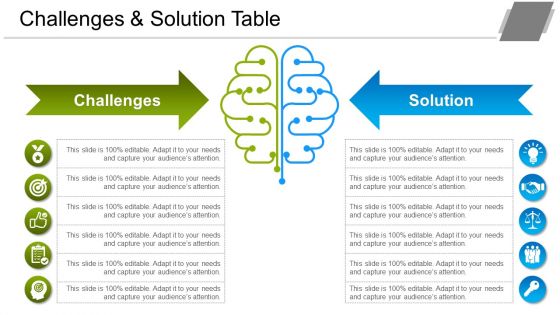
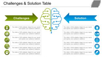
Investigate the challenges and find a better solution for it by using Challenges And Solution Table PowerPoint Graphics. Take the assistance of our PowerPoint presentation template and outline the various issues you face while executing a specific project. Employ the professionally designed PPT slideshow to identify different solutions or ideas that help to resolve the problems. Use the slide to recognize, define, and fix the problem that mainly helps to figure out the resources appropriately. Describe the process of divergent thinking in the slide and grab the attention of your audience. With the help of our problem-solving PowerPoint presentation template, you can mention the numerous strategies that include analogy, brainstorming, hypothesis testing, lateral thinking, morphological analysis, means-ends analysis, and group discussion. By using this problem statement PPT visual, you can generate a report on the number of relevant solutions that give the possible explanation and accuracy of the result. Hence, reduce the likelihood of problems occurring in business by downloading our ready-to-use PowerPoint presentation template.
People who downloaded this PowerPoint presentation also viewed the following :
Challenges And Solution Table Powerpoint Graphics with all 5 slides:
Our Challenges And Solution Table Powerpoint Graphics are a cause for joy. It contains images that are inspirational.
FAQs for Challenges And Solution
Honestly, the worst thing is cramming too much stuff on one slide - drives me crazy when I see presentations like that. Also watch out for pixelated images that look terrible when projected. Don't mix fonts and colors randomly throughout your deck either. Copyright's another thing - can't just grab any image off Google. I see people throw in random graphics that don't even relate to what they're saying, just for decoration I guess? Each visual should actually support your point or explain something. Keep it simple and high-quality. Short version: make sure every graphic has a purpose.
Dude, inconsistent graphics are presentation killers. Your audience gets distracted trying to figure out why slide 3 looks nothing like slide 1, instead of actually listening to you. Honestly, I've seen people lose their credibility over messy fonts alone – it just screams "I threw this together last minute." Pick maybe 2-3 fonts and actually stick with them. Same goes for colors. Don't make people's brains work overtime decoding your visual mess when they should be focused on what you're saying. It's such an easy fix but makes a huge difference.
Dude, break that stuff into smaller pieces - nobody wants to stare at a wall of data. Pick 3-4 colors max and stick with them. Rainbow charts are honestly the worst. Your text needs to be way bigger than you think (like 14pt minimum). Don't try cramming everything on one slide either. I usually spread the story across multiple slides or use those reveal animations. Oh, and put your main point right at the top - people zone out fast. They should get what you're saying within like 3 seconds of looking at it.
So for PowerPoint accessibility stuff - right-click any image and hit "Edit Alt Text" to describe what's shown. Way simpler than it sounds! High contrast colors work best (red-green is terrible for colorblind people). Keep text 12pt minimum, add captions if there's audio. Oh and check the Review tab to make sure screen readers will actually read your slides in the right order - that one's kinda crucial. Honestly? Just run the built-in accessibility checker before you share it. Saves you from looking like an idiot later and catches most problems automatically.
Dude, colors can totally make or break your slides. High contrast is key - if your text blends into the background, nobody's reading that mess. I learned this the hard way in college presentations lol. Stick to maybe 2-3 colors max or it'll look like a kindergarten art project. Oh, and don't do red/green combo - colorblind people will hate you. Brand colors are cool but readability comes first. Here's what I do: back away from your screen about 6 feet. Can't read it? Your contrast sucks and needs fixing.
Honestly, less is more with animations. Stick to basic stuff like fades or wipes - those spinning transitions are honestly awful and make everyone nauseous. Pick maybe 2-3 animation types max for the whole thing. Entrance animations are perfect for showing data bit by bit, and you can use emphasis ones to highlight important stuff. Just make sure there's actually a reason for each animation you use. If people walk away talking about your fancy effects instead of your actual content, you've totally missed the mark. Oh, and definitely test the timing beforehand!
Honestly, Canva's my go-to for quick stuff - it's so easy to use. Adobe Creative Suite is amazing if you want more control, but there's definitely a learning curve there. PowerPoint's built-in tools have gotten way better lately too. Smart Art and their icon library are actually decent now. Stock photos? Unsplash and Pexels are free and pretty good quality. Getty Images if you've got the budget for it. Oh, and don't overlook PowerPoint's vector tools - you can make some surprisingly professional-looking graphics without leaving the app. I'd start with Canva though, especially if you need something fast.
Okay so first rule - one main thing per slide. Don't try to fit your entire thesis on there lol. High contrast colors are clutch, and please use fonts people can actually read from the back (I learned this the hard way). There's this 6x6 thing - max 6 bullets, 6 words each. Sounds rigid but it works. White space isn't wasted space, it's what makes your slide look clean instead of like a ransom note. Oh and step back from your laptop when you're done - if you squint to read it, your audience definitely will too.
Unsplash and Pexels are my go-to spots for free images - honestly way better quality than you'd expect. Pixabay's decent too. Just check the licensing stuff because some still want you to credit them (annoying but whatever). If you're doing something super professional, maybe spring for Shutterstock since the images look way more polished. Oh, and definitely make folders to sort everything or you'll be digging through random downloads forever. Avoid anything with clear logos or people's faces unless you're 100% sure it's okay to use. Trust me, bookmark these sites now so you don't forget.
Figure out your main point first, then build the chart around that story. Bar charts work great for comparing stuff, line graphs show changes over time. Pie charts? Honestly, they're usually a mess - avoid them if you can. Colors should draw attention to what actually matters, not just look pretty. Ditch anything that clutters up the visual. Here's the thing - your title needs to tell the conclusion, not just label the data. Instead of "Q3 Sales," try "Sales Doubled After Product Redesign." Walk people through it like you're pointing out exactly what they should notice first.
Honestly? Start with a master template that has all your brand stuff locked down - colors, fonts, logo placement. Build up a little library of approved graphics and icons too. Trust me on this: set up color themes in PowerPoint so your brand palette's right there waiting for you. And yeah, make different layouts for your usual slide types (title, data, closing, whatever). I learned this the hard way after watching someone use Comic Sans in a client presentation once... still gives me nightmares. You'll be so grateful when you can just drop content into ready-made templates instead of starting from scratch every damn time.
Oh man, colors are probably the biggest thing to watch out for. Red screams "lucky!" in China but spells danger everywhere else. White's tricky too – we see purity, but it means death in parts of Asia. Don't even get me started on hand gestures and religious stuff. Plus reading flows differently – we go left to right, Arabic countries do the opposite. Honestly, I'd just test your slides with locals first if you can swing it. Or play it safe with blues and skip the cultural symbols entirely. Way less headache that way.
Honestly, just chunk everything up with good headers and bullet points - white space is your friend here. Skip the text walls, nobody's reading those anyway. One idea per slide max or you'll lose people. For data stuff, bar charts work great for comparisons, flowcharts for step-by-step processes. I'm obsessed with infographics when you have layered info to show. Color-coding helps but don't go crazy with it. Oh, and icons beat paragraphs every time. Before you design anything though, figure out what's the main thing each visual needs to say. That question alone will save you tons of time.
Dude, whitespace is a game changer for PowerPoint slides. When you cram everything together, people's brains just shut down - they can't figure out where to look first. I learned this the hard way in college presentations lol. Give each element some breathing room so your audience can actually process what you're showing them. Aim for like 20-30% of your slide being empty space. Sounds weird, but it works. Leave more blank space than feels right at first. You'll be shocked how much cleaner and more professional it looks compared to those cluttered disaster slides we've all sat through.
Ugh, PowerPoint graphics are the worst! File sizes get crazy bloated - I always compress images through the Picture Format tab when my presentation hits like 50MB. Use high-res images (300 DPI minimum) and resize them in PowerPoint instead of stretching tiny ones that look pixelated. Honestly, compatibility issues drive me nuts when sharing files. Embed your fonts and save as .pptx, or just export important slides as PDFs for backup. Oh, and make a master template with image placeholders - saves you from reformatting headaches later.
-
Very well designed and informative templates.
-
Informative presentations that are easily editable.