

Case study powerpoint guide





Try Before you Buy Download Free Sample Product
 Impress Your
 Audience
 100%
100% Editable
 Save Hours
 of Time


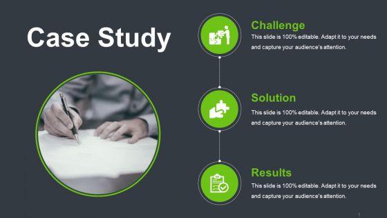
Introducing Case Study PowerPoint Guide. By employing this case journal PPT layout, you can provide insights into the project. Using our qualitative research PowerPoint theme you can demonstrate the challenges, solutions, and results obtained by implementing strategies to get the desired result. Discuss the merits and demerits of a particular methodology with the help of this case documentation PPT layout. This research PowerPoint layout can help in determining the most suitable way of approaching a problem as it can list the key features of each problem-solving method. Professionals in various fields such as clinical science, social science, psychology, and scholars can incorporate this research PPT template to highlight the in-depth analysis of the subject matter. This case report PowerPoint slide can aid in giving the overall view of the project and its development trajectory. Hence download this qualitative research PPT presentation to highlight the market analysis of your business.
People who downloaded this PowerPoint presentation also viewed the following :
Case study powerpoint guide with all 5 slides:
Our Case Study Powerpoint Guide don't believe in the blame game. It helps home on to the cause.
FAQs for Case
Hit these main parts: problem definition, background context, your analysis, findings, and recommendations. Honestly, I always screw up if I skip the background - learned that the hard way. Include data to back up your conclusions. Don't forget stakeholder views if they matter. The recommendations bit is what everyone actually wants to hear anyway. Build it like a story from problem to solution. Each section should stay focused. Oh, and practice those transitions between sections beforehand - makes everything flow way better.
Honestly, visuals are what save your case study from being a total snoozefest. Before/after screenshots work great for showing transformation. Charts make your key metrics pop. Even basic icons help break up those text-heavy slides that make people's eyes glaze over. I've watched so many presentations crash and burn because they're just bullet point marathons - nobody remembers that stuff. Think of visuals as your story's backbone instead. Timeline graphics show project phases nicely. Dashboard mockups demonstrate your results. The trick? Each visual needs to actually push your narrative forward, not just sit there looking pretty. Otherwise you're just decorating a boring story.
Here's how I'd structure it: Start with the problem so people get what you're dealing with. Then walk through your approach and what you found. The tricky part? Don't just dump your findings and call it done - that's where most presentations fall flat. You need the "so what" moment. What should people actually DO with this info? End with concrete next steps. Oh, and make it flow like you're telling a story, not reading from a spreadsheet. Each section should connect back to your original problem or you'll lose people.
Honestly, knowing your audience is everything when it comes to case study presentations. Executives? Hit them with ROI and big-picture wins. Fellow practitioners? They want the nitty-gritty methodology stuff. Same case study, but you're basically telling two different stories. Watch your language too - technical terms work great for specialists, but you'll lose a general business crowd fast. I always figure out who's gonna be in the room first, what keeps them up at night, then build from there. Your data points and recommendations should speak directly to what they actually care about. Makes such a difference.
Honestly, visuals are a game-changer - charts and graphs beat boring number dumps every time. I bombed a presentation once because I just threw data at people and watched them zone out completely. Round your numbers too (like "nearly 40%" vs "39.7%") since it's easier to digest. Don't show every single metric you collected either - just pick the ones that actually prove your point. Oh, and always give context by comparing to benchmarks or past results. Here's what works best though: start with your big insight, then back it up with the data.
Honestly, it's all about knowing what your audience actually gives a shit about. Executives? Hit them with ROI and business impact right off the bat - they don't have time for anything else. Technical people want the nitty-gritty details and methodology because that's what gets them excited. With clients though, you've gotta show how it fixes their exact problems. I made this mistake once presenting super technical stuff to executives and wow, did I lose them fast. Now I always research beforehand and literally rearrange my slides. Put their priorities first. Same information, just told differently depending on who's listening.
Dude, design absolutely matters for case studies. Clean layouts and good visual hierarchy will save your ass when presenting complex data. People zone out fast if your slides are cluttered messes with tiny text - I've seen brilliant analysis completely wasted because nobody could follow it. Keep formatting consistent and guide viewers through your story logically. Short sentences work. But you also want some flow between ideas to avoid that choppy presentation style. Honestly, you could have groundbreaking insights, but poor design creates cognitive overload and kills engagement. Focus on making key points pop visually so your audience actually absorbs what you're saying.
Start with the main problem and what happened - that's what sticks anyway. Break everything into chunks your audience actually cares about. Bullet points are your friend here. Cut out the fancy stuff that sounds smart but doesn't move things forward (you know what I mean). Charts help a ton with heavy data. Here's my test: after each point, ask "so what?" If you can't nail that answer, neither will they. Oh, and practice saying it out loud - you'll catch the confusing parts way faster that way.
So here's what works - pepper in questions as you go, don't save them all for the end. Skip the text-heavy slides, nobody's reading that anyway. Show them actual data and visuals instead. Walk through your process chronologically so they can follow along. Oh, and definitely share where things went wrong - honestly, people eat that stuff up more than the wins sometimes. After each section, ask how it connects to what they're working on. Gets them actually thinking instead of just zoning out. The whole point is making them feel like they're part of the journey, not just watching a lecture.
Definitely tie your research back to stuff they actually deal with every day. Find real examples from companies like theirs - "remember when XYZ Corp had that same problem last year?" Works every time. I love throwing in hypothetical situations too because it gets everyone engaged. Show them exactly how to use your main points on whatever they're working on right now. A simple framework or checklist is gold - something they can literally use next Monday. Oh, and always end with specific action steps. People need to walk away knowing what to do first.
Ugh, the worst thing you can do is info-dump a million details on people. I've seen so many presentations die because someone just throws data at the wall without explaining the actual story. You need that clear problem → analysis → solution flow, otherwise you lose everyone. And please don't forget the "so what" part! Like, cool findings, but why should I care? That's honestly the most common mistake I see. Oh, and never read straight off your slides - sounds robotic as hell. Executives want the bottom line, not your entire methodology breakdown. Practice those transitions beforehand so everything connects smoothly.
Lead with the hard numbers first - they grab people's attention right away and make you look legit. Then mix in the qualitative stuff to explain what's actually happening behind those stats. Customer quotes, weird behaviors you noticed, that kind of thing. I usually go like 60/40 heavy on the quantitative, but honestly depends who you're talking to. Finance people? Hit them with more numbers. Product teams need that human context though, so balance it out more. The qualitative data should make your numbers come alive, not just be a data dump. Nobody wants to sit through that.
Canva or PowerPoint work great for slides. Miro's clutch for mapping out processes - way better than trying to draw stuff by hand lol. I swear by Notion for keeping all my research organized, otherwise I forget half the stuff I looked up. Loom's solid for recording practice runs so you can spot when you're saying "um" every five seconds. Excel works fine for basic charts if you need data viz. Oh and Tableau if you're feeling fancy. Don't go crazy with tools though - pick like 2-3 max or you'll waste more time figuring out the software than actually prepping.
Oh totally, storytelling is what makes people actually give a shit about your case study instead of just skimming through another boring report. Think of it like this - start with the problem and who it affected (the human stuff), then walk through what you tried, including the failures honestly. People love hearing about what didn't work, weirdly enough. Wrap it up with real results and what you learned. Structure it like any good story: beginning, middle, end. Don't just dump data on people - give them something they can follow and remember later.
Don't just ask "any feedback?" after your presentation - you'll get nothing useful. Ask stuff like "which slide confused you?" or "where did I lose you?" Those specific questions actually help. I keep notes on what people tell me because I always forget later. If multiple people say the same thing, like your ending felt rushed, that's what to fix next time. Before your next case study, just pick one or two things from your notes to work on. Don't try to fix everything at once - that never works. Build from there and you'll actually see improvement instead of just spinning your wheels.
-
Unique design & color.
-
Good research work and creative work done on every template.