


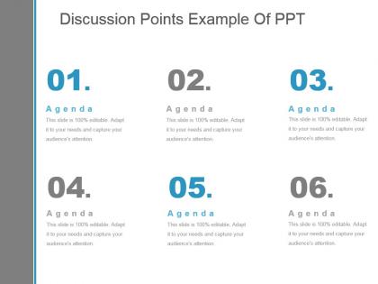
Discussion points example of ppt




Try Before you Buy Download Free Sample Product
 Impress Your
 Audience
 100%
100% Editable
 Save Hours
 of Time


Give folks cause to be full of confidence again with our Discussion Points Example Of Ppt. It helps boost deflated egos.
People who downloaded this PowerPoint presentation also viewed the following :
Discussion points example of ppt with all 5 slides:
Identify complex elements with our Discussion Points Example Of Ppt. Guide folks on handling difficulties they face.
FAQs for Discussion points
Okay so three things really matter: visual hierarchy, consistent design, and white space. Don't cram everything together - people's eyes need somewhere to rest. I literally cannot with slides that have tiny font everywhere. Nobody's reading that mess! One idea per slide max. Make your fonts big enough that someone in the back can actually see them. Colors should help your message, not fight against it. Oh and try this - show your slide to someone for 3 seconds. If they can't tell what it's about, you've got too much going on. Trust me on this one.
So color psychology is actually pretty powerful for presentations. Blue builds trust - perfect for data slides. Red grabs attention and creates urgency, but don't go crazy or you'll look like a fire truck lol. Green works great for progress reports since it suggests growth. Orange and yellow energize people but can be overwhelming if you use too much. Honestly, I think most people underestimate how much colors affect their audience. Pick one main color that matches your message first, then build everything else around it. The trick is just matching your palette to what you're trying to achieve.
Here's what I've learned about slides - simple is everything. High-quality images, barely any text, and make sure people in the back can actually read it. I once made slides so text-heavy I basically gave everyone eye strain, so learn from my mistake lol. Your visuals should back up what you're saying, not compete with it. Same fonts and colors throughout (sounds boring but looks way cleaner). Oh, and test your tech first! Save everything as PDFs too because technology loves to fail at the worst moments. You'll be so glad you did.
Know your audience first - seriously, this makes or breaks everything. Executives want the big picture stuff, ROI numbers, business impact. Don't bore them with technical details. But if you're talking to developers or IT folks? Go deep, use their language, get into the weeds. I bombed a presentation once by getting way too technical with our sales team - they looked completely lost lol. Switch up your examples too. Healthcare crowd gets medical scenarios, retail people want retail stories. Honestly, just spend like 10 minutes googling who'll be there beforehand and you'll be golden.
Honestly, the worst thing you can do is pick something super busy or distracting. Your content should be the star, not some crazy background pattern. Also skip anything with tiny fonts - nobody wants to squint from the back of the room (trust me on this one). Make sure it actually fits what you're presenting too. Like, don't use cartoon templates for budget reports lol. Here's what I learned the hard way: test it with your real content first! Some templates look amazing empty but completely fall apart when you dump actual data in there. Just go with something clean that people can actually read.
Dude, stories are like magic for presentations. People's brains are wired for narratives - way more than boring bullet points anyway. You'll hook them with setup-conflict-resolution structure, plus they actually remember your points afterward. I still recall random stories from elementary school but can't tell you what happened in yesterday's team meeting lol. Stories create emotional connections too, which is clutch for getting people on your side. Start with a quick story that proves your main point, or sprinkle in case studies like mini-narratives. Trust me, it works way better than just rattling off data.
Dude, typography can make or break your whole presentation. Stick with boring fonts like Arial - I know it's not exciting, but your audience needs to actually read this stuff from way back there. High contrast is key, and go big with your font size (24pt minimum). I made this mistake once with some "elegant" script font and nobody could read a damn thing. Two font weights tops, keep everything consistent. Oh and definitely do the across-the-room test before you present. Trust me on this one.
Honestly, less is more with animations. Simple fades or slides work great - just don't go crazy with the flashy stuff (we've all seen those cringe PowerPoint disasters). I like revealing bullet points one by one when I'm explaining something important, or building charts piece by piece. Keeps people focused. But seriously, don't animate every single thing or your audience will get dizzy. Stick to 0.5-1 second timing usually. Oh, and test it beforehand! Nothing's worse than your animations breaking mid-presentation. The whole point is supporting your story, not becoming the main event.
OK so first thing - move around! Don't just stand there like a statue. I bombed my first presentation doing exactly that lol. Mix up your content every few minutes. Stories work great, then maybe jump to a poll or quick activity. The audience needs to feel like they're part of it, not just sitting there getting lectured at. Eye contact helps too, even when you're nervous (which honestly, everyone is). Oh and ask questions throughout - gets people thinking instead of zoning out. Treat it more like you're having a conversation with them rather than just talking AT them.
Less text, more visuals - that's the golden rule. I swear by the 6x6 thing: max 6 bullets, 6 words each. Your images need to actually mean something too, not just random stock photos (though honestly, even cheesy stock beats a text wall). Don't pack everything together - white space saves lives. Here's my test: can someone get your main point in 3 seconds? If not, you've crammed too much stuff on there. Oh, and make sure your visuals are decent quality. Blurry screenshots make everyone question your life choices.
Match your template to your audience first - use your company's colors and fonts if it's for work. Data presentations need good chart layouts, but storytelling ones can be more visual. Honestly? I'd rather see a boring template with clear content than some flashy thing that makes my eyes hurt. High contrast and readable fonts are a must. Oh, and definitely test it on the actual projector beforehand - I've watched so many presentations crash and burn because the colors looked totally different on screen. Nothing kills your momentum like scrambling to fix formatting issues while everyone's watching.
Build chart spots right into your slide templates instead of winging it each time. Different layouts for different chart types - bar graphs, line charts, whatever. Saves you from that last-minute formatting panic we've all been there for. I swear, good data gets completely lost when people just dump everything into text blocks. Keep colors consistent across your charts and give them room to breathe with white space. Oh, and make a master "data slide" template with your fonts and brand colors already set up. Then you just plug in new numbers. Game changer, trust me.
For your opening slide, just stick the basics - presentation title, your name, date. Nothing fancy. I like throwing in a subtitle that teases the main benefit though. Now for closing slides... please don't do the lazy "Questions?" thing. It's such a momentum killer. Sum up your key points in 2-3 bullets instead. Contact info goes there too. Most important part? Give them something concrete to do next - "Let's chat about next steps" or whatever fits. Honestly, people zone out during the middle but they'll remember how you wrapped up, so don't waste it.
Oh totally! First thing - swap out their colors and fonts for yours, plus drop your logo in there. The master slide feature is clutch because it updates everything at once (saves so much time, honestly). Then replace their stock photos with your actual product shots or whatever branded stuff you have. I'd also mess with the layout a bit to match your vibe. Oh and don't forget the boring stuff like footers and transitions - those details actually matter more than you'd think. Once you nail those basics, it'll actually look like it came from your company instead of some random template.
So there's a bunch of different ways you can go with this. PowerPoint and Google Slides have template editors but they're kinda basic if you want something that actually looks good. Canva's probably your best bet - super easy to use and you can make stuff that doesn't look like everyone else's. Adobe's where you go for the fancy stuff (InDesign, Illustrator) but honestly it's a pain to learn. Oh and Figma's solid too if you're into that whole collaborative thing. I'd just start with Canva though, it's the sweet spot between simple and actually customizable.
-
Commendable slides with attractive designs. Extremely pleased with the fact that they are easy to modify. Great work!
-
Great designs, Easily Editable.