


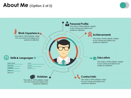
About me ppt summary infographic template




Try Before you Buy Download Free Sample Product
 Impress Your
 Audience
 100%
100% Editable
 Save Hours
 of Time


Advise the insensitive with our About Me Ppt Summary Infographic Template. Encourage folks to express care and concern.
People who downloaded this PowerPoint presentation also viewed the following :
About me ppt summary infographic template with all 5 slides:
Hardly ever err with our About Me Ppt Summary Infographic Template. You will be consistently accurate.

FAQs for About me ppt
Start with something that'll actually make people remember you - a weird hobby or random fact works great. Then hit your job stuff and what you're good at, but don't make it sound like a resume copy-paste (honestly, those make me want to skip to the next person). Throw in some personal stuff so you seem like an actual human. What gets you excited about work? Got any wins you're proud of? Those details matter way more than you'd think. Oh, and definitely tell people how to find you later. Keep the slides clean though - nobody wants to read paragraphs.
Honestly? Dump all that boring placeholder stuff first. Get your actual work examples and achievements in there – the real ones that matter to you. Corporate-speak is the worst, so just write like you talk. Switch up the colors and fonts to match your vibe. Throw in some photos that actually look like you, not those weird stock headshots everyone uses. Your colleague Sarah or whoever – have them take a quick look before you publish it. The whole point is making people think "oh this person seems cool" when they land on your page. Templates are fine but they shouldn't feel like templates, you know?
Definitely use good photos of yourself - not boring headshots though, show some personality! Pick a color scheme and stick with it. Most people make the huge mistake of cramming too much text everywhere. It's honestly painful to watch. Go for visual stuff instead of bullet points, like timelines or simple graphics. Your fonts need to be big enough so people in back can actually read them. Oh and add interactive bits if you can swing it. I mean, would you want to sit through your own presentation? Design it like that.
Honestly, less is way more here. Stick to like 3-5 bullet points max and make that font big enough to actually read. Let your visuals carry the weight - grab one solid photo of yourself (professional but not awkward-stiff, you know?) and throw in maybe a couple simple icons for your skills or whatever. I literally cannot with slides that are just text walls! Try the 70/30 thing - most of your slide should be visual stuff, then 30% text. Oh and don't just read your slide out loud... that's painful for everyone. Your slide's there to back up what you're saying, not be your script.
Honestly? Just go with something clean like Montserrat or Arial - fancy fonts are so distracting. Color-wise, I've been loving muted palettes lately (maybe I'm getting old lol). Navy and orange is solid, or try deep green with cream. Don't go crazy with more than 3 colors though. The contrast thing is huge - your text needs to actually show up against the background. Oh, and definitely test it on a projector first if you can. What looks perfect on your laptop screen can be totally unreadable when it's projected. Trust me on that one.
Yeah totally! Search for "[your industry] about me slide template" and you'll find tons. Creative field ones are packed with visuals and portfolio stuff - honestly they look amazing. Corporate templates focus more on metrics and leadership achievements, way more formal. Healthcare, education, tech - they all have their own versions. The main differences are what sections they highlight and the overall vibe. Like creative ones show off projects and artistic skills, while business ones are all about ROI. Oh and the terminology changes too depending on your field, which is actually pretty helpful.
Oh this is actually pretty simple! Instead of just rattling off boring facts about yourself, turn those moments into actual stories. Like when I say I'm detail-oriented, I'll talk about catching that huge mistake my whole team missed - way more memorable, right? Start with something hooky about why you picked your career, then weave in little anecdotes that show your skills. Personal stuff works too if it connects to work strengths. Just keep each story under 30 seconds and always circle back to why it matters for whoever's listening.
Okay so biggest thing - don't just rattle off your resume like a robot. Nobody wants to hear your job titles and where you went to school. Tell actual stories that show your personality instead. Skip the boring hobbies too (seriously, everyone "likes to travel"). You want maybe 2-3 good stories that actually reveal who you are. Keep it casual and conversational. I see people trying to cram every accomplishment in there and it's just... a lot. The whole point is connecting with people, not proving how impressive your LinkedIn is. Practice those stories beforehand so you're not rambling.
Honestly, photos and videos are game-changers for presentations. People connect way better when they can actually see your workspace or watch clips of you in action - way more than just reading bullet points about your skills. Short videos work best though, nobody's got patience for long ones. The trick is picking stuff that actually tells your story instead of random pretty pictures. Like, I'd go with maybe 2-3 really solid pieces that show off your biggest wins or what you're about. It breaks up all that text and makes people remember you afterward.
Honestly, 3-5 minutes tops for most situations. People start zoning out after that - I've totally done it myself. Conference settings? Maybe push to 7-8 minutes but that's really the limit. Pick 3-4 things that actually matter to whoever's listening. Practice so you're not awkwardly pausing between points. Oh, and definitely end with a question or something that gets people talking back to you. Their attention spans are pretty much nonexistent these days, even when they genuinely want to know about you.
Skip the generic "I'm a team player" nonsense and show actual examples instead. Like if you boosted productivity by 30% or handled a $50K budget - use those real numbers! Honestly, presentations full of random soft skills with zero proof make me want to hide under a desk. Break your wins into clean sections with bullet points. Don't dump everything on one slide though. Pick your best 3-5 accomplishments and give each one space to breathe. For each one, explain what the problem was, what you did about it, and how it turned out. Way more convincing than just listing skills.
Okay so you want something super clean and adaptable - neutral colors, good fonts, layouts that work for any crowd. Whether you're talking to the CEO or doing a casual team presentation, right? The smart move is finding templates with modular sections you can swap around easily. Like, ditch the "weekend hiking" slide when you're pitching to investors, add it back for internal stuff. I've watched people mess this up by picking something too playful or way too stiff upfront. Much better to start flexible. Then you're just tweaking instead of rebuilding the whole thing every time.
Throw some numbers into your story but make them actually mean something. Like "boosted team productivity 30%" or "handled a $500K budget" - that stuff hits different than vague claims. Even personal numbers work... I've been cramming in programming languages lately and honestly it shows growth. Don't just rattle off stats though. Weave them into the actual story arc, especially at those big turning points. Maybe that project's 95% success rate is what landed you the next gig? The numbers should feel like they belong there, not like you're desperately trying to impress someone with random metrics.
Find templates with modular layouts you can mix and match - that's key. Multiple color schemes and editable text boxes are must-haves. Oh, and make sure the image containers work with different photo sizes because that's always annoying when they don't. Good font pairings matter way more than people think (seriously, typography can make or break the whole thing). You'll want timeline layouts, skill sections, portfolio grids - not just boring bullet point slides. Test swapping colors and fonts first before you buy anything. The best ones let you grab elements from different slides and move them around however you want.
Make your text big enough to actually read - 18pt Arial or Calibri works great. High contrast colors are your friend here. Don't forget alt text for images! I learned this the hard way when someone couldn't see my "brilliant" yellow text on white background
-
Illustrative design with editable content. Exceptional value for money. Highly pleased with the product.
-
Wonderful templates design to use in business meetings.