


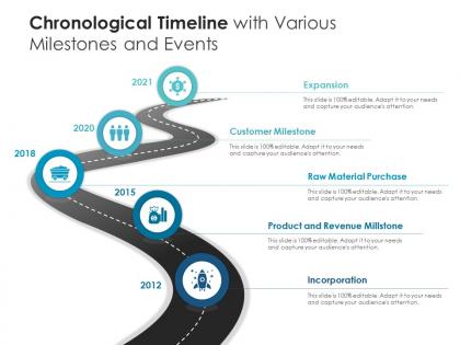
Chronological timeline with various milestones and events




Try Before you Buy Download Free Sample Product
 Impress Your
 Audience
 100%
100% Editable
 Save Hours
 of Time


Our Chronological Timeline With Various Milestones And Events are topically designed to provide an attractive backdrop to any subject. Use them to look like a presentation pro.
People who downloaded this PowerPoint presentation also viewed the following :
Chronological timeline with various milestones and events with all 2 slides:
Use our Chronological Timeline With Various Milestones And Events to effectively help you save your valuable time. They are readymade to fit into any presentation structure.
FAQs for Chronological timeline with various
You definitely want clear time markers - like actual dates or "next" and "then" so people can follow along. I've watched way too many presentations where the timeline was all over the place and it was painful. Build each point off the last one naturally. Don't spend forever on one thing then race through everything else. Visual stuff like progress bars really helps. Oh, and start by figuring out your main moments first, then add details around that basic structure. That way you won't get lost in the weeds while you're talking.
Honestly, timelines are game-changers for presentations. Your brain naturally wants to follow things in order, so when you jump around chronologically, people get lost fast. I've seen so many good presentations fall flat because of this. Timelines show how events connect and build on each other - way easier to follow than random facts thrown together. They make complex stuff digestible too since you can see both the overview and specifics. My approach? Pick your key dates first, then weave the story around those moments. It's like giving your audience a map instead of making them wander around confused.
Honestly, I'd just use **Canva** or **Adobe Express** - they've got really good timeline templates and you don't need to be a design wizard. PowerPoint is fine if that's all you have, but the timeline stuff is kinda meh. Oh, and **Visme** or **Piktochart** are decent too if you want something between super easy and way too complicated. Really depends on your patience level though. Canva's perfect when you're in a rush and need something that looks professional. But if you actually want to mess around with fonts and colors and all that, go with Visme.
Oh man, this is so true! Western audiences want everything super linear - past, present, future, boom boom boom. But like, Asian and Indigenous cultures see time as more circular? So they might jump around chronologically and that feels totally normal to them. Meanwhile you've got some cultures that need ALL the background context before you even mention what's happening now. Others just want you to cut to the chase immediately. I bombed a global presentation once because of this - learned my lesson real quick! Honestly, just ask about your audience beforehand or at least warn them how you're structuring things.
With history presentations, chronology is everything - your audience needs to follow how events led to other events, so you're basically stuck with timeline order. Science presentations? Way more flexible. You might go chronologically through your experiment steps, but honestly you could just as easily organize around your main concepts or data patterns instead. Time doesn't matter as much in science unless you're doing something like climate research where the timeline is actually your data. So for your presentation - are you showing how things unfolded over time, or are you trying to prove a specific point? That'll tell you which approach to take.
Okay so basically our brains are just wired to follow sequences, right? When you organize stuff chronologically, people can actually build this mental timeline in their heads. Way better than just throwing random facts at them. Each piece connects to the next one, which makes everything stick better in memory. It's like - imagine trying to explain a movie by jumping around scenes versus telling it start to finish. The cause-and-effect thing just clicks. I swear, next time you're doing a presentation or whatever, try putting everything in time order. People will follow along so much easier and actually remember what you said later.
Start with a solid structure - linear works for most stuff, but go layered if your data's complicated. Color coding and icons help break things up so it doesn't look like a hot mess. Honestly, most people try cramming way too much in and it becomes unreadable. Focus on your main events first. Add the smaller details after. Keep your date formats consistent - sounds obvious but you'd be surprised how often people mess this up. Also, definitely have someone else look at it before you're done. They'll catch the confusing bits you totally missed.
Honestly, infographics are a game-changer for timelines because your brain just processes visuals way better than chunks of text. Colors and icons show you the cause-and-effect stuff instantly. Most of us are visual learners anyway - I know I zone out reading long paragraphs about historical events. You'll spot patterns and turning points right away instead of hunting through dates. My history teacher used to draw everything on the board and it actually stuck. Try sketching out whatever sequence you're explaining first. Visual hierarchy makes all the difference.
Honestly, the worst thing you can do is jam way too much detail into every single period. People's brains just shut off. Also don't bounce around the timeline randomly - it gets confusing super fast unless there's actually a good reason. Here's what bugs me though: when people spend the same amount of time on boring stuff as they do on the major events that actually changed everything. Make sure you've got clear dates and transitions or people will get totally lost. Focus on what really matters for your main argument. And yeah, throw in some visuals - they help way more than you'd think.
Okay so first thing - use time markers like "in 2019" or "six months later" so people can actually follow along. Start with whatever challenge or moment kicked everything off, then hit your biggest turning points in order. Don't try to cram every detail in there though! Pick maybe 3-4 moments that really mattered. I swear, nothing's worse than someone jumping all over the timeline and losing everyone. Connect things with stuff like "this led to" so it flows. End with where you're at now and what you figured out. Make it feel like an actual journey, you know?
Honestly, horizontal timelines are your best bet since we naturally read left to right anyway. Gantt charts are super handy when you've got overlapping events - they're basically the gold standard for project stuff. Interactive ones work well if people need to dig into specific time periods. I always forget how useful basic flowcharts can be for simple sequences too. Oh, and scrolling timelines are pretty solid for longer histories. Really depends on whether your audience just needs to glance at it or actually explore the data. Complex stuff = interactive. Simple overview = stick with basic horizontal layouts.
Honestly, digital timelines are so much cooler than the boring static ones we grew up with. You can make them interactive now - people click through events, see animations showing how things changed over time. AR museum stuff is getting crazy good too, like they'll overlay historical events right onto the physical space you're standing in. Short sentences work great. The biggest win is that you can throw in videos, audio, whatever - and people don't have to follow your timeline in order if they don't want to. Timeline JS is pretty solid for beginners, or check out Tiki-Toki. Way more engaging than just reading dates on a page.
Look, chronological order just works because that's how our brains are wired - we expect things to happen in sequence. When you lay out events clearly, people can actually follow without their brain working overtime. It's way less exhausting than making them solve some weird puzzle, you know? Plus it makes you look credible since you're not jumping around or seeming like you're hiding stuff. People trust you more when they can see the clear cause-and-effect chain. Honestly, it's like giving someone directions vs. just pointing vaguely toward your destination.
Throw in clear transitions like "meanwhile" or "by 1985" so people don't get whiplash jumping between decades. Visual stuff helps tons too - timelines, color coding different eras, maybe some basic slide animations. I've sat through way too many presentations where someone goes from 1920 to 1980 with zero warning and half the room looks confused. You can also connect things with phrases like "while this was happening in Europe..." or "around the same time in Japan..." Short sentences work. Longer ones that flow naturally work too. Just give your audience those breadcrumbs so they're not constantly doing mental math about when stuff happened.
Honestly, getting your sequence right is huge - it can totally make or break what you're trying to say. Like if you're pitching a solution, start with the problem first. Creates that urgency, you know? Your audience will actually want to hear your fix. Do it backwards and they'll zone out immediately. Oh, and timing matters way more than people think. Don't dump heavy stuff on people right before lunch - learned that one the hard way. You've got to think about where your audience's head is at. Map out what order makes sense for them to follow, then figure out when they're actually going to listen and act on it.
-
Excellent Designs.
-
Nice and innovative design.
-
Designs have enough space to add content.
-
Great product with highly impressive and engaging designs.
-
Content of slide is easy to understand and edit.
-
Best Representation of topics, really appreciable.