


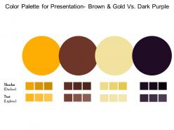
Color palette for presentation brown and gold vs dark purple





Try Before you Buy Download Free Sample Product
 Impress Your
 Audience
 100%
100% Editable
 Save Hours
 of Time


You have the diagnosis just right. Prescribe the process with our Color Palette For Presentation Brown And Gold Vs Dark Purple.
People who downloaded this PowerPoint presentation also viewed the following :
Color palette for presentation brown and gold vs dark purple with all 2 slides:
Your influence has an effect due to our Color Palette For Presentation Brown And Gold Vs Dark Purple. Folks feel driven to consider your ideas.
FAQs for Color palette for presentation brown and gold
Oh yeah, colors make a huge difference! Blue's your safe bet - builds trust and keeps everyone chill, which is why literally every corporate presentation uses it. Red grabs attention fast but don't go crazy or you'll stress people out. Green feels natural and balanced. Yellow works great for highlighting stuff but seriously, never use it for big chunks of text - your eyes will hate you. Orange energizes people (though I'm kinda sick of seeing it everywhere lately). Just pick 2-3 colors max and test them on different screens first. Trust me on that last part.
Honestly, bad contrast will kill your presentation faster than anything else. Your audience starts squinting at light gray text on white backgrounds? They're mentally checked out. I've watched entire rooms lose focus because someone thought pale yellow was "aesthetic." Dark blue on white works every time - boring but bulletproof. Test your slides from the back row though, because what looks fine on your laptop might be impossible to read projected. Don't go crazy with neon colors either. People's eyes need to actually rest somewhere, you know?
Start with what vibe you're going for - trustworthy and stable means blues, energetic is reds/oranges, calming/natural leans green. Think about who you're targeting too since different people react to colors differently. Don't just pick whatever's trendy right now, seriously that's such a mistake! You'll also want to consider practical stuff - does it work across different platforms? Is it accessible? Oh and definitely test a few options with real users if you can swing it. Once you decide, write down your exact colors so everyone stays on the same page.
Honestly, color choices can totally save or ruin your presentation. Dark text on light backgrounds = your friends won't hate you for making them squint. I've seen way too many neon green on hot pink slides that literally hurt to look at. Keep it simple with maybe 2-3 colors tops. High contrast is your best friend here. Also, definitely check how your slides look on different screens - I learned this the hard way when my "perfect" slides looked terrible on the actual projector. Just pick something clean and stick with it throughout.
Everyone's obsessed with earth tones right now - sage green, terracotta, those soft blues. Monochromatic color schemes are everywhere too, especially gray with one pop of color. Don't even get me started on millennial pink... I thought that died but nope, still haunting every deck I see. Dark mode palettes work great for tech stuff if that's your vibe. Oh and stick to 3-4 colors max or it'll look like a rainbow threw up. Coolors.co is actually clutch for finding combinations that don't make your eyes bleed.
Dude, color harmony is what stops your slides from looking like a unicorn exploded everywhere. Your audience won't get distracted by awful clashing colors when you pick ones that actually work together. Plus it creates this nice flow between slides - I always use complementary colors to highlight important stuff. Honestly? This is what separates the amateur PowerPoints from ones that look legit professional. Stick to maybe 3-4 colors from the same family and you'll see how much cleaner everything looks immediately. It's weirdly one of those small things that makes a huge difference.
Dude, colors can seriously mess up your presentation if you're not careful. Red screams "lucky!" in China but "danger!" here in the West. White? Pure and clean to us, but it's actually mourning colors in parts of Asia - who knew, right? Green's tricky too since it means nature everywhere but also jealousy or money depending on where you are. I'd definitely look into your audience's background first. Maybe run your slides by someone local if you can? Honestly though, when I'm unsure I just go with boring neutral colors for international stuff.
Oh dude, Coolors.co is where it's at - you just smash the spacebar and it spits out new color combos. Seriously addictive lol. Adobe Color's probably what most people use, lets you pull palettes straight from photos which is pretty neat. For the nerdy color theory stuff, Paletton's your best bet. Honestly though? Start with Coolors since it's free and stupid easy. You can lock the colors you like and mess around with the rest. Oh and if you're already using Figma or whatever, they've got palette tools built right in too.
So you'll want good contrast ratios - WebAIM's contrast checker is clutch for this, shoot for 4.5:1 minimum. Don't just use color alone though! I learned this the hard way when I made slides with bright green text that looked fine to me but was awful for others. Red-green combos are especially bad since that's super common color blindness. Try adding patterns or labels with your colors so everyone can tell things apart. Oh and test everything in grayscale - if it still works, you're golden. Honestly saved me so many headaches once I started doing this.
Honestly, color is like your cheat code for getting people to look where you want them to. Bright or contrasting colors on your key points? People's eyes will go there first - it's just how our brains work. I totally bombed a presentation once because my main findings were in boring black text and nobody even noticed them lol. You can build a whole visual hierarchy too, like making all your important numbers the same blue or whatever. But seriously, don't go overboard. Stick to maybe 2-3 accent colors and use them smart, not everywhere.
Oh totally! I just switch up my usual colors to match whatever season we're in. Spring = soft pastels and greens, summer = bright corals and blues, fall = those gorgeous oranges and burgundies (honestly my favorite combo), winter = cool blues with some metallic touches. Just did this for our Q4 deck actually—used those rich autumn tones and it looked so much better than our boring default template. Don't go crazy though. Pick maybe 2-3 seasonal colors as accents but keep your main brand stuff the same. Trust me, it makes presentations way more interesting without being unprofessional.
RGB is your best bet for presentations - way more vibrant colors since it's made for screens. You get those bright blues and electric greens that actually pop. CMYK is for printing so everything looks duller and more muted. I found this out the hard way when my "amazing" presentation colors looked like garbage when I printed handouts lol. Screen-only presentation? Go RGB all the way. But if you need printed stuff too, just start with CMYK so you don't hate yourself later. Trust me on this one.
So here's what works - start with cooler, muted colors when you're setting up the problem. Then gradually shift to warmer or brighter tones as you build toward your solution. Don't go crazy with like 20 different colors though, that's just chaos. Pick 3-4 colors max and stick with them for specific themes throughout your deck. Oh, and circle back to your opening palette for the conclusion - gives it that nice wrapped-up feeling. Honestly, mapping out your colors before you design saves so much time later. Makes the whole thing feel way more purposeful instead of random.
Keep it simple with colors - 3-4 max or you'll create a hot mess. Some people are colorblind, so don't make color your only way to show important stuff. Neon colors are the worst under those harsh projector lights, trust me. Your text needs good contrast with the background too. That light gray on white combo? Looks fine on your laptop but disappears completely when projected. I learned this the hard way once. Test everything on the actual equipment first and have a high-contrast backup ready just in case.
Honestly, gradients are a game changer for presentations. They add this depth that flat colors just can't pull off - makes everything look way more polished. Your eye flows naturally across the slide instead of getting stuck on harsh color blocks. I used to think they were cheesy (maybe I watched too many 90s PowerPoints?) but subtle ones actually work really well. Start with your brand colors and do a light-to-dark fade. You'll be shocked how much more dynamic it looks. Plus they're perfect for creating hierarchy - darker areas naturally draw attention to your key points.
-
Excellent products for quick understanding.
-
Really like the color and design of the presentation.