

Color Palette With Five Shade Midnight Blue Stratos Black Pearl Deep Cove Paris M




Try Before you Buy Download Free Sample Product
 Impress Your
 Audience
 100%
100% Editable
 Save Hours
 of Time


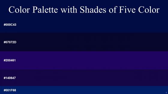
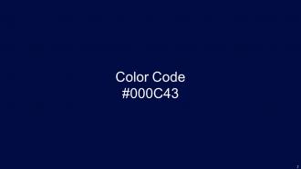
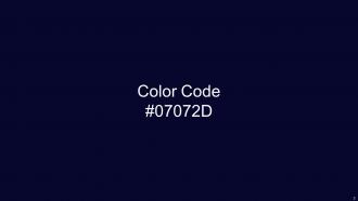
Heres a visually-pleasing color palette with Five Color Shades With Hex Code 001f68, 000c43, 07072d, 140647, 200461. These colors are intuitively picked to ignite the spark of brilliance in your designs and creativity.
People who downloaded this PowerPoint presentation also viewed the following :
Color Palette With Five Shade Midnight Blue Stratos Black Pearl Deep Cove Paris M with all 14 slides:
Use our Color Palette With Five Shade Midnight Blue Stratos Black Pearl Deep Cove Paris M to effectively help you save your valuable time. They are readymade to fit into any presentation structure.





FAQs for Color Palette With Five Shade Midnight Blue Stratos Black Pearl Deep
Colors in presentations trigger distinct psychological responses, with blue conveying trust and professionalism, red creating urgency and energy, green suggesting growth and stability, while yellow evokes optimism and orange stimulates enthusiasm. These color associations enable presenters to strategically influence audience emotions and decision-making, with many organizations finding that consistent color psychology enhances message retention and drives desired outcomes.
A cohesive color palette enhances audience engagement by creating visual consistency, establishing emotional connections, and improving content readability across presentations. Through strategic color choices, organizations in sectors like retail, healthcare, and financial services streamline brand recognition, reduce cognitive load, and ultimately deliver more memorable experiences, with many finding that unified palettes increase audience retention significantly.
**INPUT**: What tools or apps can assist in creating a color palette for presentations? **OUTPUT**: Color palette tools include Adobe Color, Coolors, Paletton, Canva's color wheel, and ColorSpace, offering features like harmony generation, accessibility checking, and brand integration. These platforms streamline design workflows by enabling quick palette creation, color extraction from images, and seamless export to presentation software, ultimately delivering professional visual consistency and enhanced audience engagement. [Word count: 56 words]
Cultural perceptions of color significantly influence presentation design by dictating emotional responses, symbolic meanings, and audience engagement across different regions. Colors carry distinct cultural associations—red signifies luck in China but danger in Western contexts, while white represents purity in some cultures and mourning in others—requiring presenters to strategically adapt their color choices for global audiences, ultimately ensuring cultural sensitivity and maximizing message effectiveness.
**INPUT**: What are the best practices for using contrasting colors in text and backgrounds? **OUTPUT**: Best practices for contrasting colors include maintaining 4.5:1 contrast ratios for normal text, using darker text on lighter backgrounds, avoiding color combinations like red-green or blue-yellow, and testing readability across devices. These approaches enhance accessibility by improving legibility, reducing eye strain, and ensuring compliance with WCAG guidelines, with many organizations finding that strategic color contrast ultimately delivers better user experiences and broader audience engagement. [Word count: 60 words]
Research your target audience's psychological responses to colors, analyze competitor branding within your industry, and consider cultural associations that resonate with your demographic. Financial services often favor blues and grays for trust, while healthcare utilizes calming greens and blues, with many organizations finding that testing color combinations through focus groups or A/B testing delivers measurable improvements in audience engagement and brand recognition.
Color serves as a fundamental brand identifier in presentation templates, establishing visual consistency, conveying brand personality, evoking specific emotions, and enhancing audience recognition across all communications. Through strategic color implementation, organizations streamline brand messaging, reinforce corporate identity, and create memorable visual experiences, with many companies finding that consistent color usage increases brand recognition by up to 80%, ultimately delivering stronger market presence and competitive advantage.
A monochromatic color scheme uses varying shades, tints, and tones of a single base color to create visual cohesion while maintaining depth and interest. This approach streamlines design consistency, enhances professional aesthetics, and reduces visual clutter, with many presenters finding that monochromatic palettes deliver stronger brand alignment and improved audience focus.
Common color palette mistakes include choosing too many colors, ignoring brand consistency, neglecting accessibility standards, following trends over strategy, and failing to test across different mediums and devices. These oversights often result in visual confusion, reduced readability, and weakened brand recognition, with many organizations finding that strategic color choices ultimately enhance user experience, strengthen brand identity, and improve communication effectiveness.
Gradients and textures enhance color palettes by adding visual depth, creating smooth transitions between elements, and breaking monotony without introducing new colors. These techniques enable presenters to maintain brand consistency while achieving sophisticated visual hierarchy, with many corporate presentations finding that subtle gradients in backgrounds and textured overlays deliver more engaging audience experiences and professional polish.
Accessibility in color choices ensures presentations are inclusive for audiences with visual impairments, color blindness, or varying visual abilities, requiring sufficient contrast ratios, alternative visual cues, and readable color combinations. These design principles enhance comprehension across diverse audiences while meeting compliance standards, with many organizations finding that accessible presentations ultimately deliver broader engagement, reduced communication barriers, and stronger professional credibility.
Screen presentations benefit from bright, saturated colors and high contrast ratios, while print requires CMYK color modes, darker tones, and careful consideration of paper quality and lighting conditions. Many organizations find that creating dual palette versions—one optimized for digital displays with vibrant blues and greens, another for print materials with deeper, more subdued alternatives—ensures consistent brand representation across all mediums, ultimately delivering professional credibility and enhanced audience engagement.
Current trending color combinations include sage green with cream, deep navy with coral accents, warm terracotta paired with soft blues, monochromatic jewel tones, and sophisticated charcoal with gold highlights. These palettes enhance visual engagement by creating psychological comfort, improving readability, and establishing professional credibility, with many organizations finding that strategic color choices significantly boost audience retention and brand perception.
Color consistency across slides and templates is achieved through establishing master color palettes, using template libraries with predefined color schemes, and implementing brand style guides with specific hex codes. This systematic approach streamlines design workflows, ensures professional cohesion across presentations, and enables teams to maintain visual brand integrity, with many organizations finding that standardized color systems ultimately deliver faster content creation and stronger brand recognition.
Color palette inspiration resources include Adobe Color, Coolors.co, Dribbble, Behance, Pinterest, and Material Design guidelines, along with nature photography platforms and brand showcase websites. These platforms enable designers to explore trending combinations, extract palettes from images, and analyze successful brand applications across industries like fashion, technology, and hospitality, ultimately delivering enhanced visual consistency and audience engagement.
-
Editable templates with innovative design and color combination.
-
It's always a delight to see new templates from you! I am extremely pleased with the fact that they are easy to modify and fit any presentation layout in seconds!