Company overview presentation portfolio

Rating:
90%
Slide 1 of 5
Favourites Favourites

Try Before you Buy Download Free Sample Product

Audience Impress Your
Audience
Editable 100%
Editable
Time Save Hours
of Time
The Biggest Sale is ending soon in
0
0
:
0
0
:
0
0
Rating:
90%
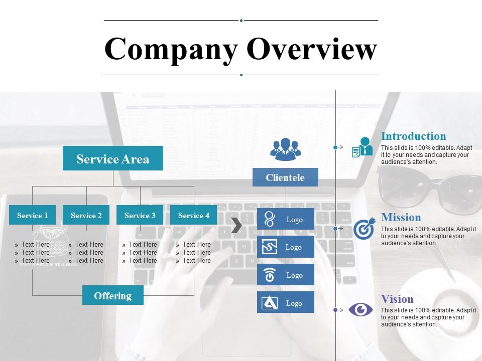
Introducing company overview presentation portfolio PPT template. The presentation template can be downloaded and saved in any desired format. Valuable for the business presenters and entrepreneurs as they can showcase their business success in a creative way. Privilege of insertion of logo and trademarks for more personalization. Adaptable to wide screen view without the problem of pixilation. Can be used with Google slides. These are created with well-designed methods and tools. Beneficial for industry professionals, managers, executives, researchers, sales people, etc.

FAQs for Company

Look, we're basically trying to fix how awful most presentations look out there. Everyone should be able to make something decent without being a designer or wasting their whole afternoon on layouts. That's the big thing - democratizing good design. Startup founder? Teacher? Doesn't matter. You'll actually end up with something polished. We're constantly tweaking stuff based on what users tell us too. Honestly, terrible slide decks are everywhere and it drives me nuts! Just grab one of our templates next time instead of starting from nothing.

So we get industry experts to review each template first - people who actually use this stuff day-to-day. Plus we track which ones work best and update them based on user feedback. It's basically crowdsourced quality control but with professional oversight, which sounds fancy but really just means we don't let random people decide what's good lol. The templates get refreshed every quarter too. Oh, and definitely grab the newest version before you start - I learned that the hard way when I used an outdated one last month. Trust me, it saves headaches later.

Honestly, these templates are pretty solid because they're made by actual designers who worked at real companies, not just random freelancers. They've got industry-specific stuff too - like SaaS onboarding or retail launches. Way more flexible than most places that lock you into boring formats. Here's the cool part though: they update them every few months based on what users actually want, so you won't get stuck with something that looks dated. Oh, and definitely try their preview tool first - it shows how everything looks with your brand colors and fonts before you commit.

So first you'll want to nail down what the client actually wants - their brand stuff, who they're targeting, the usual. I usually do 2-3 wireframe concepts because options are good, though honestly the decision phase drags on forever sometimes. Once they finally pick one, polish it up with all the details and build your master file. Then dev takes over for the coding part. Oh, and make sure you design it flexible from day one - different content lengths will definitely come up later. After approval it's pretty smooth sailing through testing.

Honestly, user feedback drives pretty much everything we do with templates. Bug reports, feature requests, random comments - our product team obsesses over all of it. They've got these crazy detailed spreadsheets tracking what people want most. Short sentences mixed with longer ones feel more natural when you're actually talking. When everyone started complaining about mobile issues, boom - that became our top priority. The whole company pivoted. So yeah, definitely keep telling us what's broken or missing because it literally decides what we build next. Your complaints become our roadmap, which is kind of cool when you think about it.

Honestly, it's all about mixing things up. We hit design conferences regularly and subscribe to the good tech publications - you know, the ones that actually matter. Online communities are huge too since trends usually pop up there first. My team does these "innovation time" sessions where we just mess around with new tools, and I swear some of our best ideas come from those random experiments. We've got partnerships with tech vendors who hook us up with beta access, which is pretty sweet. The trick is staying aware without going crazy chasing every new thing that drops. Got to focus on what actually adds value.

So we do content in 15+ languages, which is honestly a lot more work than you'd think. Regional teams handle the cultural stuff since they actually get the local nuances - way better than trying to Google translate our way through it. Our UI, marketing campaigns, all that gets adapted so we don't accidentally say something stupid. Focus groups test everything before launch too. Oh, and customer support speaks the local languages, which seems obvious but apparently isn't always? If you're planning anything global, talk to the localization people early. Trust me, they'll catch weird stuff you never would've considered.

Business stuff dominates - pitch decks, quarterly reports, project updates. Teachers are constantly making presentations too, so educational templates do really well. Marketing and sales presentations are massive, especially for product launches. That whole minimalist thing is everywhere now (clean, lots of white space). Corporate people love their data-heavy layouts, while creative agencies go for the visual storytelling approach. Honestly, I'd start with business categories since that's your biggest audience. Oh, and client proposals - those are always in demand too.

Hey! So there's a few different ways to tackle this. The template editor has drag-and-drop stuff which is pretty intuitive. They've got video tutorials too that cover the most common tweaks people make. Honestly, I'd start by browsing their template gallery first - seeing what other companies in your space have done saves so much headache. Find something close to what you want, then customize from there. If you hit a wall (which happens), their support team is solid. They'll actually hop on calls for the trickier modifications. Way better than just getting stuck with email back-and-forth, you know?

So we've basically woven sustainability into everything we do now. From day one of any project, teams have to think about where materials come from, energy costs, recycling - the whole deal. There are checkpoints built right into our timelines too. Honestly slowed us down at first, but whatever, it's normal now. Production switched to renewable energy and we track waste reduction monthly (your team probably does this already). Oh, and if you're starting something new, just peek at the sustainability section in our design docs - saves you a headache later.

So we use a few different things to track this stuff. Post-download surveys are pretty standard, plus we look at usage analytics and those star ratings people leave on templates. Download-to-completion rates tell us a lot - also how long people spend customizing things. The sharing data is honestly my favorite metric because it shows what's actually resonating with users, you know? Plus we track if people come back for more templates. Your dashboard shows all this in real-time, which is super helpful. Oh, and if you need deeper dives on specific templates, just hit up the analytics team for custom reports.

So we work with design agencies and freelance spots like 99designs and Behance - they keep feeding us new templates. Stock photo partnerships with Unsplash and Pexels are clutch too, saves you from that endless image hunt (you know how that goes). The Canva developer network thing is probably our biggest win though - gives us access to their design API. Oh, and definitely hit up the "Partnership Collections" section first when you're starting a project. Those templates are usually way better quality and more up-to-date than the regular stuff.

Oh nice question! So all their templates actually come with accessibility built right in - no need to add it later. You get WCAG 2.1 AA compliance automatically, which covers color contrast, keyboard navigation, screen readers, proper HTML structure. Trust me, your future self will thank you when clients start asking about compliance stuff. Alt text fields are already there, plus focus indicators and fonts that scale properly. I've seen too many people have to go back and fix this stuff later - such a pain. Just drop in your content and you're done, honestly.

So we're going pretty hard on AI automation and green tech stuff this year. Three new product lines drop in Q2 that should actually make your life easier workflow-wise. The sustainability features are honestly kind of cool - carbon tracking, energy optimization, all that ESG stuff your boss probably loves talking about. Mobile integration's getting way better too since we're all basically glued to our phones anyway. Oh, and check your email for beta invites if you want to try things early. I think you'd actually dig the new automation tools.

Honestly, we just put user needs first and build the pretty stuff on top. Forms need to actually work - like, can people find what they're looking for without getting frustrated? Our design team goes a bit overboard with animations sometimes (they can't help themselves), but we test everything with real users before shipping. There's this unspoken rule that every flashy element has to actually do something useful. Quick tip when you're looking at templates: always ask yourself if something helps the user or just makes the designer feel clever.

Ratings and Reviews

90% of 100
Review Form
Write a review
Most Relevant Reviews
  1. 100%

    by Darrel Burns

    Visually stunning presentation, love the content.
  2. 80%

    by Eddie Sandoval

    Graphics are very appealing to eyes.

2 Item(s)

per page: