

Competitive Analysis For Pharmaceutical Global Pharmaceutical Industry Outlook IR SS





Try Before you Buy Download Free Sample Product
 Impress Your
Audience
 100%
Editable
 Save Hours
of Time


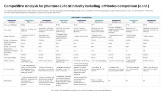
The slide presents the key players in the pharmaceutical industry. It provides a glimpse of significant participants and key competitors of the industry to gain insight into their products, sales, and other tactics. It will help the company implement new business strategies to compete successfully in the market.
People who downloaded this PowerPoint presentation also viewed the following :
Competitive Analysis For Pharmaceutical Global Pharmaceutical Industry Outlook IR SS with all 10 slides:
Use our Competitive Analysis For Pharmaceutical Global Pharmaceutical Industry Outlook IR SS to effectively help you save your valuable time. They are readymade to fit into any presentation structure.







FAQs for Competitive Analysis For Pharmaceutical Global Pharmaceutical Industry
So I've been looking at what our competitors are doing, and honestly? They're crushing us on a few key things. First off, their designs are super clean and minimal - no clutter anywhere. Plus they give users crazy customization options, like switching colors and fonts with zero hassle. But here's what really gets me - their templates actually solve real problems instead of being those boring generic ones we see everywhere. The preview feature is solid too; you know exactly what you're getting before you commit. Their category organization makes way more sense than ours (kinda embarrassing tbh). Bottom line: people want something polished but flexible enough to make it theirs.
Oh yeah, pricing totally controls how people shop around. Most folks just want the best bang for their buck - they'll grab freemium for basic stuff but jump to premium when it feels like a good deal compared to buying everything separately. Limited-time discounts are honestly kind of manipulative but they work so well. When your competitors are all charging like $29/month, suddenly $15 looks incredible and $50 better have some seriously cool features. I'd keep an eye on when they run sales and stuff so you can time your moves right.
Look at how your competitors handle their visual stuff - branding, UI design, packaging, how they lay everything out. Apple does that super clean minimal thing while Samsung crams in every feature possible, you know? Same with subscription boxes - they're all trying different unboxing vibes. Check out their color choices, fonts, materials, the whole user experience. Some go crazy flashy, others keep it simple (honestly the simple ones usually win me over). Grab screenshots of your top 3-5 competitors and just... study what they're doing differently than you. Map out their design choices. It's pretty eye-opening once you start comparing side by side.
So most companies are doing those little pop-up surveys after downloads - you know, "rate this template" type stuff. Canva's really good at this. They're also stalking social media mentions (smart tbh) and A/B testing different versions to see what sticks. Oh, and here's something cool - they track which template elements users delete most often. That's basically a red flag that something sucks. Figma does this too I think. You should probably start simple though. Just do thumbs up/down ratings first since people actually respond to those. More complex feedback can come later once you've got the basic system working.
Your competitors are killing it with visual content - before/after template makeovers, quick design hacks, carousel posts showing their best work. Instagram and LinkedIn are obvious choices since everything's so visual, but Pinterest is weirdly massive for this stuff too. They're teaming up with business influencers and design people for legit reviews and tutorials. Smart move honestly. The clever ones run mini design challenges to get users creating content for them. I'd stalk maybe 3-5 of your biggest competitors' accounts and track what they post, how often, engagement rates - you'll probably find some holes in your own approach.
Honestly, your users want three big things that competitors are nailing right now. Real-time collaboration is the biggest one - people are so over the "can you see my screen?" mess in meetings. Google Slides kills it here. Better templates come up a lot too, especially industry-specific stuff. And mobile presenting needs work since everyone's using tablets now. The AI design suggestions thing is pretty cool - Canva and Gamma are doing that well. But yeah, I'd definitely tackle collaboration first. That's what people complain about most, and it'll probably give you the biggest impact.
Your competitors are hitting around 60-70% effectiveness with that same audience you're targeting. Their video ads are honestly pretty solid - kinda makes me jealous watching them perform so well. But they're totally missing obvious pain points your customers actually worry about. Pricing transparency, customer service issues - stuff people genuinely care about. Quick thought: grab their top 5 campaigns and see where those messaging gaps are. That's where you can jump in with something way better. Sometimes the best opportunities are hiding in what everyone else isn't saying.
Everyone's going super minimal right now - tons of white space and big, bold fonts. Dark mode is basically mandatory at this point, which honestly makes sense. Mobile-first design isn't even worth mentioning since it's just expected now. Video backgrounds are huge, plus all those little animations when you scroll. The drag-and-drop modular stuff is pretty clever though - lets people customize without coding. Oh, and micro-animations everywhere to keep people clicking around. I'd definitely check out your top competitors' latest templates and see what's actually getting people to stick around on their sites.
Honestly, everyone's really upping their accessibility game lately. Canva and Google Slides are crushing it with screen reader support and colorblind-friendly themes. You'll find bigger default fonts everywhere now, plus alt text fields built right into template editors. Microsoft's been throwing in way more diverse stock photos too - which is cool but kinda overdue if you ask me. Oh, and some platforms even have templates with dedicated spaces for sign language interpreters now. I'd check out 3-4 major competitors and document what they're doing well. That'll show you where the bar's set these days.
Look for three types of partnerships your competitors are doing: tech integrations, strategic alliances, and distribution deals. Press releases are gold for this - companies can't help but show off new partnerships. Check their LinkedIn too, plus any conference presentations they're doing. Joint webinars are a dead giveaway something's brewing. Set up Google alerts for "[competitor name] + partnership" and peek at their partner pages every few months. Oh, and watch for co-branded content or shared booths at events. Honestly, most of this stuff isn't hidden if you know where to look.
Your competitors basically set the bar for what customers expect from your industry. Like if they're doing 24/7 chat, customers will assume you should too. Their response times and channels become what people judge you against - which honestly sucks when someone raises standards and forces everyone to catch up. But flip side? You can find where they're screwing up and make that your advantage. Mystery shop their service, check their reviews, lurk in their support forums. Sometimes the gaps are obvious once you start looking.
So our competitors mostly target North America and Europe, which is why their templates are all clean and minimalist - tons of white space, neutral colors, basic sans-serif fonts. That's what works there. But here's what's cool: they're actually starting to test busier, more colorful layouts in Latin America and Southeast Asia because people there want more info crammed on screen. Makes sense when you think about it. I'd check their regional template differences every few months or so. You'll catch these changes early and can tweak your own stuff accordingly.
Check where they put testimonials - usually homepage, pricing, near signup buttons. Smart ones use actual company logos and video testimonials instead of boring text quotes. Those feel way more real, you know? Look for case studies with real numbers too. Here's what's clever: they match testimonials to specific industries or problems right where people are deciding to buy. I'd track which testimonials they feature most often - tells you exactly what objections they're dealing with from customers. It's basically a cheat sheet for understanding their sales conversations.
So everyone's going crazy with AI presentation builders right now. Gamma, Beautiful.AI, Tome - they're all doing the auto-generate thing where you just type a prompt and boom, slides appear. Real-time collab is huge too, basically Google Docs for presentations. The voice-to-slide stuff is wild though - you literally just ramble your ideas and it builds everything. I tried one last week and honestly? Pretty impressive. They're all racing to cut deck creation time from hours down to like 10 minutes. You should definitely check what their "AI assistant" features actually do - that's where the real competition is happening.
So the perception study results came back and honestly, you're doing better than I expected. Users trust you way more than Brand X - they think you're reliable and your customer service actually rocks. Innovation though? Yeah, that's where Brand X is crushing it. They've got everyone convinced they're the cutting-edge ones, which... I mean, look at their ad budget. You're sitting pretty solidly in the middle overall. People feel more connected to your brand than most others, but the "industry leader" thing isn't really sticking. Here's what's bugging me though - you already have innovative stuff! You're just terrible at talking about it. Focus your next campaign there and you'll be golden.
-
SlideTeam is my one-stop solution for all the presentation needs. Their templates have beautiful designs that are worth every penny!
-
Perfect template with attractive color combination.