
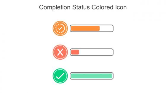
Completion Status Colored Icon In Powerpoint Pptx Png And Editable Eps Format




Try Before you Buy Download Free Sample Product
 Impress Your
 Audience
 100%
100% Editable
 Save Hours
 of Time


This Completion status colored icon in powerpoint pptx png and editable eps format is a 100 percent editable icon. The downloaded file will have this icon in EPS, PNG and Powerpoint pptx format and is perfect for your next project. It has a simple yet stylish design.
People who downloaded this PowerPoint presentation also viewed the following :
Completion Status Colored Icon In Powerpoint Pptx Png And Editable Eps Format with all 6 slides:
Use our Completion Status Colored Icon In Powerpoint Pptx Png And Editable Eps Format to effectively help you save your valuable time. They are readymade to fit into any presentation structure.

FAQs for Completion Status Colored Icon In Powerpoint Pptx Png And
OK so here's what works: green checkmarks for done, orange circles for in-progress, red X's for not started. Make them big enough to actually see - I swear, half the presentations I sit through have tiny icons that nobody can read from the back row. Don't go crazy with colors though, keep it simple and think about colorblind people too. Oh, and definitely put a legend on your first slide so people aren't guessing what everything means. The key is making it super obvious at a glance where things stand.
So basically, colors have this instant psychological effect on people. Green = done/success because we're wired to think traffic lights and checkmarks. Red obviously means incomplete or error. Yellow and orange? That's the anxious "loading" feeling - like when you're not sure if something's actually working or just broken. Blue feels more neutral, less urgent. Here's the thing though - you really can't mess with these conventions. People make split-second judgments, and if you randomly use red for "complete," everyone's gonna be confused and frustrated. Stick to what people already expect, trust me.
Honestly, just go with the classics - checkmarks for done, empty circles for not started. Half-filled circles work great for stuff that's in progress. Green for complete, gray for pending, you know the drill. But don't make color the only way people can tell the difference since some folks are colorblind. I've seen too many apps try to get fancy with weird custom icons that just confuse everyone. Stick to symbols people already understand without thinking about it. Maybe run them by a couple coworkers first? Sometimes what seems obvious to you isn't actually that clear.
Honestly, animated status icons are so much better than static ones. They show real progress happening instead of just sitting there. You can do filling progress bars, checkmarks that pop up one by one, or icons that smoothly change from empty to complete. It's way more intuitive - like actually watching your project move forward rather than guessing where things stand. The movement naturally draws your eye to what's changing too. Just don't go crazy with it though. Keep animations under 2 seconds or they'll get annoying. PowerPoint's morph transition works great, or even simple fade-ins.
Honestly, icons are like visual shortcuts that instantly show people where you are in your presentation. Your brain processes images way faster than text - we're just built that way. So when you use consistent icons for progress (like checkmarks for done, empty circles for what's next), people can follow along without thinking about it. Keeps them focused on your actual content instead of getting confused about structure. Makes everything look cleaner too, which I'm always a fan of. Super simple system but it works.
Make a master template first with your status icons all set up - green checks for done, orange dots for in progress, red X's for not started. Trust me, I used to wing it every time and it looked terrible! Size and position everything consistently upfront. Then just copy/paste from that template instead of starting over each slide. Oh, and write down your specs somewhere so teammates can stay consistent too. Way easier than recreating the same icons over and over.
Honestly, the worst thing you can do is make icons too subtle. I made that mistake once with gray vs slightly-darker-gray for status indicators - nobody could tell the difference! Complex designs are another trap. They look cool but turn into mush when they're tiny. Pick one clear visual system and stick with it throughout your app. If a checkmark means "done" somewhere, don't randomly use it for "favorite" later. Simple is always better. Test with real people early though - I've been shocked by how differently users interpret things that seem obvious to me.
Hey! So you can totally switch up those completion icons by playing with colors, symbols, and the overall look. For younger crowds, try gamified stuff like progress bars or those little achievement badges - they eat that up. Professional users usually want something cleaner though, like simple checkmarks or percentage indicators. Oh, and don't forget about cultural differences with colors - red means danger in some places but good luck in others, which is kinda wild when you think about it. Best bet is testing different styles with actual users first. Maybe survey a small group about what they'd prefer before you roll anything out to everyone.
Honestly, I'd just grab something from Heroicons or Feather Icons first - why reinvent the wheel? You can probably tweak their checkmark stuff to fit what you need. If you're set on making your own though, Figma's great for UI work since everything stays crisp at different sizes. Sketch works too but feels a bit dated now. Canva's fine if you want dead simple, but you'll hit walls pretty quick with customization. Adobe Illustrator's where you go when you need total control - though it's overkill for basic completion icons IMO. Start with the free icon libraries and see if anything clicks.
Oh man, colors are tricky! Green screams "success" here but can mean inexperience in parts of Asia. Red's "danger" to us, "luck" to others. Even checkmarks aren't foolproof - some cultures read right-to-left so your whole layout feels weird. Honestly, I learned this the hard way on a project once. Different shapes and symbols mean totally different things depending where you're from. Your safest move? Test with people from various backgrounds, or just go with something obvious like progress bars. They're pretty much universal and you can't really mess them up.
So for showing urgency, color coding works great - red for overdue stuff, yellow when deadlines are getting close. Progress bars that flip red when you're behind schedule are super helpful too. Priority indicators like exclamation points or stars do the trick. Those blinking ones are honestly so annoying but yeah, they work. Just don't go overboard with the urgent markers - if everything's screaming for attention, your team will just tune it out. Oh, and stick to the same color scheme so people actually know what means "drop everything" versus "eh, whenever."
Oh good question! So definitely don't rely on just color - add text labels like "Complete" or "In Progress" next to your icons. Screen readers can be super finicky about this stuff. Make sure there's good contrast between the icon and whatever's behind it too. Checkmarks are your friend since everyone gets what those mean. Alt text is crucial - describe the actual status clearly. I always think of it like this: if someone can't see that green checkmark, they should still know the task is finished through the text or symbol. Redundancy is honestly your best bet here.
Yeah, so everyone's going super minimal right now with those outlined icons instead of filled ones. Micro-interactions are huge too - like when checkmarks smoothly appear or progress rings actually look satisfying. That electric green everyone used? Thank god we're moving to softer greens now. Also, circles are kinda boring at this point - rounded squares or custom shapes that match your brand work way better. Just don't go crazy with more than 2-3 states or it gets messy. Oh, and test everything tiny since these icons end up crammed everywhere.
Honestly, status icons are perfect for this stuff - your brain just gets it instantly without reading anything. Think traffic lights but for your to-do list! Progress bars are cool and all, but when you're scanning a busy interface, nothing beats that quick visual hit of a checkmark or half-filled circle. Just stick with symbols people already know (checkmarks = done, circles = in progress, etc.) so they don't have to figure out your weird system. I've seen apps try to get creative with custom icons and it just confuses everyone. Keep it simple and consistent across your whole app.
Definitely run surveys after big template updates and check your analytics to see which icons people actually use. Users will 100% let you know when something's confusing - just give them a feedback channel. I'd also watch your support tickets since that's usually where icon confusion shows up first. A/B test different styles with smaller groups before going wide. Honestly, what looks amazing in mockups doesn't always work in practice. Combine your click rates and hover data with actual user feedback - that combo will tell you what's really working versus what's just pretty.
-
Kudos to SlideTeam for achieving the high success rate in delivering the top-notch slides.
-
Really like the color and design of the presentation.